Bulbul in London asked us to take their identity and turn it into signage that would give the new restaurant the presence it deserved.
Bella Capri returned to us with a new challenge: could we take the bespoke wallpaper we had created for Wimbledon and bring the same character to their restaurant in Fleet?
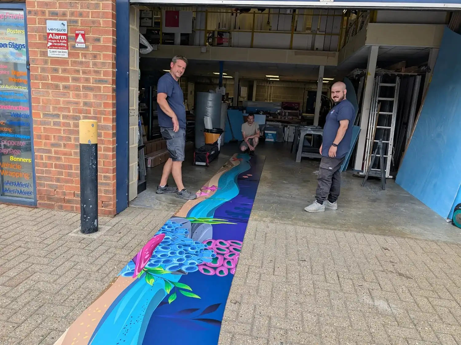
Guildford Spectrum gave us the opportunity to take our design, print and installation capabilities somewhere a little different!
Complete Sign Solutions was commissioned to install elegant oak plank signs with engraved detailing at The Franciscan Centre, Ladywell.
When Frimley Health Foundation Trust and Frimley Health Charity set out to refurbish Ward F1 at Frimley Park Hospital, they wanted more than just a fresh coat of paint
Bella Capri approached us with an image of another restaurant interior they had discovered and loved, particularly the wallpaper used throughout the space.
Complete Sign Solutions, a primary signage contractor for Freedom Leisure, was tasked with equipping the new leisure centre in Cefn Hengoed, Wales.
Longacres Garden Centre recently took over a premises in Addlestone, formerly known as Bourne Valley Garden Centre, and needed a bold, high-impact rebrand.
As a trusted signage and graphics partner for Technogym, we were brought in to work directly with their client, Finlake Resort & Spa, to enhance their gym and studio spaces.
Frimley Health Charity is dedicated to enhancing patient care and staff well-being across the Frimley Health NHS Foundation Trust, which includes Heatherwood Hospital, Frimley Park Hospital, and Wexham Park Hospital.
As a trusted partner of Technogym, we were approached to work directly with their client, London South Bank University, to enhance their gym spaces with high-quality branded visuals.
MJF Interiors approached us to enhance their new showroom in the heart of London, aiming to combine impactful signage with their high-quality office furniture offerings.

Complete Sign Solutions, a primary signage contractor for Freedom Leisure, was tasked with equipping the new leisure centre in Cefn Hengoed, Wales. Our scope included directional signage, entrance and car park signs, and motivational wall graphics to enhance the space's functionality and ambiance.
Freedom Leisure, a prominent leisure provider managing over 100 sites across the UK, sought our expertise to transform their new premises from an empty shell to a welcoming environment. We managed the project from initial site survey to final installation, ensuring all signage needs were met.
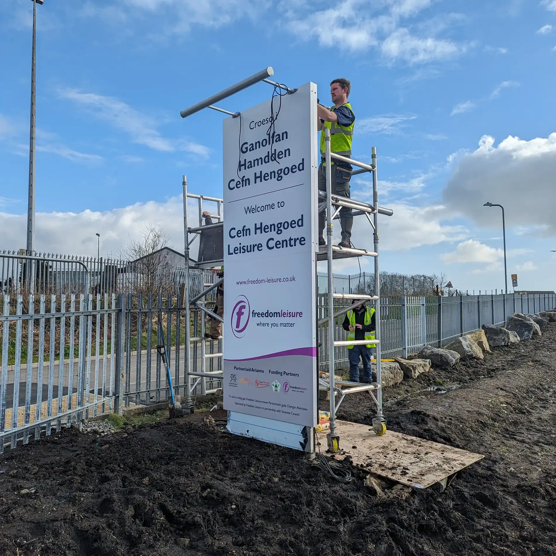
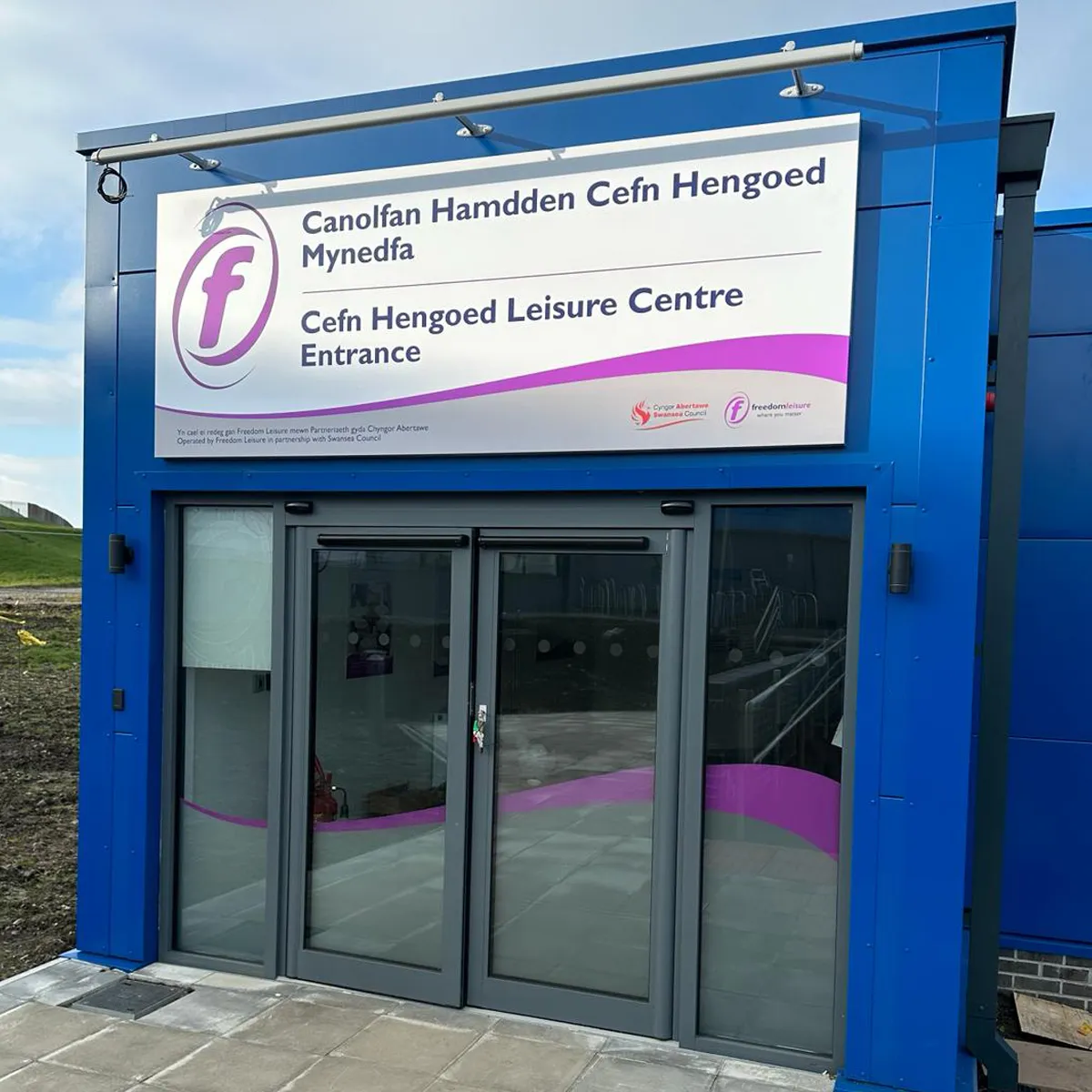
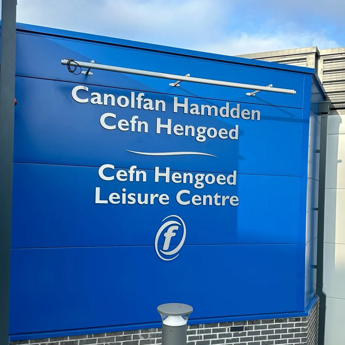
Our journey began with a site visit to the bare-walled centre in Wales, a significant distance from our Camberley base. It was crucial to make the trip count, so our signage production manager, Stuart, meticulously marked signage locations on floor plans while touring the site with project managers Lindsay and Gwyn.
The signage package included directional panels, projecting signs, door signs, and vibrant branded wall graphics using a fabric tension framework system. We also manufactured a large totem sign to prominently mark the new leisure centre's location.
Our in-house design team developed proofs based on the survey and Freedom Leisure’s requirements, adhering to brand guidelines to ensure clear, navigable signage that would enhance visitors' experience.
Once production was complete, our team traveled to Wales for installation. Two team members stayed for a week, while three others joined for a day to help install the large totem sign. One of our designers, Rachel, was also on-site to document the installation process and our progress.
The new signage and wall graphics breathed life into the centre, making it ready to serve the public as a fantastic new local hub for Cefn Hengoed. The client was thrilled with the installation, receiving positive feedback from local authorities and new visitors alike.
Working with Freedom Leisure on the Cefn Hengoed project was an enriching experience. The successful signage installation has transformed the centre into a vibrant and accessible space, ready to welcome the community. We look forward to future collaborations with this incredible leisure group.
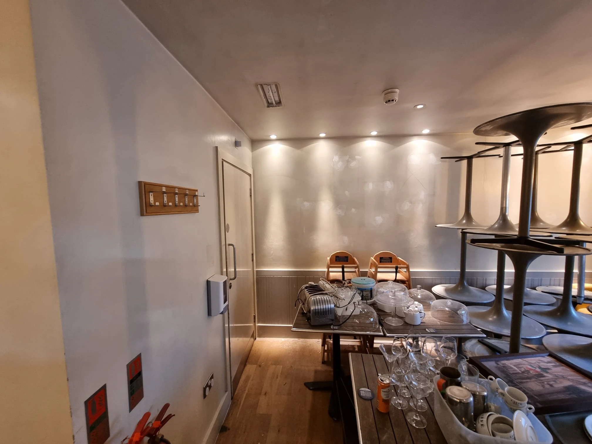
Sometimes a project begins with a finished idea rather than a blank canvas. Bella Capri approached us with an image of another restaurant interior they had discovered and loved, particularly the wallpaper used throughout the space. They wanted to achieve a similar look at their Wimbledon restaurant and asked us to explore how we could bring that style into their own interior space.
After some research, we managed to track the original wallpaper down to a specialist supplier in Europe. While we had found exactly what the client had initially asked for, the cost of purchasing the wallpaper was considerably higher than anticipated. Rather than simply sourcing the existing product, we suggested another option: use the original image purely as inspiration and create something completely bespoke for Bella Capri!
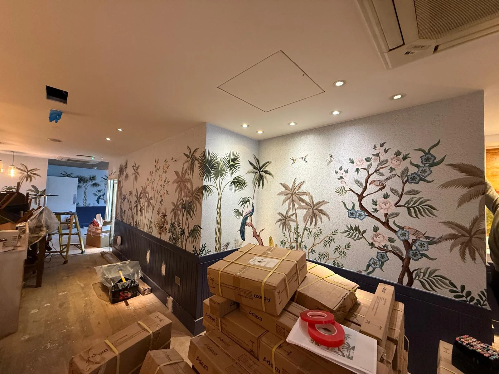
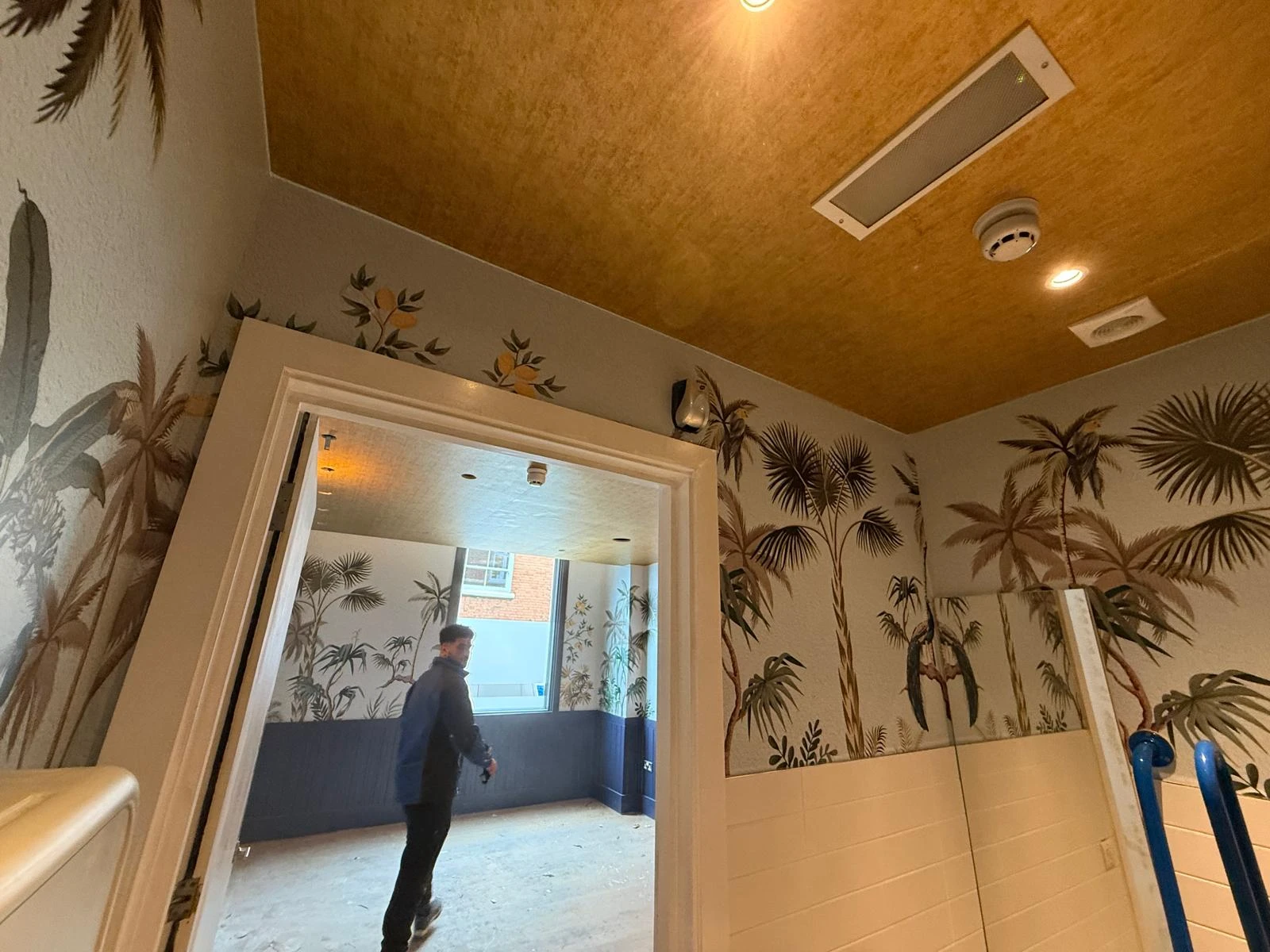
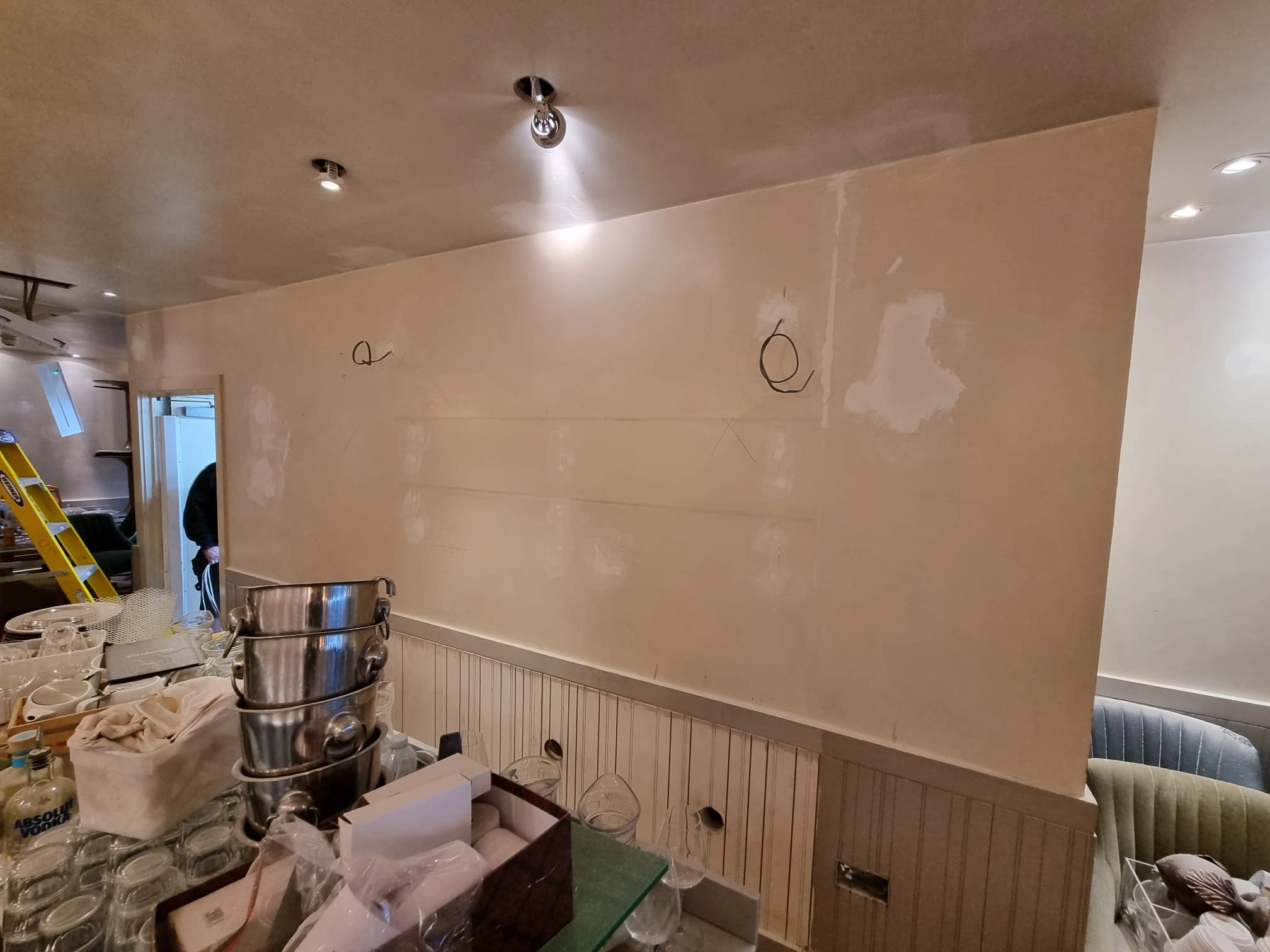
They loved the idea, giving our design team the opportunity to develop a wallpaper that captured the character and atmosphere they had been drawn to while creating something unique to their restaurant. Several concepts and revisions followed as we refined the artwork, gradually developing the design until we reached something they were completely happy with. The finished artwork could them be produced specifically for the dimensions and layout of their site in Wimbledon, rather than adapting and existing wallpaper to fit the space.
Once approved by the client, we printed the bespoke design and installed it throughout the restaurant, turning the artwork from something developed on screen into a major feature of the finished interior. Creating the design ourselves also meant that Bella Capri wasn’t simply recreating something they had seen elsewhere. The inspiration had become the starting point for an interior graphic designed specifically for them, giving the Wimbledon restaurant an identity of its own.
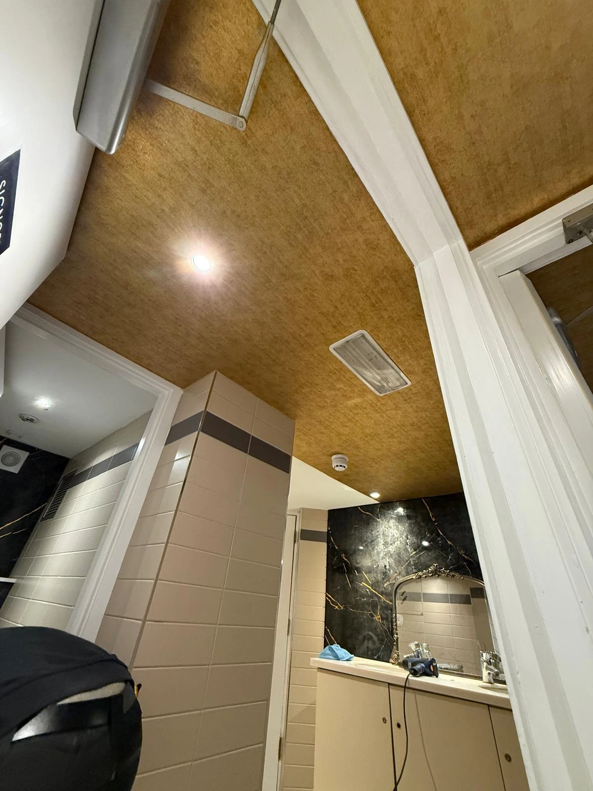
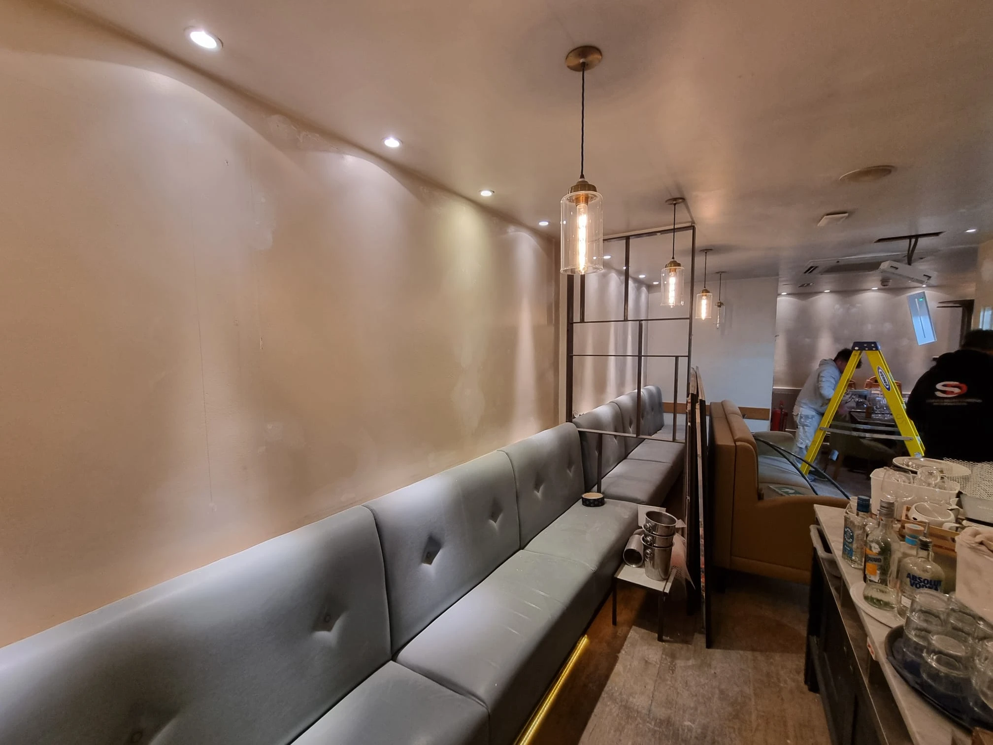
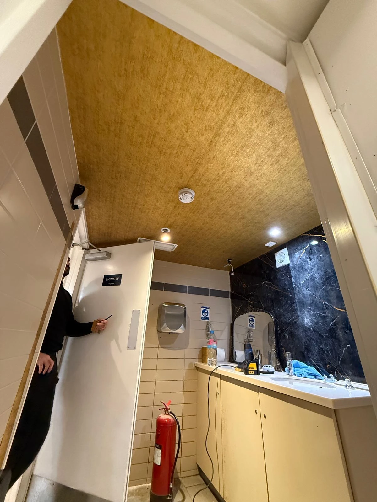
Wallpaper wasn’t the only transformation taking place. Bella Capri also wanted to introduce gold details into several areas of the restaurant. We applied a gold architectural film to ceiling areas within the toilets and corridors surrounding the toilets, creating a completely different finish without the need to replace the existing surfaces. The gold works particularly well alongside the bespoke wallpaper, adding another layer of detail and helping create the rich, decorative feel the client wanted for the interior.
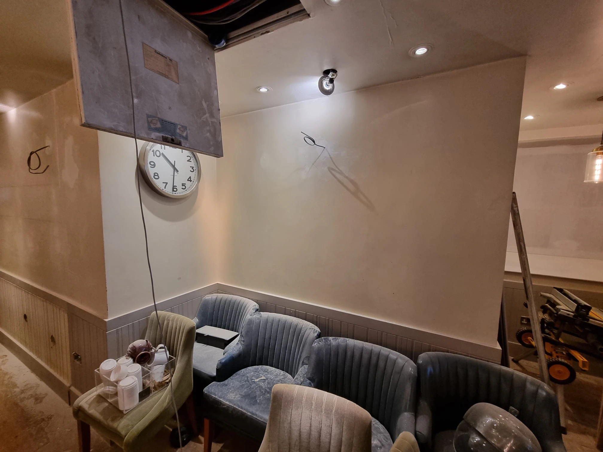
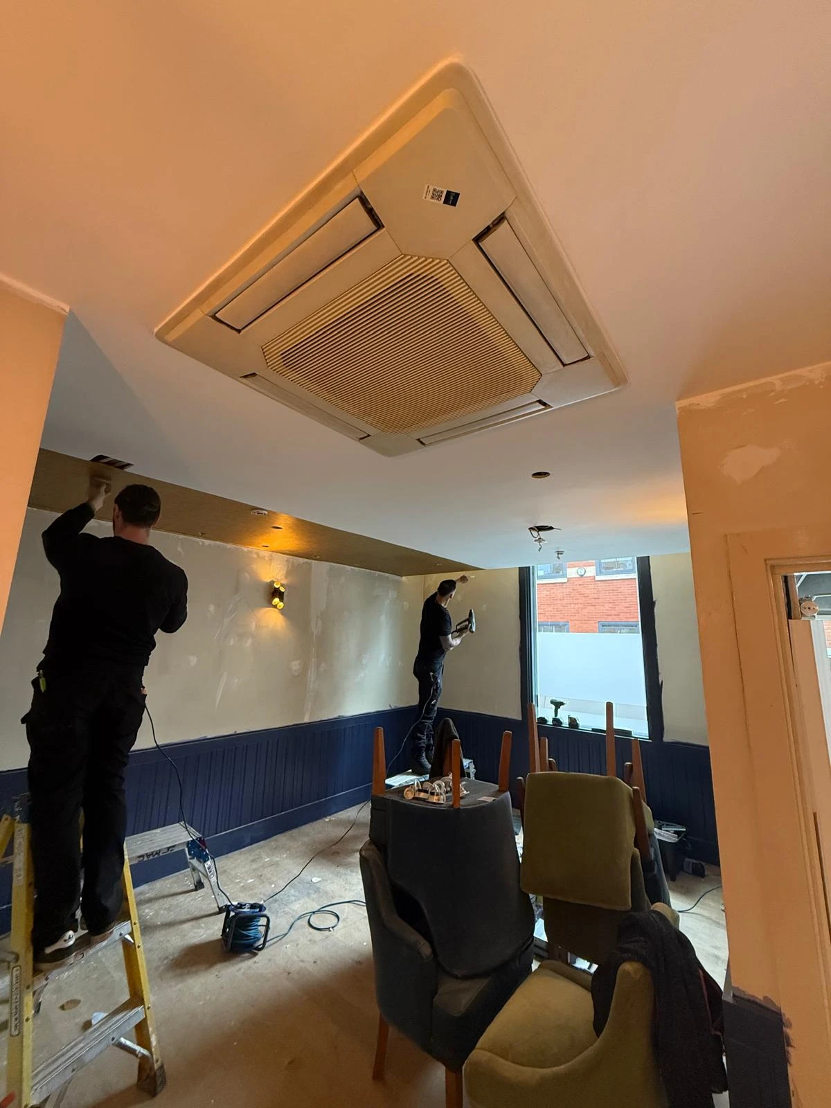
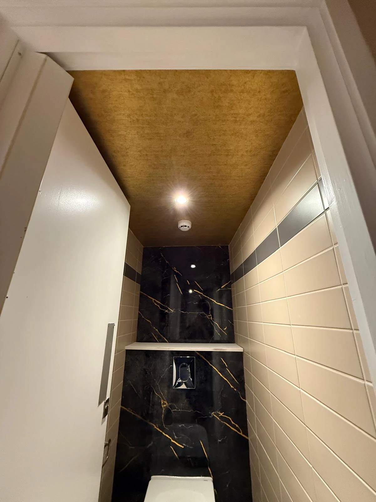
The finished project is a great example of what can happen when a client’s initial inspiration is developed into something much more personal. What began as a request to replicate a wallpaper they had seen elsewhere ultimately resulted in a bespoke design created specifically for Bella Capri, complemented by architectural finishes that helped tie the wider interior together.
For us, it also demonstrates that bespoke design doesn’t always have to begin with a completely new idea. Inspiration can come from anywhere; the important part is taking what the client loves about it and developing it into something that feels entirely their own.
Complete Sign Solutions was commissioned to install elegant oak plank signs with engraved detailing at The Franciscan Centre, Ladywell. Our goal was to create functional, aesthetically pleasing signage to help visitors navigate the beautiful convent grounds.
The Franciscan Centre, Ladywell, in Godalming, is a serene convent with sprawling landscapes. Despite its beauty, visitors had trouble finding their way around the extensive grounds and numerous buildings. Our mission was to install clear, attractive directional signage to guide visitors effortlessly.
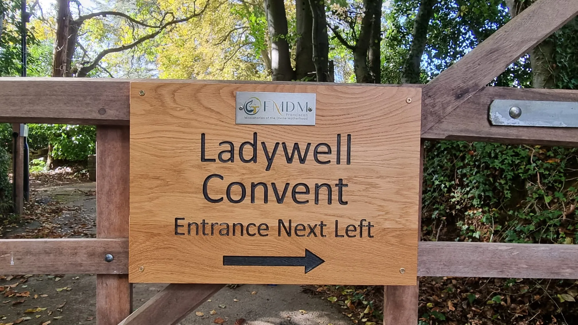
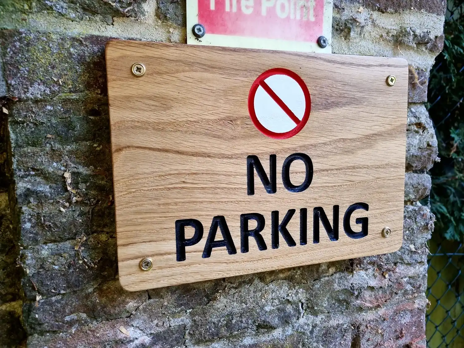
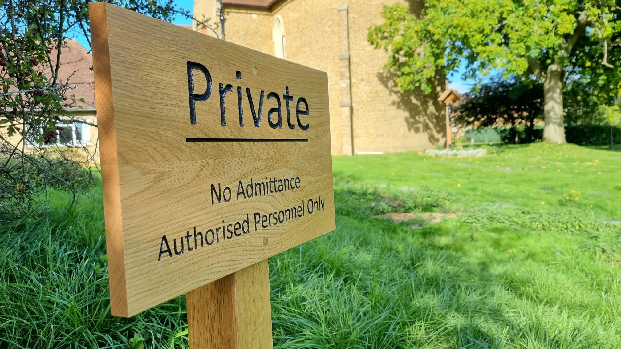
Our project began with a site visit to identify ideal locations for the new signs. Stuart led this initial visit, collaborating with Dawn from the convent. After determining the locations and approximate sizes, the design phase commenced. Rachel, our graphic designer, crafted the signage designs, ensuring clarity and harmony with the surroundings.
Once designs were approved, we began production. The oak planks underwent a thorough process, including three coats of oil staining for durability and beauty. This step, although time-consuming, was crucial for achieving the perfect finish.
Installation day arrived, one of the hottest of the year, but our team handled the challenging conditions with enthusiasm. They installed the signs with precision and care, ensuring everything was just right and leaving the site spotless.
Our work didn't stop there. We returned multiple times to add more signs, maintaining consistency in quality, colour, and size. Working with The Franciscan Centre, Ladywell has been a rewarding experience, and we look forward to future collaborations.
MJF Interiors approached us to enhance their new showroom in the heart of London, aiming to combine impactful signage with their high-quality office furniture offerings. The challenge was clear: create a cohesive and visually striking signage package that highlighted their products without overwhelming the space.
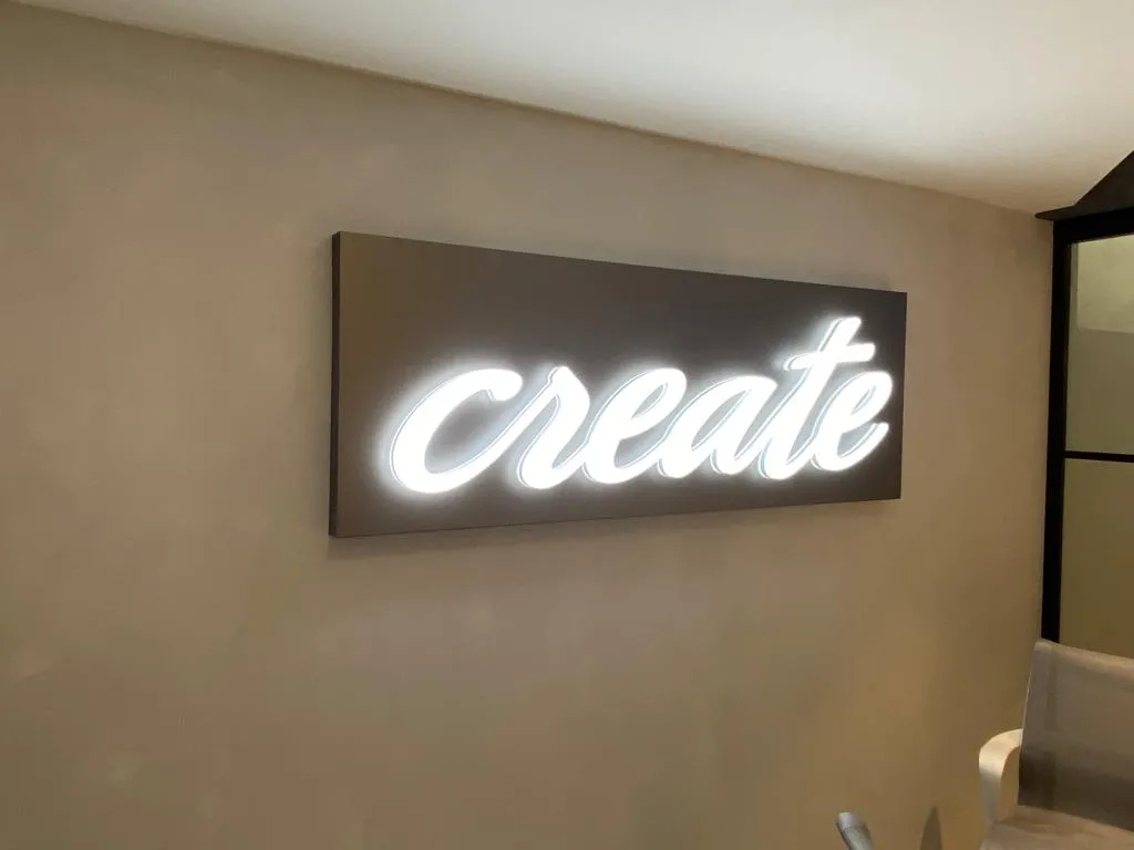
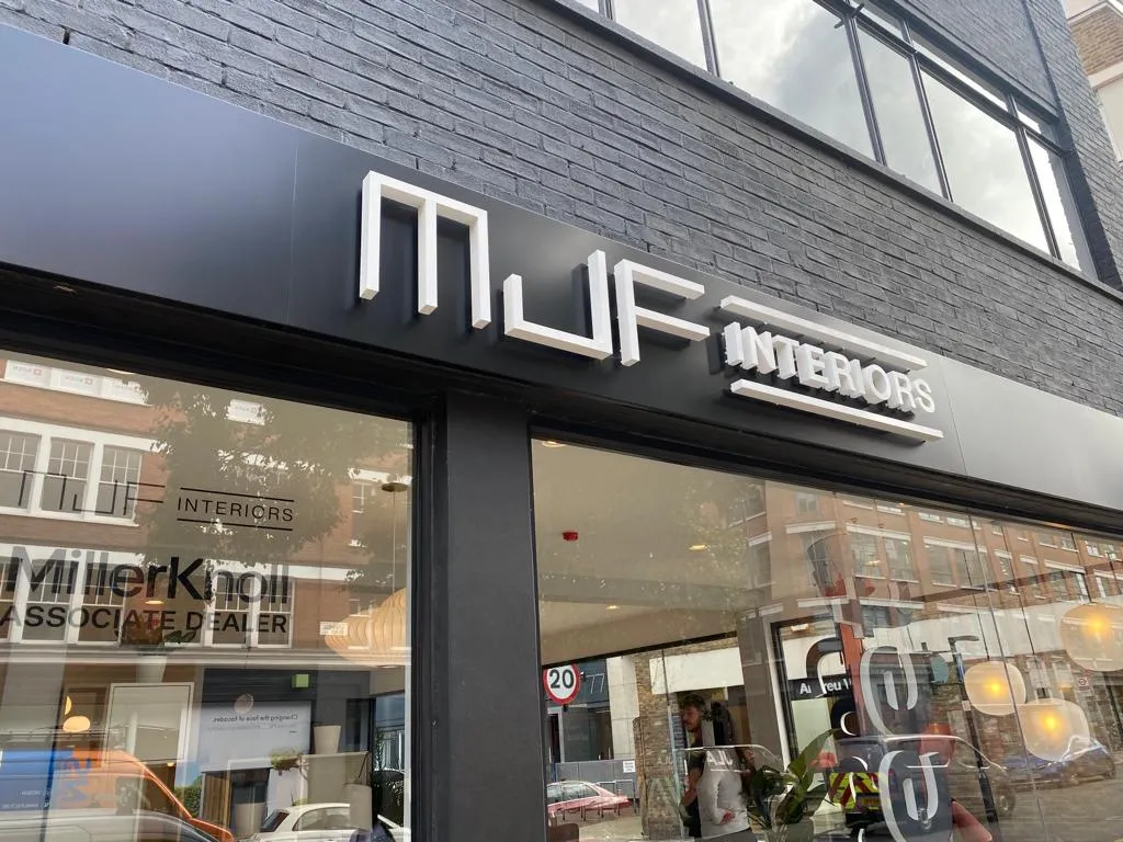
Our team worked closely with the client to design and install a range of interior and exterior signage solutions. For the shop front, we created built-up lettering with halo illumination, offering an elegant yet eye-catching presence. Inside the showroom, we installed a variety of illuminated and non-illuminated signage, including flat-cut Perspex letters and feature signage using mirror chrome built-up letters, adding a touch of sophistication and modernity.
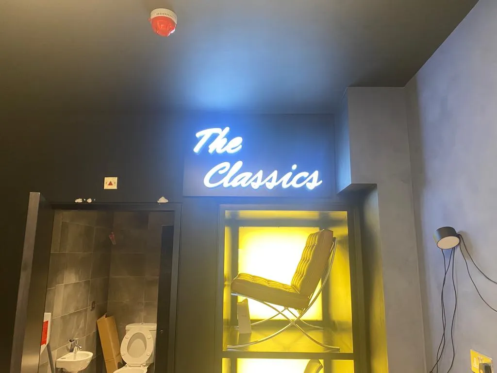
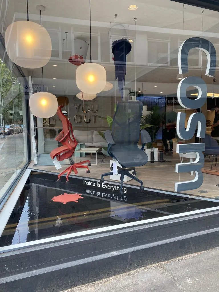
One of the standout features of the project was the innovative window display, where we used illuminated signage to showcase a featured brand of office chairs. To make the display even more engaging, we crafted hanging acrylic paint splashes above the chairs, giving the illusion of paint being poured onto the furniture. This clever visual concept represented the wide range of colours in which the chairs were available, making the product the clear focal point.
Though there were no major challenges, the creation of the paint splashes (something we’d never done before) pushed the boundaries of our usual design materials, providing a fun and exciting opportunity to explore new ideas. Another challenge was ensuring the various signage elements worked cohesively within the showroom. With so many different materials and types of signage, it was crucial that they complemented both the furniture on display and the overall atmosphere of the space.
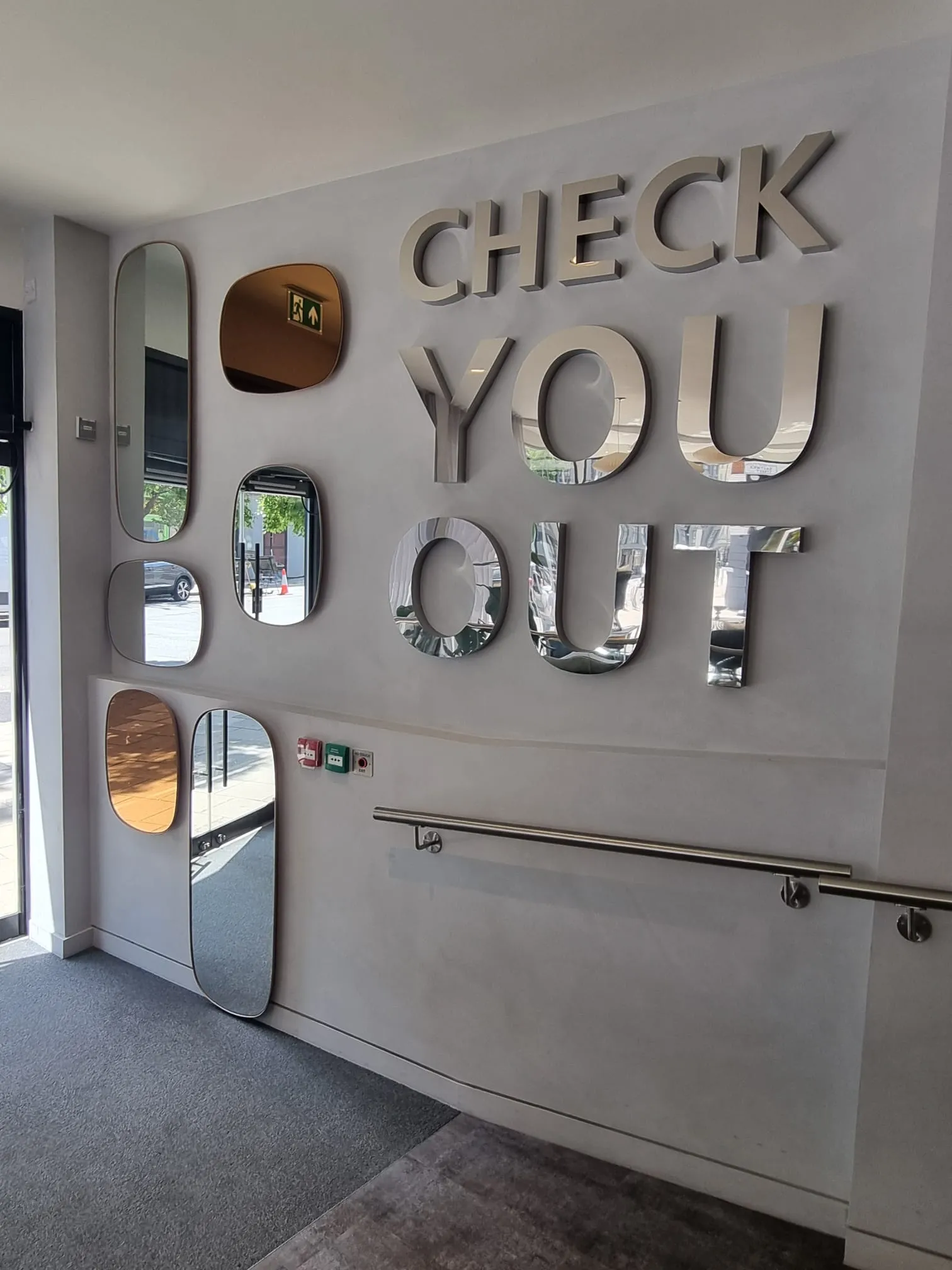
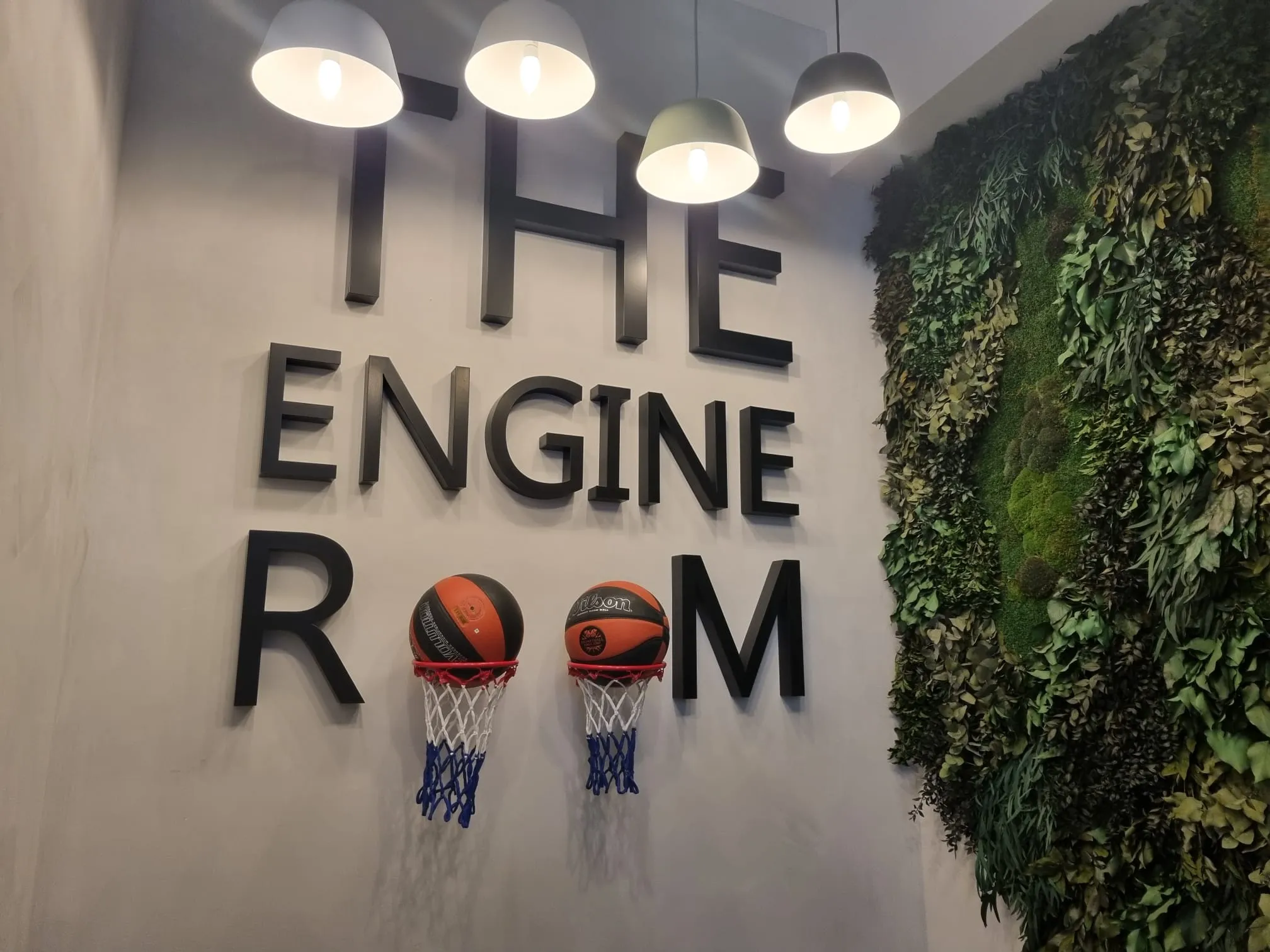
To achieve this, we worked closely with MJF Interiors to carefully select materials and plan the positioning of each piece of signage. We wanted every sign to stand out while ensuring that the showroom’s furniture, not the signage, remained the star of the show. The result was a carefully balanced showroom with an inviting, professional atmosphere that highlighted both the product and the space itself.
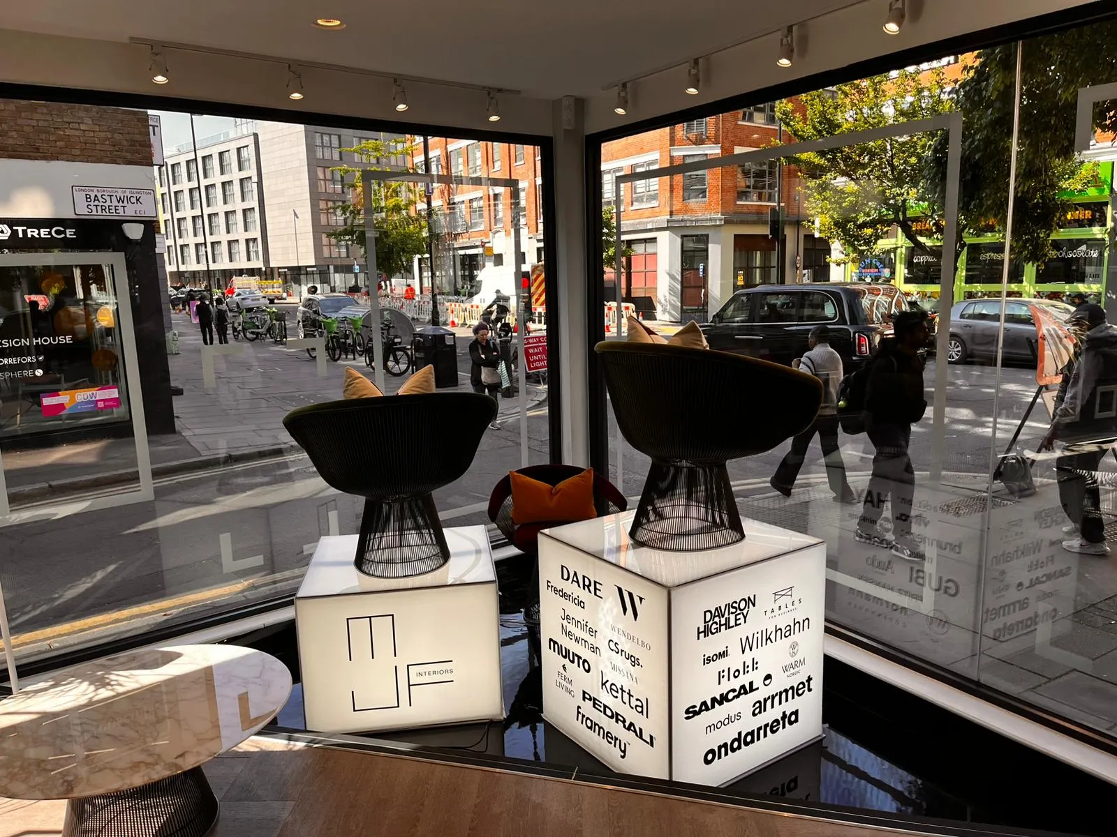
The client was thrilled with the outcome, and the project’s success led to us being asked to frequently update the main window display in line with new featured furniture pieces. In May 2025, we returned to change the window display for MJF Interiors following a change in the product line they wanted to promote. We supplied framework to support certain chairs they wanted to display, incorporating fabric inserts to fill the sides. With bright LED lamps inside these cubes, light shines through the top, made from Opal Perspex, to illuminate the product and the fabric sides featuring printed logos. The varying heights of the two cubes create an appealing layout for the chairs, showcasing them beautifully both during the day and at night.
Looking ahead, we are excited to work with MJF again in the future when they change their window display again to promote a new line of products.
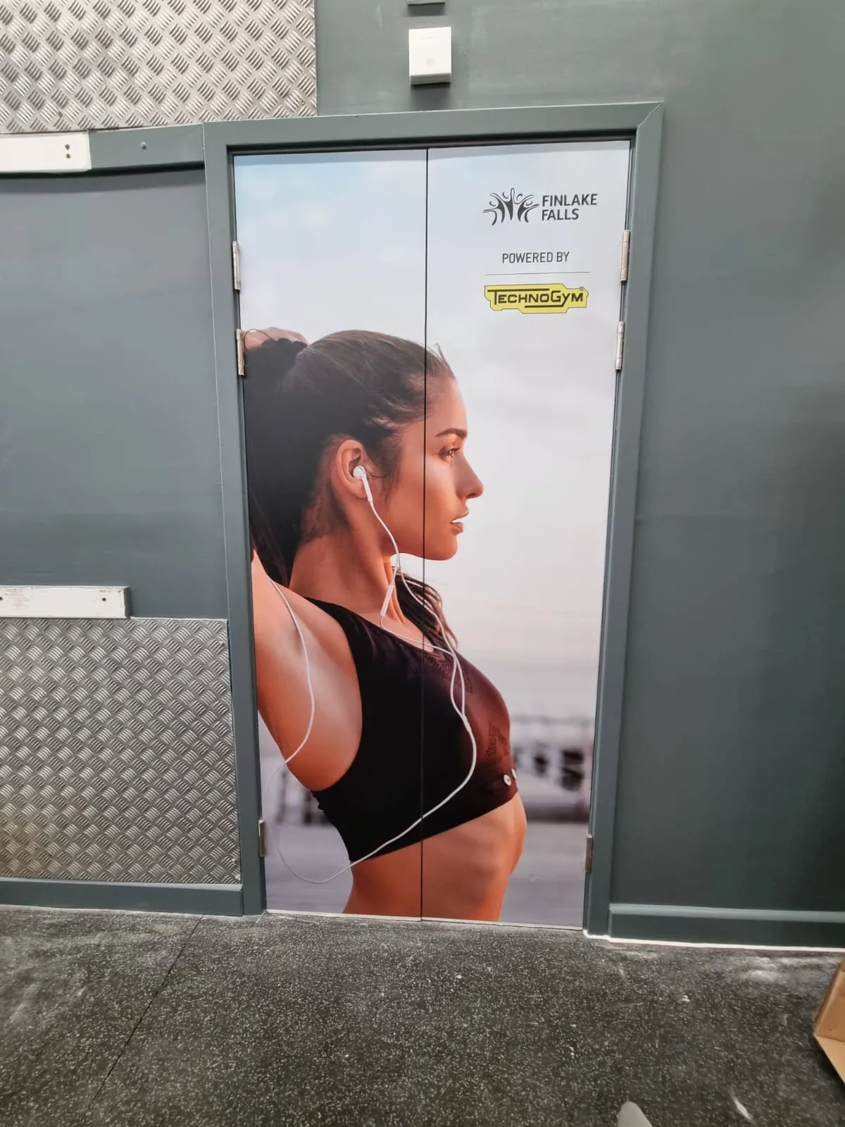
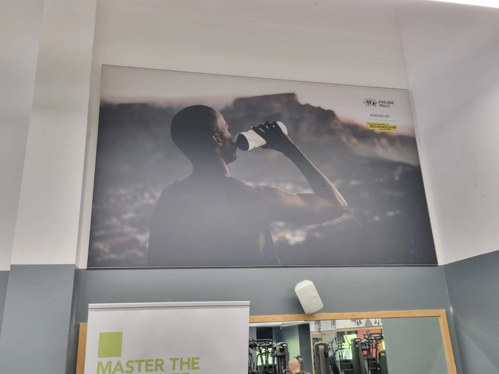
As a trusted signage and graphics partner for Technogym, we were brought in to work directly with their client, Finlake Resort & Spa, to enhance their gym and studio spaces. The goal was to bring the facility to life with high-quality wall graphics and fabric tension frames, incorporating dual branding for both Finlake and Technogym. In addition to the gym and studio areas, we also provided graphics for the reception area, creating a cohesive and visually engaging environment. While there was an initial scope to extend graphics throughout the stairwell and other areas, budget constraints meant that this could be revisited in the future.
One of the main challenges was the tight deadline. With an open day scheduled just a week and a half after the quotation and artwork were approved, the usual two-week production timeline for a project of this scale had to be condensed. Given the large number of graphics being installed across multiple areas, losing even a few days of production time made this a demanding task.
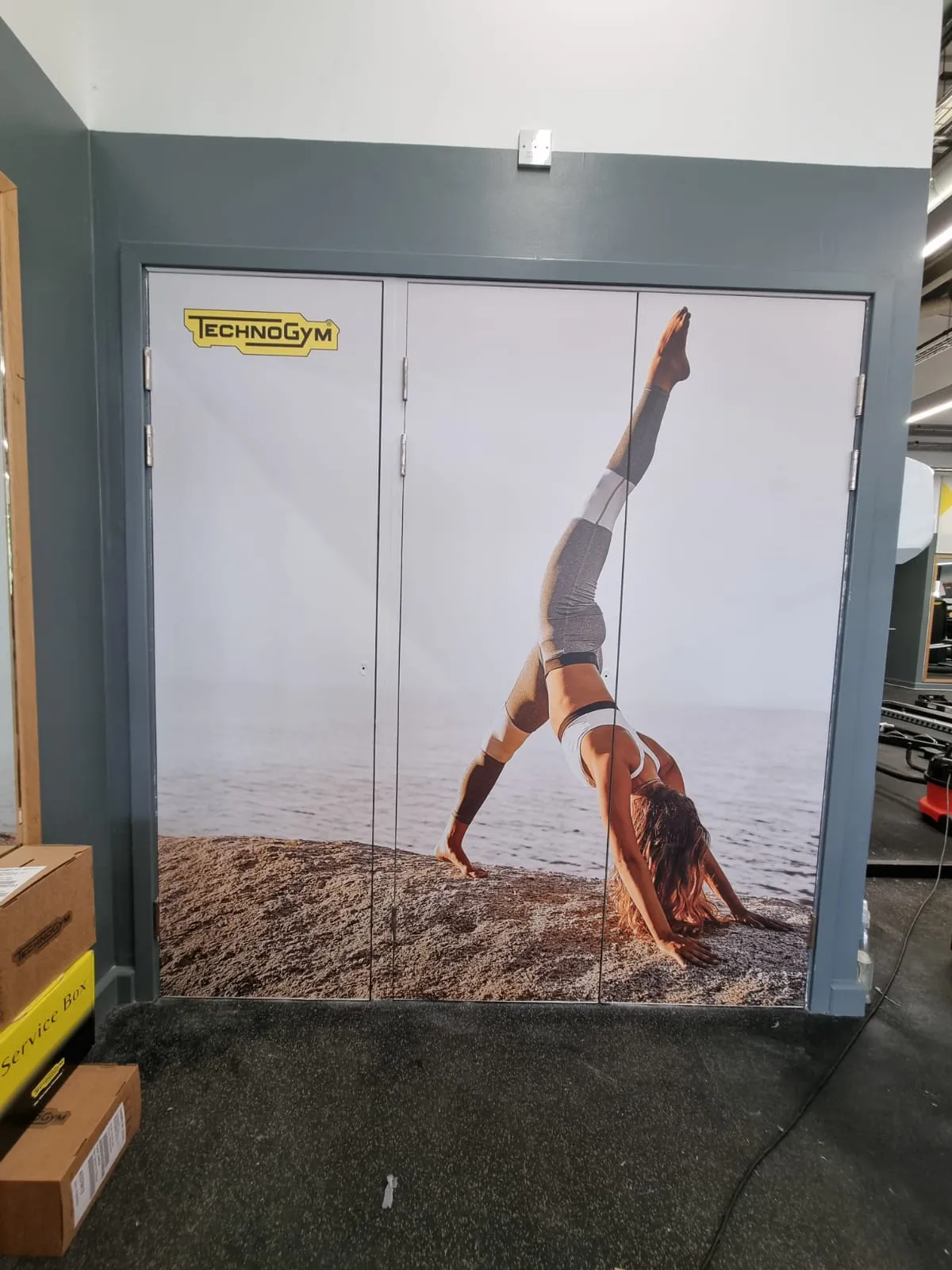
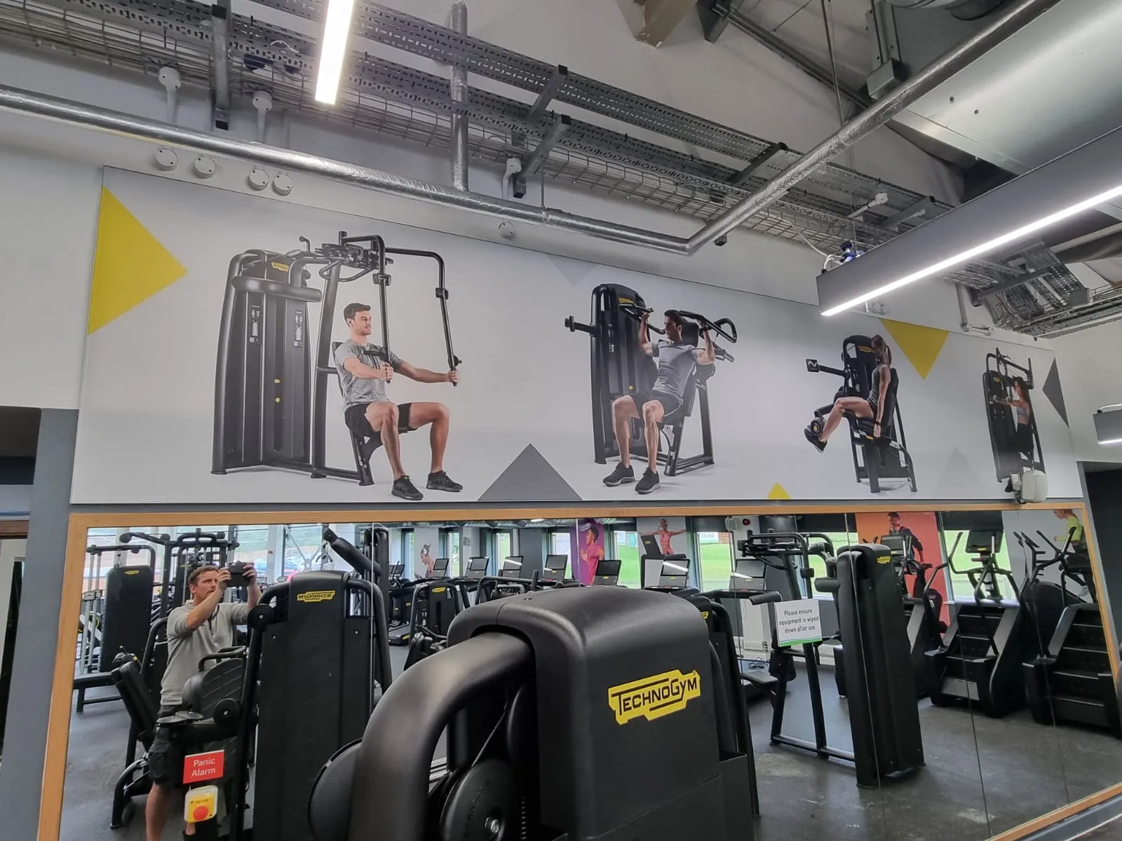
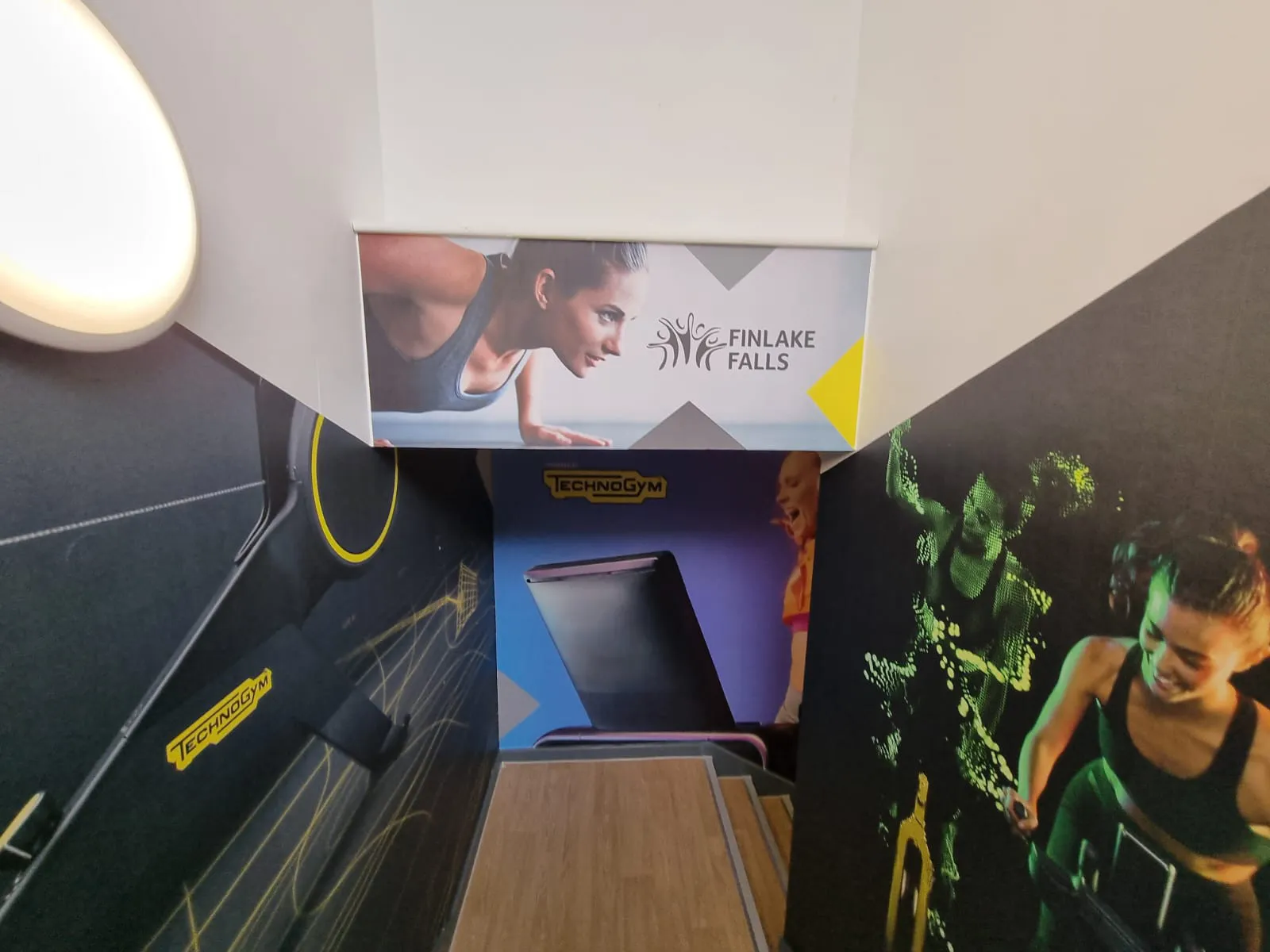
To meet the deadline, our installation team adapted quickly. We arranged early morning installations and stayed in nearby hotels to maximise working hours on-site. By deploying multiple teams across different areas of the facility, we accelerated the process while maintaining our high-quality standards. This strategic approach allowed us to complete the entire installation before the open day, ensuring everything was ready for visitors.
Technogym was highly impressed with our ability to manage such a large-scale project within a limited timeframe. Finlake Resort & Spa was equally pleased with the transformation, noting how the new graphics brightened up the gym and studio spaces, particularly the stairwell. As an ongoing partner with Technogym, another successful project at Finlake reinforced our reputation, leading to further opportunities to support Technogym’s clients and enhance their fitness spaces
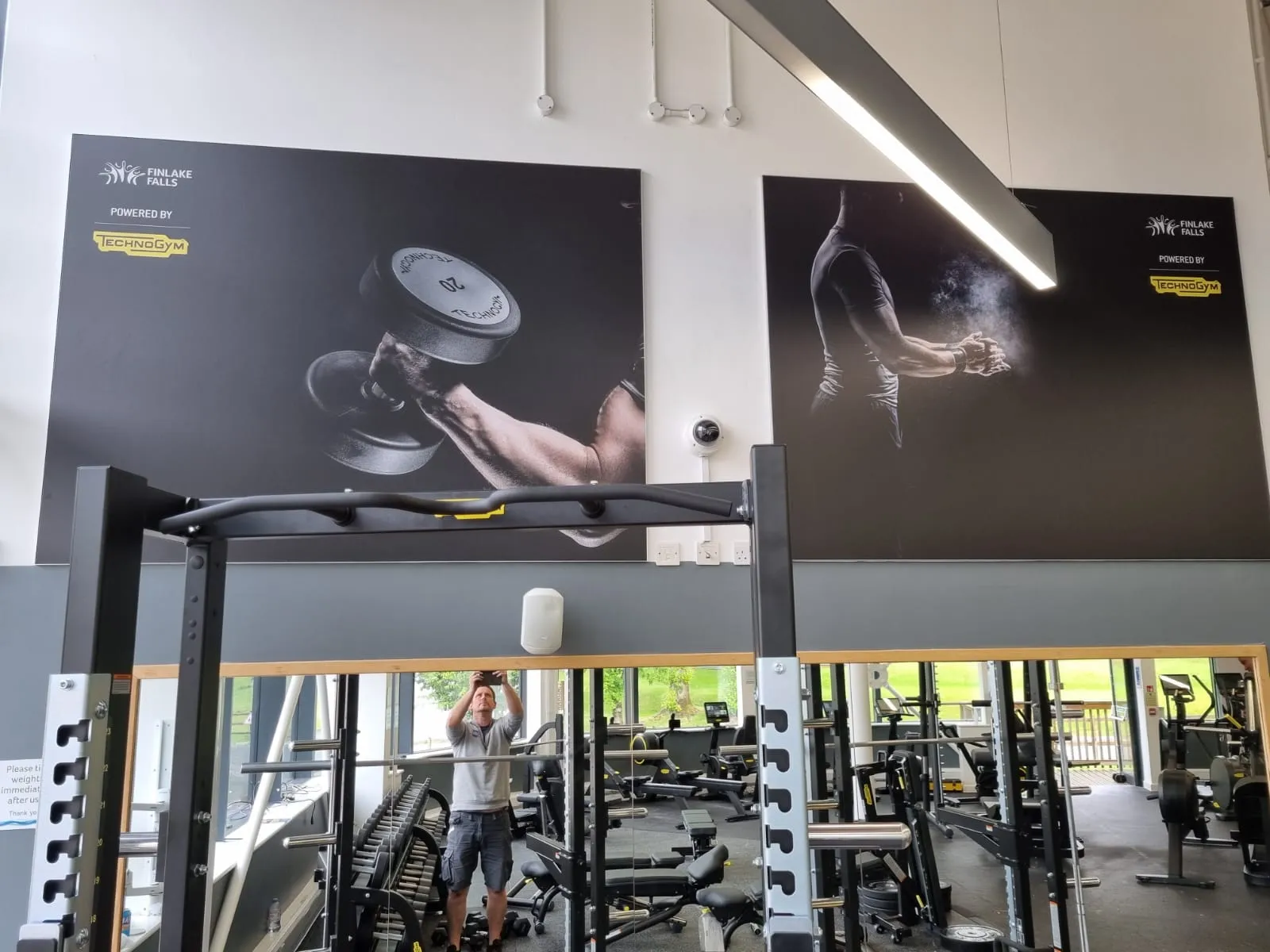
As a trusted partner of Technogym, we were approached to work directly with their client, London South Bank University, to enhance their gym spaces with high-quality branded visuals. The goal was to create a cohesive and engaging environment that aligned with Technogym’s branding while complementing the university’s existing colour schemes. To achieve this, we supplied a series of fabric tension frame systems with printed fabric skins, tailored to different sections of the gym. These graphics added character to the spaces while maintaining a premium, professional look. Additionally, we installed a vinyl wall graphic in the assessment area to further enhance the environment.
One of the main challenges was working around sockets and other wall obstructions, ensuring that functionality wasn’t compromised. Fortunately, the system we used offered versatility, allowing us to cut around sockets and switches rather than covering them so they cannot be used.
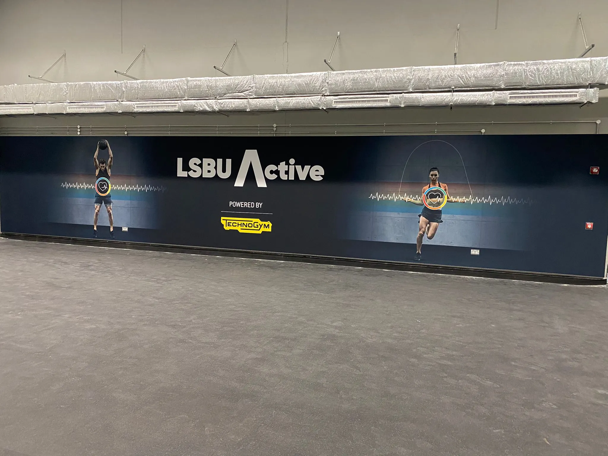
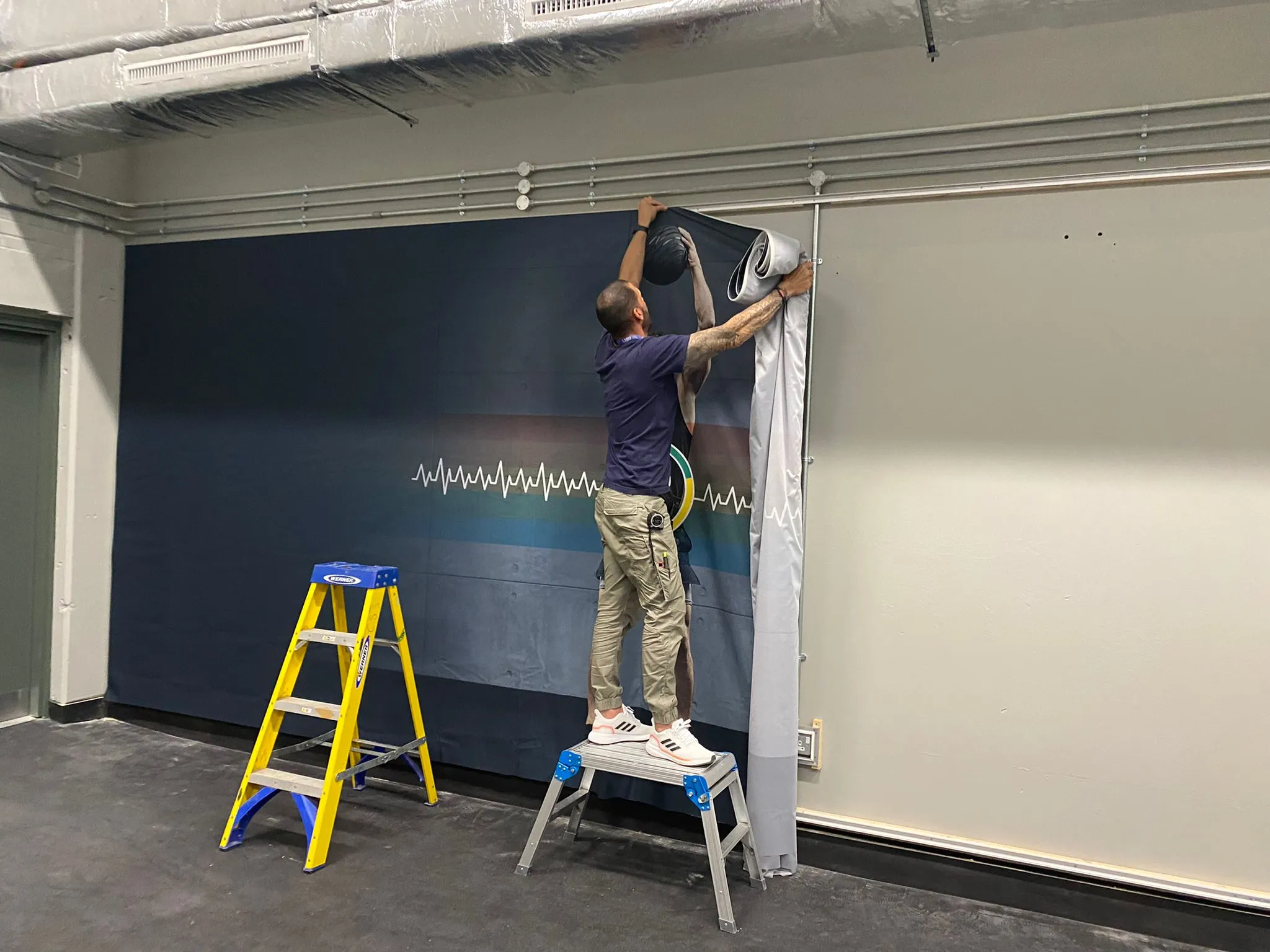
Out installation team carefully measured each area on-site, identifying where adjustments were needed. By calculating the precise cuts and determining additional framework lengths, we were able to seamlessly integrate the graphics without disrupting access to sockets or switches. The result was a flawless installation that blended perfectly with the space, making it appear as though the system had always been there.
Initially, the client was unsure about how the frames would look, concerned that they might appear too bulky. However, after reviewing samples and examples of our previous installations, they decided to proceed, and they were thrilled with the outcome. Both Technogym and London South Bank University were highly impressed with the premium finish, noting how the graphics transformed the gym areas without overpowering them.
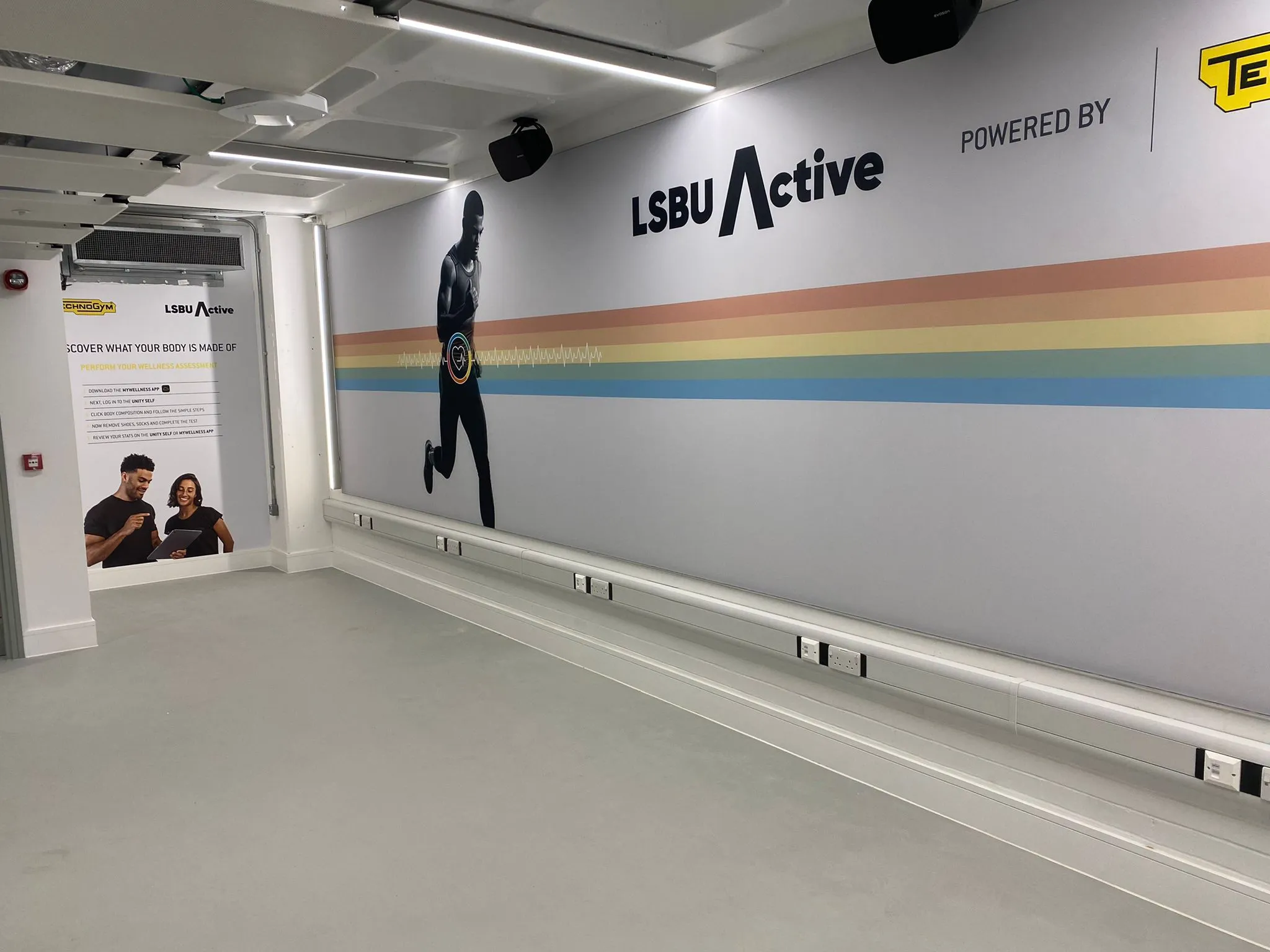
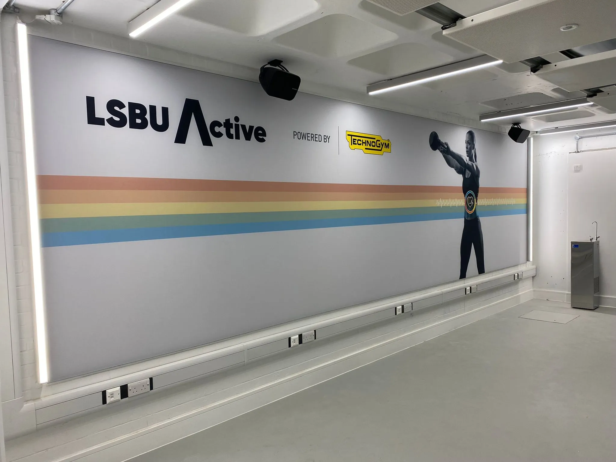
This project demonstrated how the right signage solutions can bring both style and functionality to a space, reinforcing brand identity while maintaining a sleek and professional environment.
Longacres Garden Centre recently took over a premises in Addlestone, formerly known as Bourne Valley Garden Centre, and needed a bold, high-impact rebrand. The existing signage featured two curved arches displaying the previous name, but instead of simply rebranding these existing elements, we proposed a more striking solution; one large illuminated sign spanning the entire 14-metre-wide entrance and exit. Given the landscape orientation of the Longacres logo, this approach ensured maximum visibility from the road while creating a cleaner and more cohesive look at the main entryway. To achieve this, we manufactured a large flex skin box, significantly enhancing the garden centre’s presence.
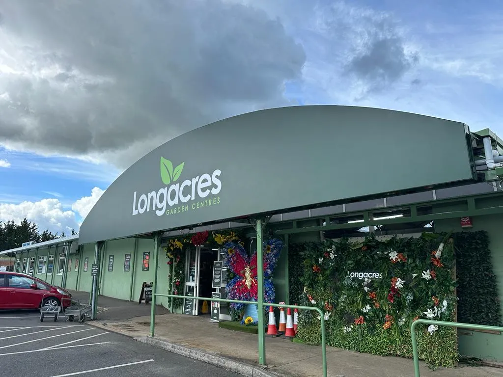
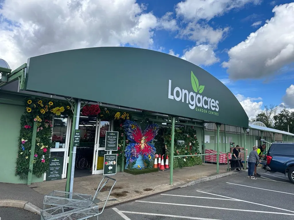
Installing such a large sign over the main entrance and exit of a busy working shop posed challenges, particularly when working around customers and maintaining the flow of foot traffic. With years of experience in public-facing installation, our team carefully sectioned off work areas, directing people safely around the site using barriers, tape, and access machinery. The sign itself was fabricated in seven sections, requiring careful assembly above the entryway while ensuring minimal disruption to customers and store operations.
Our installation team holds IPAF licenses, allowing us to use access machinery efficiently and safely. A job of this scale would have been significantly more difficult and hazardous without the proper equipment, so having certified installers ensured both safety and speed. Additionally, by pre-assembling and labelling the sections in our workshop, we streamlined the installation process, reducing time on-site and ensuring a seamless fit.
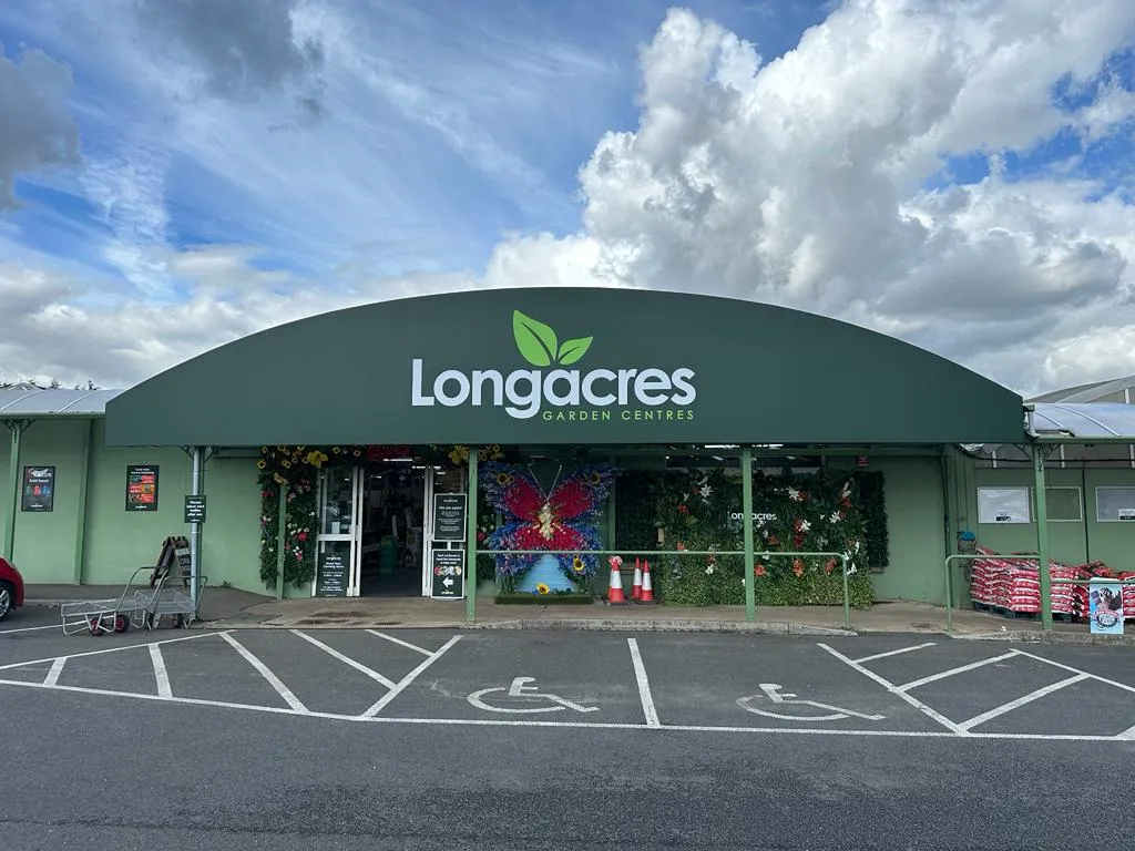
The final result was a highly visible, professional-looking illuminated sign that impressed both the client and their customers. Seeing such a large-scale sign come to life on-site was incredibly rewarding, and the impact at night, with the Longacres logo brightly illuminated, is undeniable. As a long-standing signage and graphics supplier for Longacres across multiple locations, as well as their vehicle graphics, we were thrilled to collaborate on this project and continue to support them with their branding needs.
Frimley Health Charity is dedicated to enhancing patient care and staff well-being across the Frimley Health NHS Foundation Trust, which includes Heatherwood Hospital, Frimley Park Hospital, and Wexham Park Hospital. The charity focuses on funding projects that go beyond the standard NHS provisions, such as acquiring state-of-the-art medical equipment, improving hospital environments, and supporting staff development. Their efforts aim to create a more comfortable and efficient healthcare experience for patients, staff, and visitors alike.
As part of their ongoing efforts, we collaborated with Frimley Health Charity to transform the Children’s Ward and Ward 24 at Wexham Park Hospital. The goal was to create a welcoming and engaging environment through a wide range of custom vinyl graphics and signage solutions. Our work included flat-cut letters, wall graphics, door wraps, Perspex fact plaques for animal-themed rooms, desk wraps, themed door signs, and projecting signs. The design themes were carefully curated to bring different areas of the ward to life, incorporating jungle, land-to-sea, and underwater themes. Additionally, each clinic room was themed around a specific animal, such as polar bears, whales, seahorses, otters, seagulls, turtles, and more! Each room had it’s door wrapped in an image of the animal, and also featured Perspex plaques inside the room which displayed animal imagery along with a dedicated fact plaque, offering children an engaging distraction while receiving treatment.
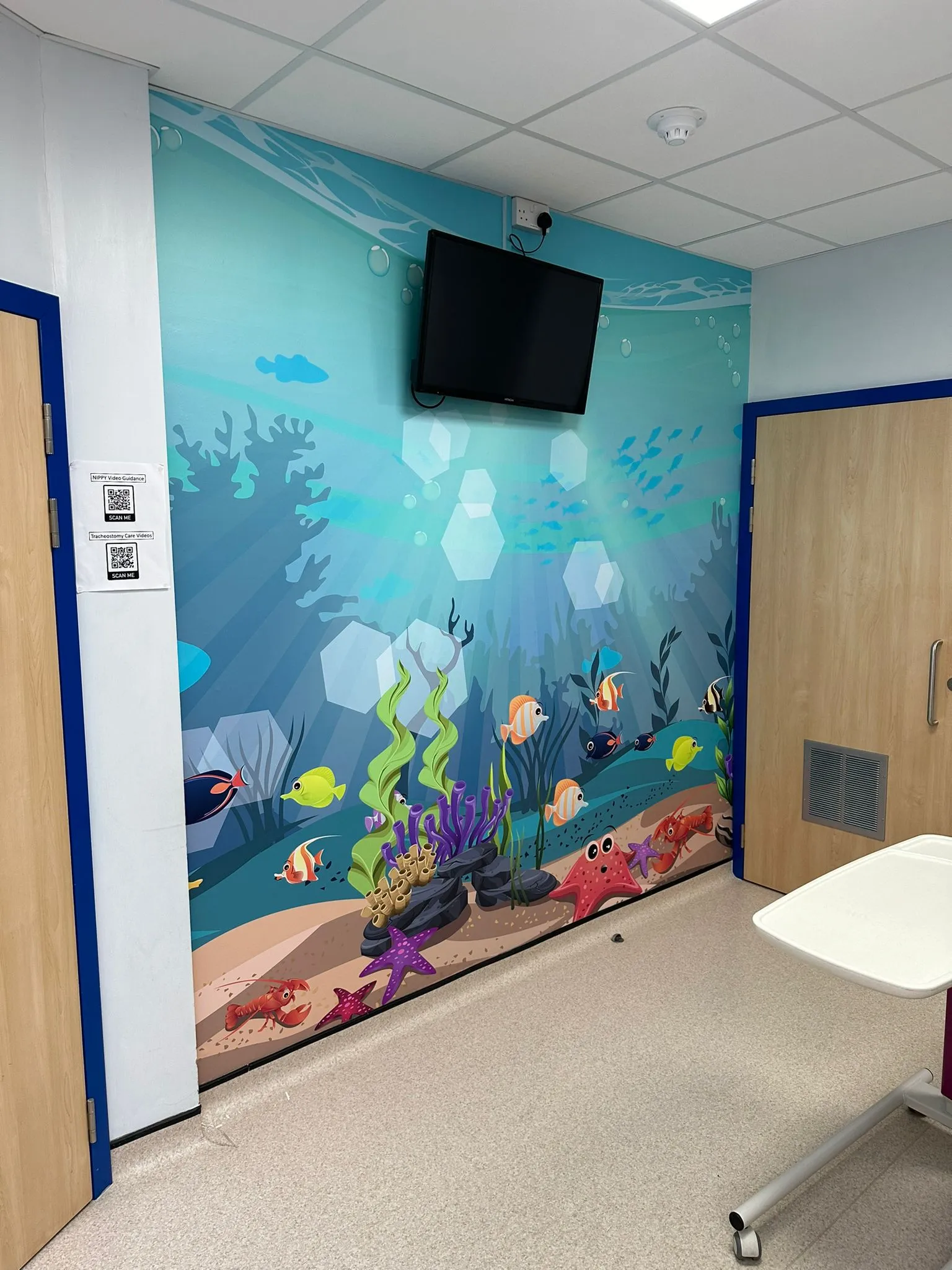
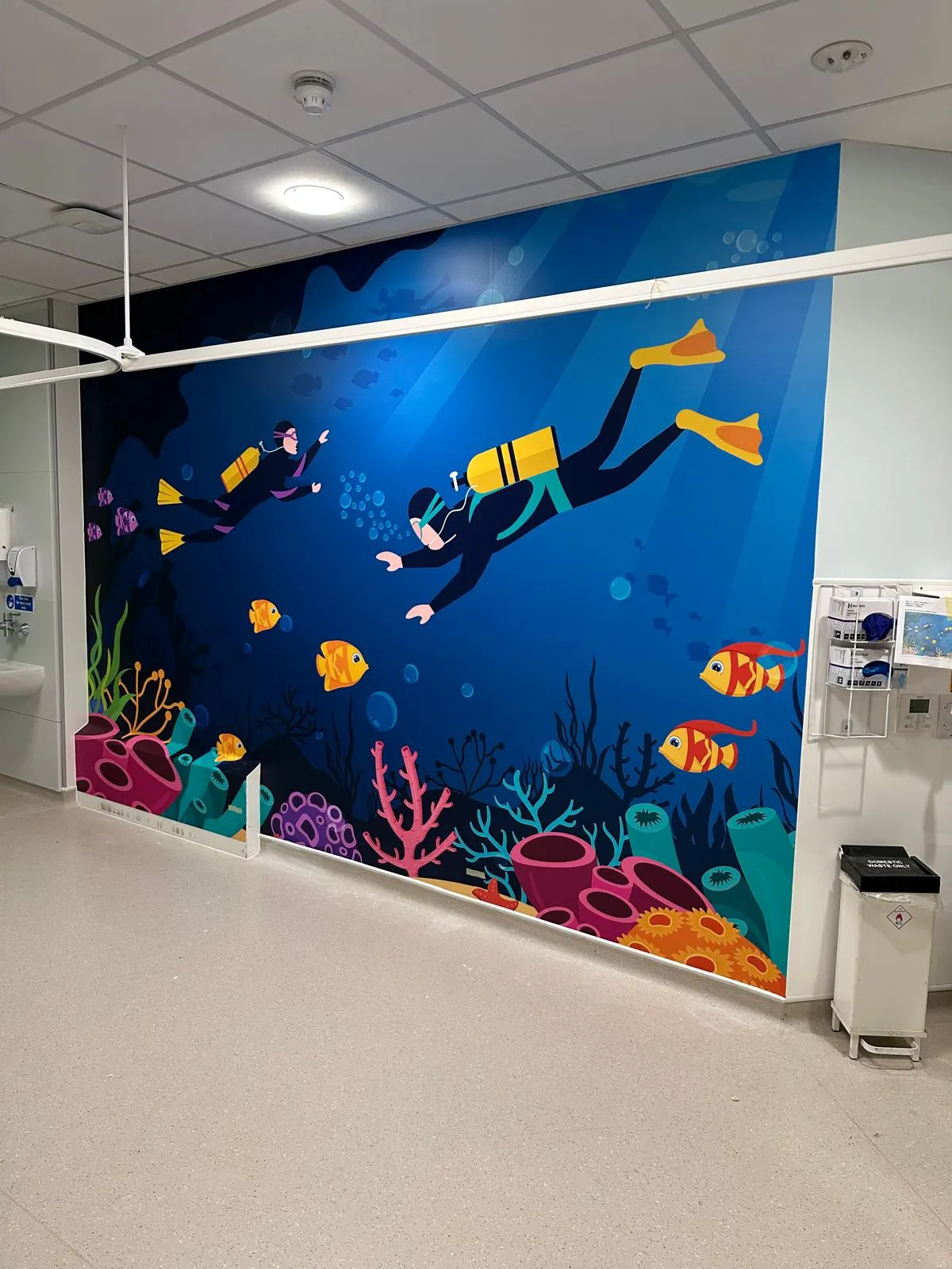
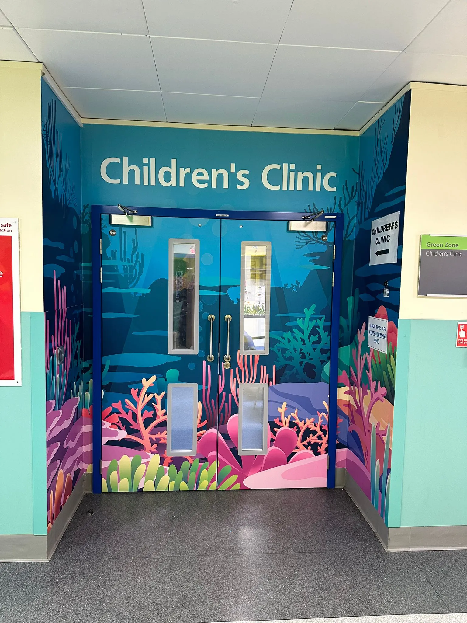
One of the main challenges of this project was working within a live hospital environment. Having extensive experience in hospital installation, we took great care to minimise disruptions to patients, staff, and daily operations. The installation was carried out in phases to ensure that medical care remained uninterrupted. By coordinating closely with the hospital staff, we scheduled work at times that best suited the ward’s operations, allowing us to complete the project with minimal impact on patient care.
The final transformation was met with overwhelming positivity. Hospital staff praised how the new graphics brightened the ward, creating a more inviting space for children and their families, and our flexibility to work around them. Patients and visitors also shared their appreciation, noting how the designs helped ease anxiety and create a more comforting atmosphere. Frimley Health Charity was delighted with the results, from the initial design phase to seeing the completed installation. Our long-standing partnership with the charity continues to bring inspiring signage and graphics to hospitals across the Frimley Health Foundation Trust, enhancing patient experiences and hospital environments with every project.
A waterslide is probably not the first thing that comes to mind when you think of large format graphics, but this project for Freedom Leisure at Guildford Spectrum gave us the opportunity to take our design, print and installation capabilities somewhere a little different!
As part of an update to the leisure facility, Freedom Leisure wanted to give the large waterslide structure a fresh, more modern appearance. The existing design consisted mostly of blue painted panels with a vinyl graphic across the structure. The brief was to transform both sides of the slide with a colourful underwater theme, taking inspiration from artwork being used elsewhere within the facility’s upgrade works. Our design team recreated this visual style across the much larger structure, incorporating underwater scenery, sea life, coral and plant life to make the slide feel like part of the surrounding aquatic-themed environment.
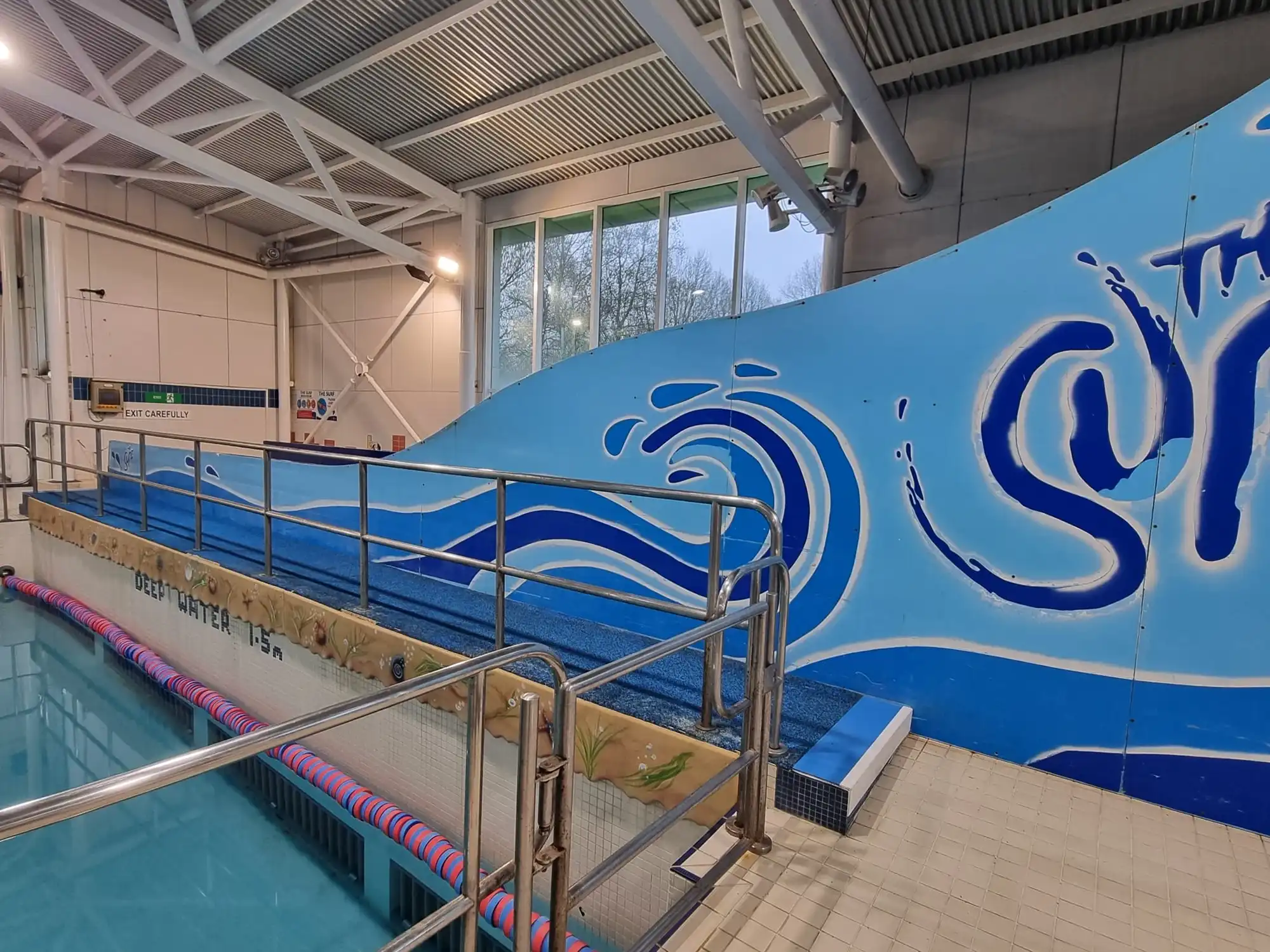
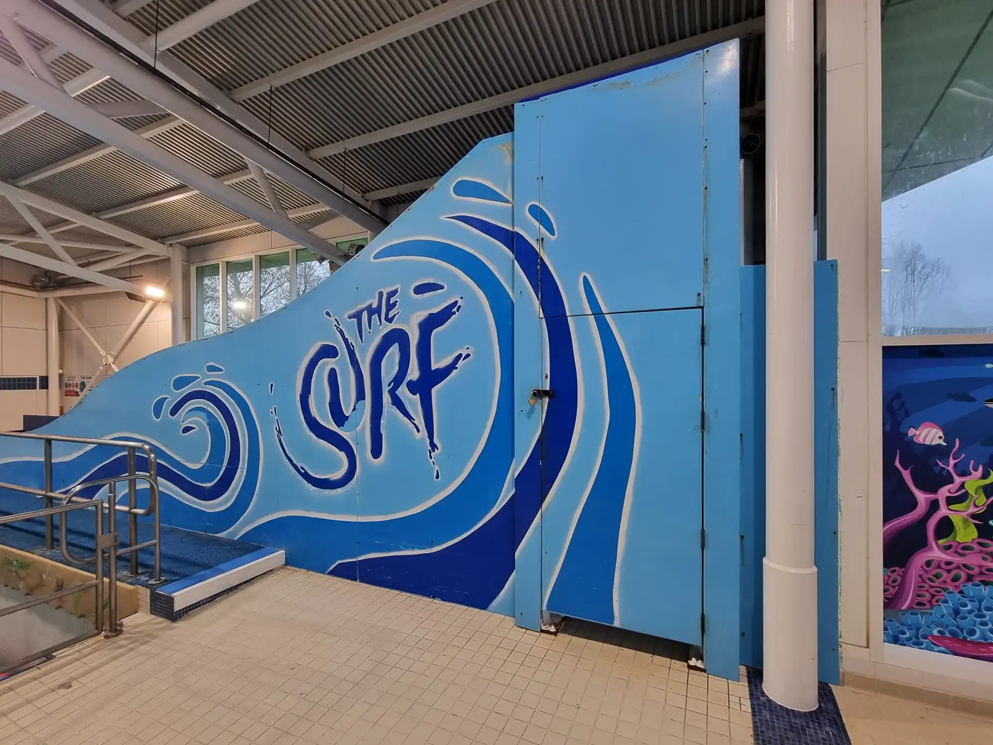
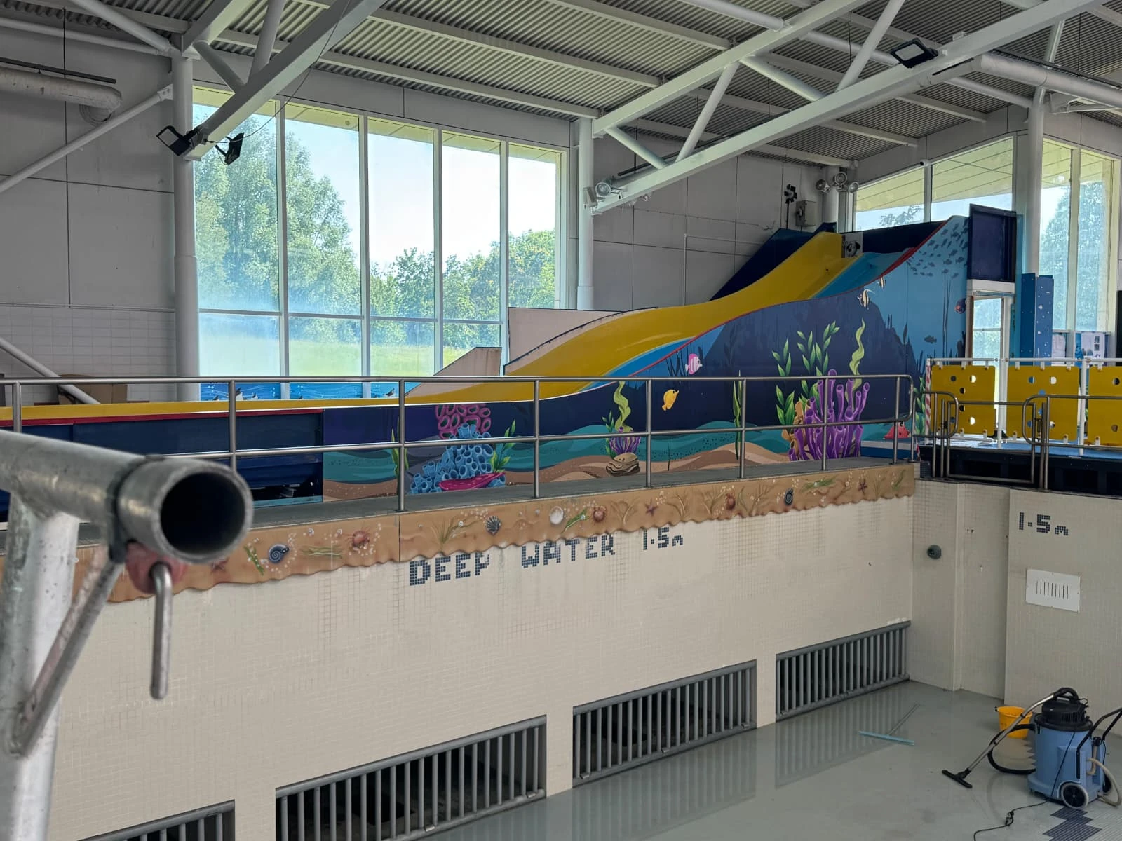
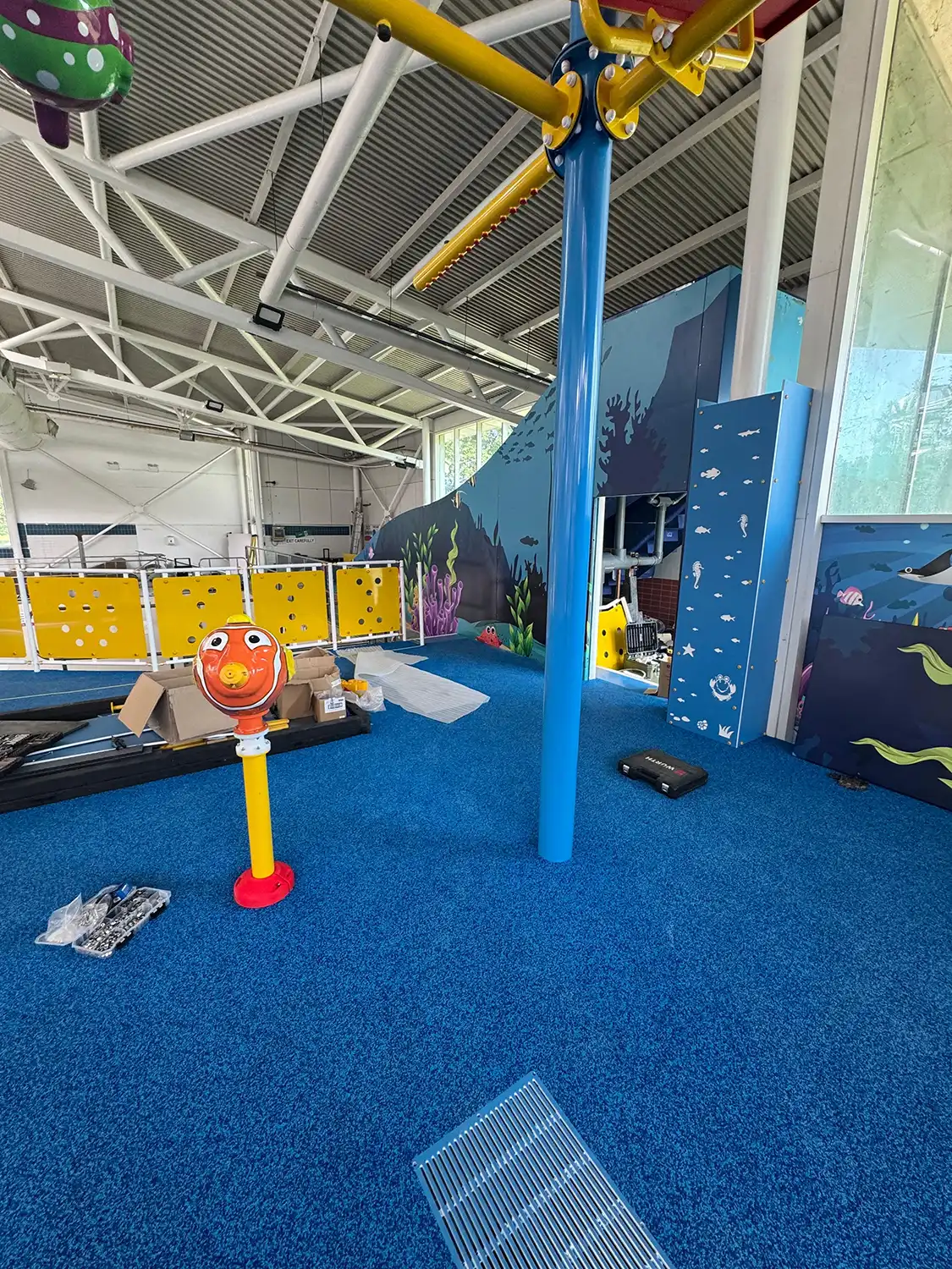
The scale and construction of the waterslide made this considerable more involved than applying graphics to a regular wall. Both sides were made up of individual fibreglass panels, each forming part of the overall shape of the structure. Our installation team carefully removed the panels from the slide and transported them back to our workshop, where preparation could begin.
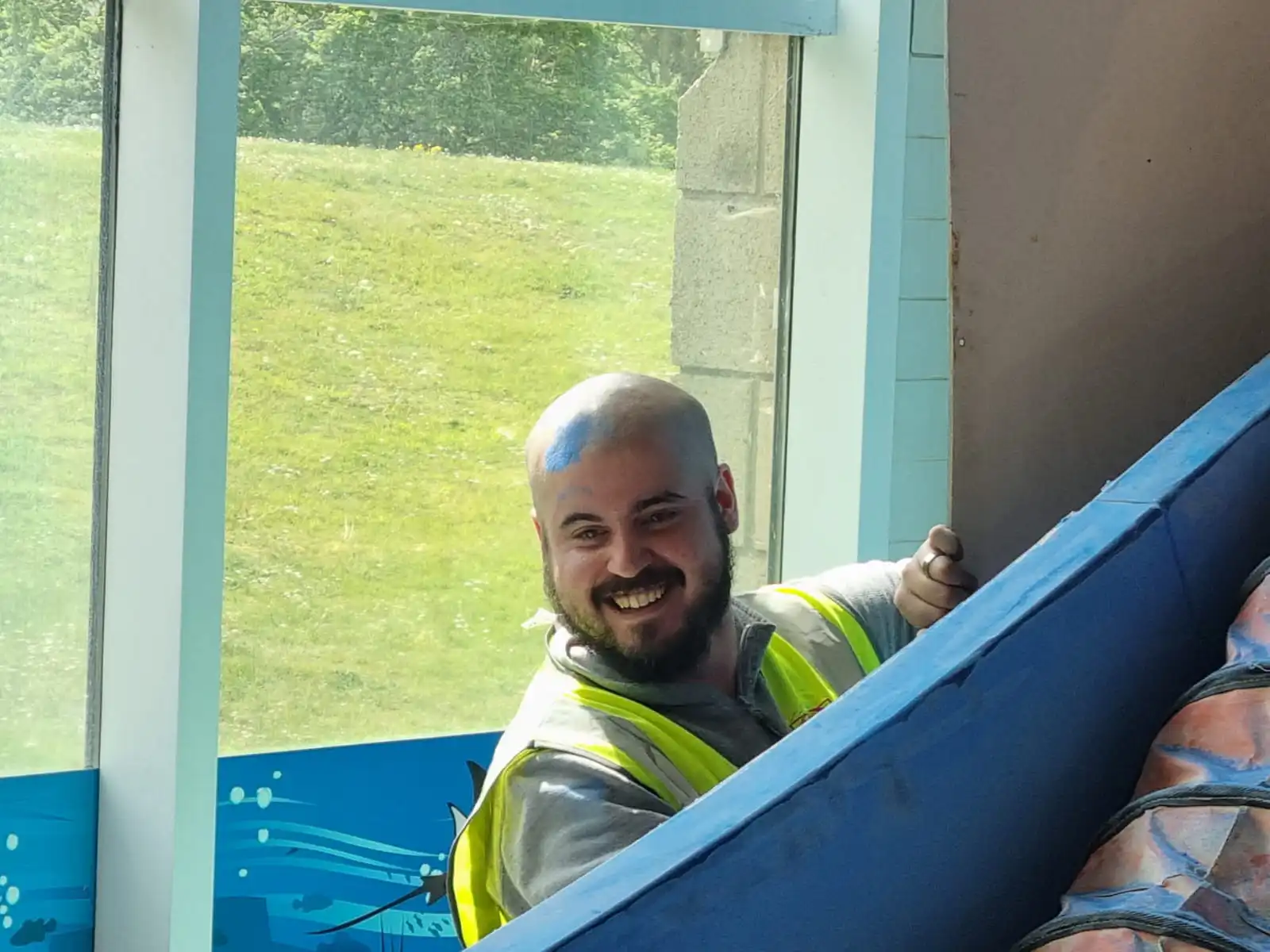
One of the team’s favourite photos from this project is one of our team members having a blue mark on his head from the residue where other contractors had already started working on sanding other areas of the slide down. He cracked on with a smile on his face though!!
Before any new graphics could be applied, every panel needed to have a clean and smooth surface. The previous vinyl and painted finish were removed and the fibreglass panels were sanded down individually, giving us the best possible base for the new graphics. With so many separate pieces eventually needing to come back together as one design, preparation wasn’t limited to the panels themselves. The artwork was carefully set up for print so that we could accurately position each section and ensure the underwater scene flowed from one panel to the next once everything was reassembled.
Each panel was wrapped at our workshop before being transported back to Guildford Spectrum for installation. Although the leisure centre remained operational throughout the project, the area surrounding the waterslide was closed, allowing our team to reinstall the finished panels safely and methodically. Piece by piece, the structure came back together and the individual graphics became one large underwater scene spanning both sides of the slide.
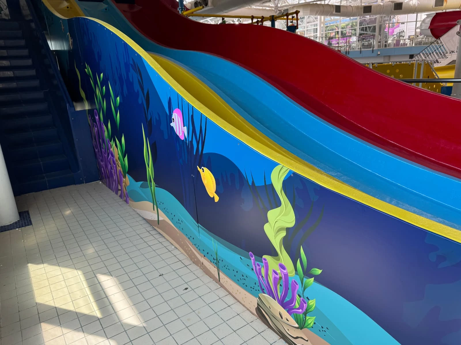
The difference between the original structure and the finished installation was huge! What had previously been a mostly blue feature became an engaging part of the pool environment, with the new artwork giving the waterslide a completely different character while matching the style used elsewhere in the facility. Freedom Leisure were delighted with how the finished graphics looked, and seeing the complete design come together on site was equally rewarding for our own team after the amount of preparation that had gone into it.
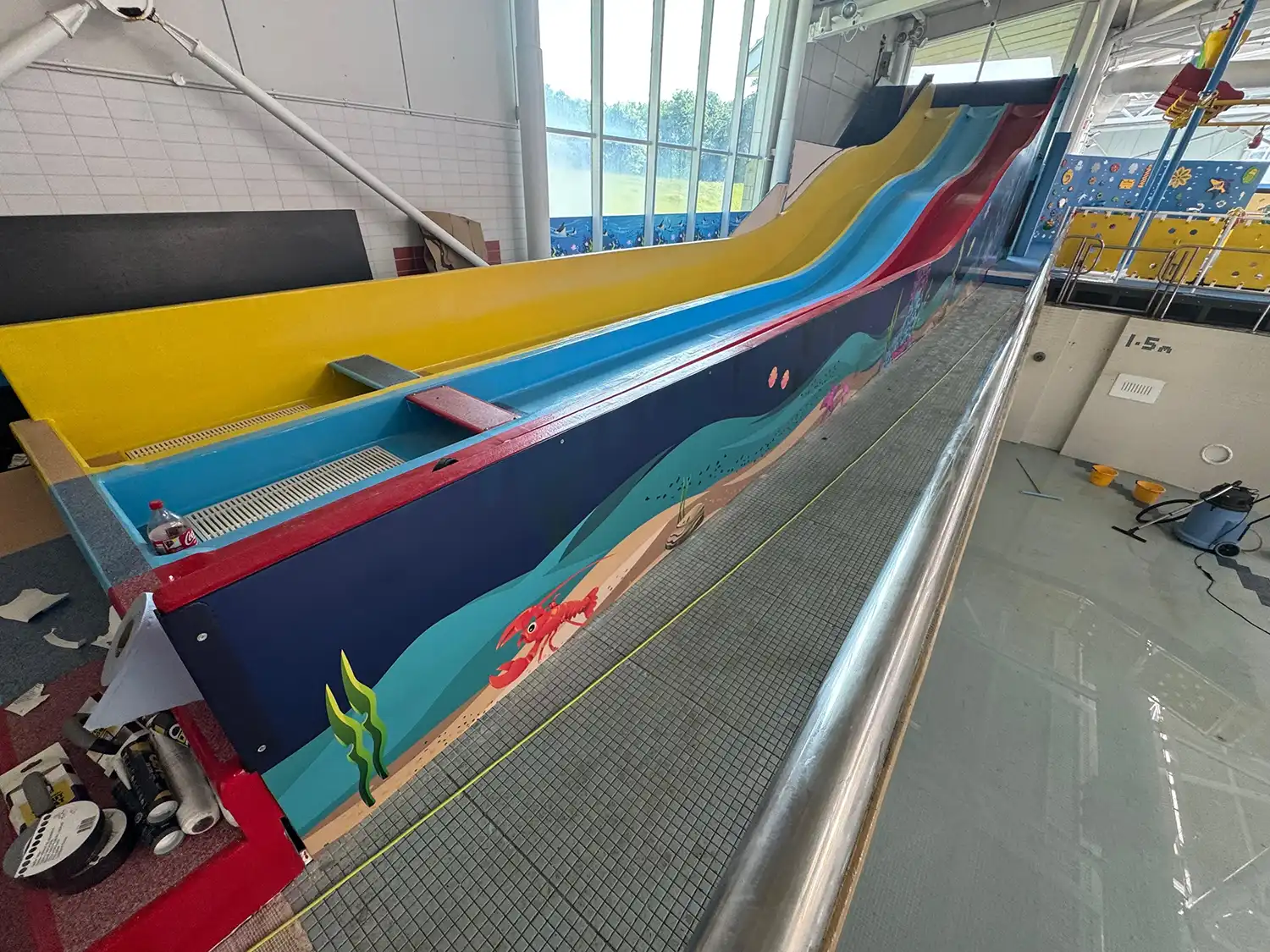
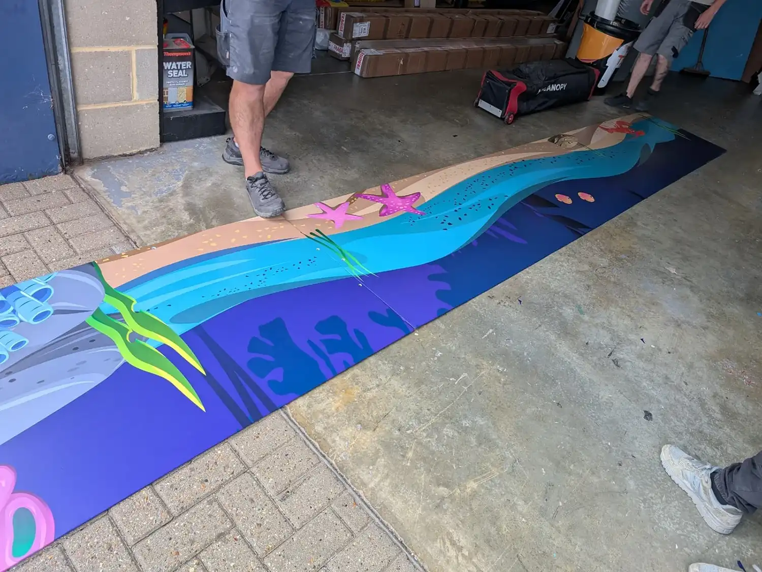
Projects like this are a great example of just how versatile large format graphics can be. A surface doesn’t necessarily need to be flat, straightforward or even conventional. With the right prep work, artwork and installation processes, graphics can completely transform any space or structure – even one as large and unusual as a waterslide!
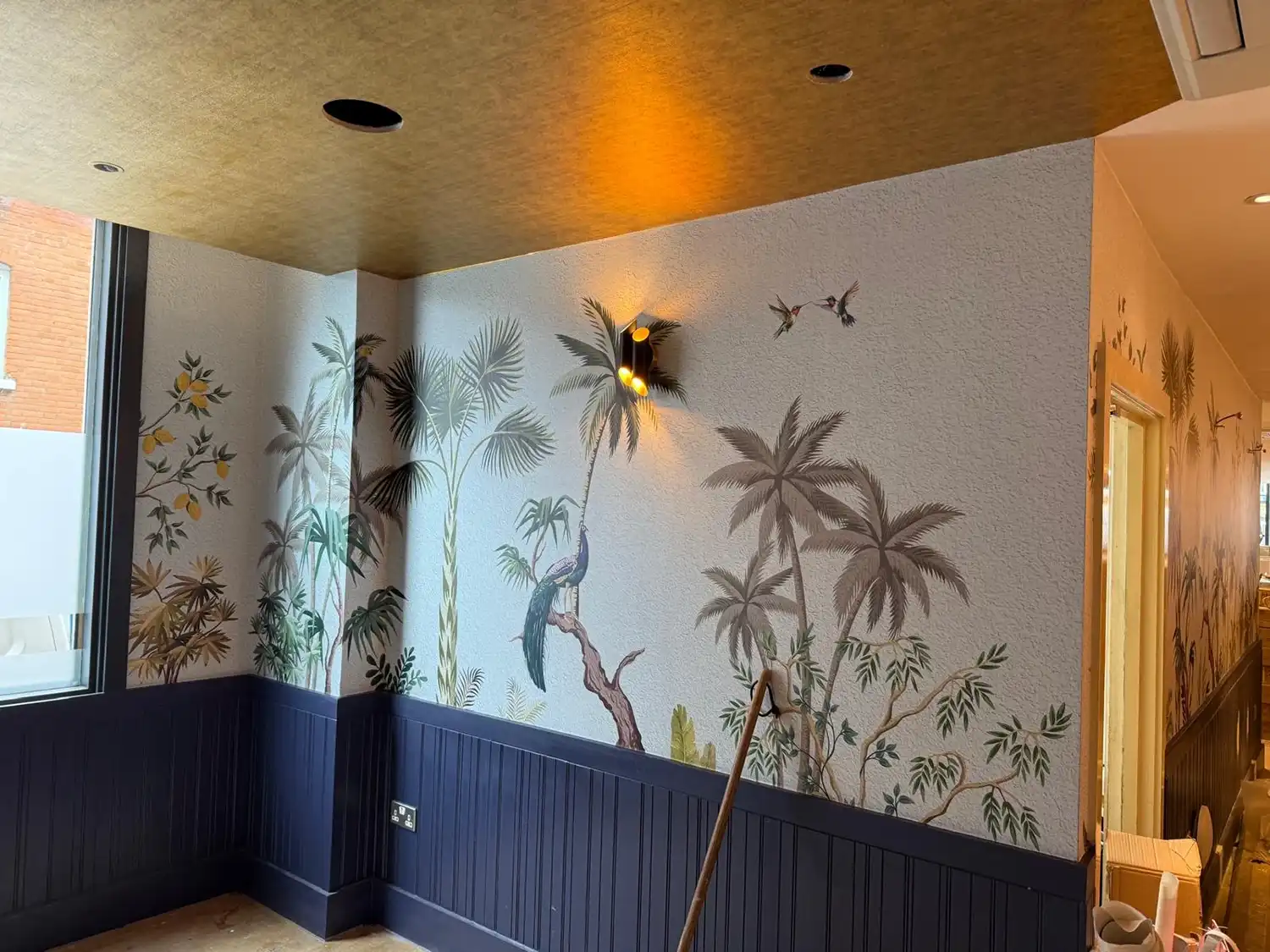
Following the transformation of Bella Capri’s Wimbledon restaurant, the client returned to us with a new challenge: could we take the bespoke wallpaper we had created for Wimbledon and bring the same character to their restaurant in Fleet?
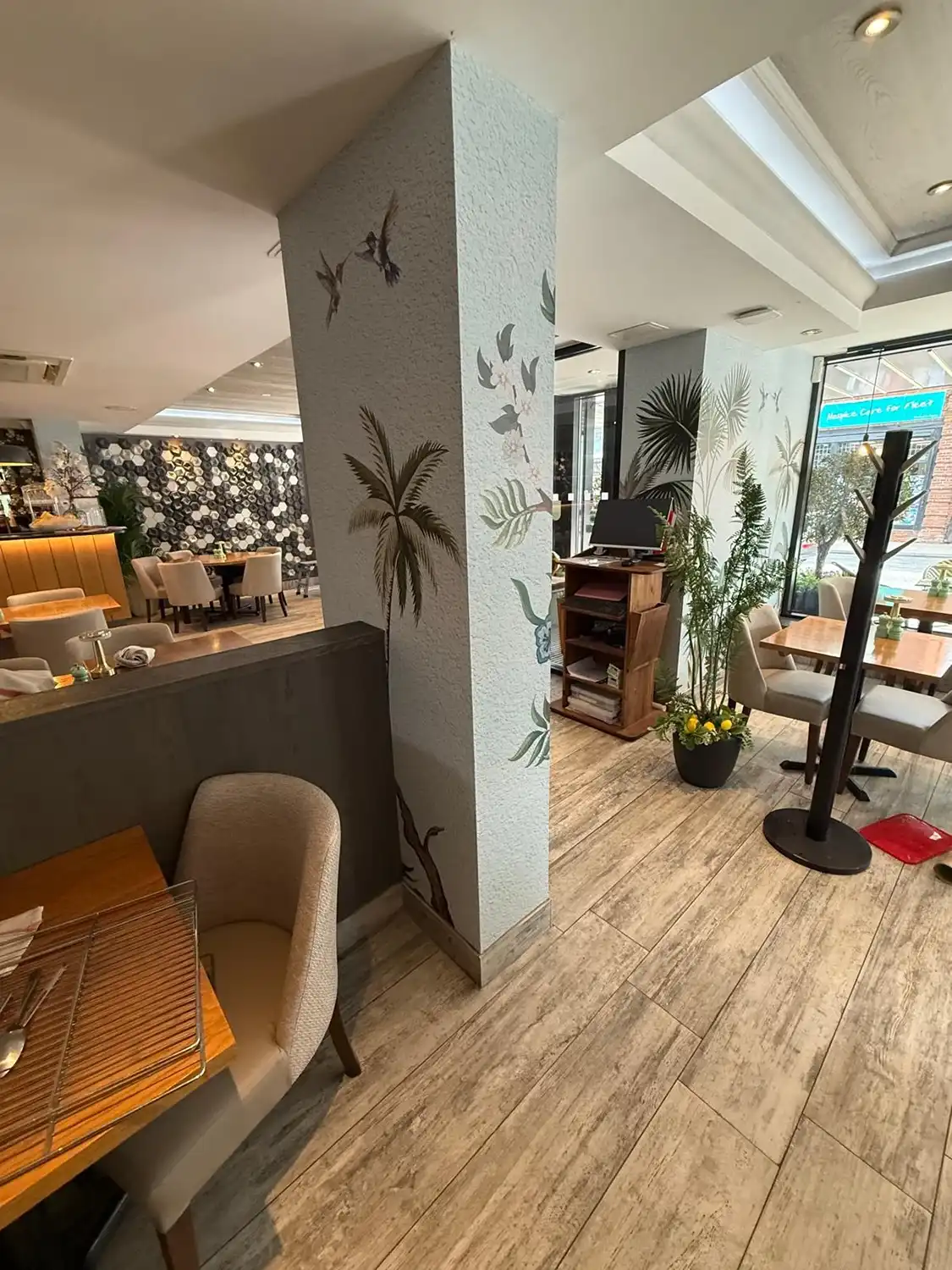
Rather than simple reproducing the original artwork, we needed to adapt it to work within a completely different space. Our team visited the Fleet restaurant to measure the areas and understand how the existing interior would affect the design. From there, we reworked the original artwork specifically for the new dimensions, retaining the recognisable style of the Wimbledon installation while ensuring it felt considered for its new surroundings.
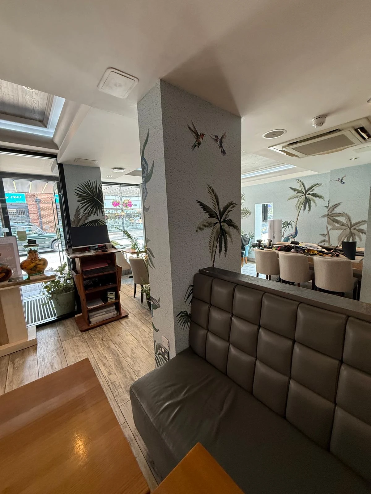
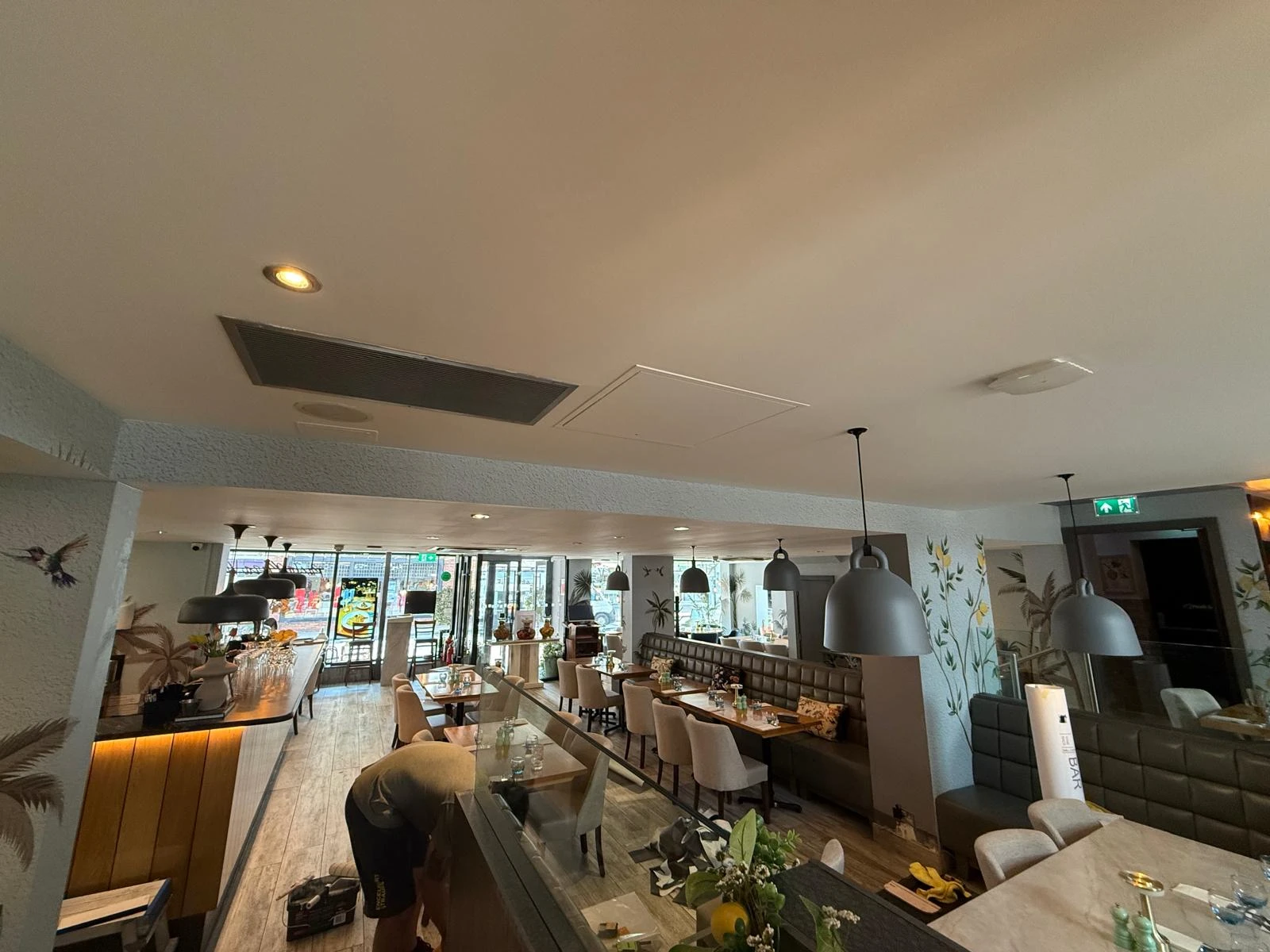
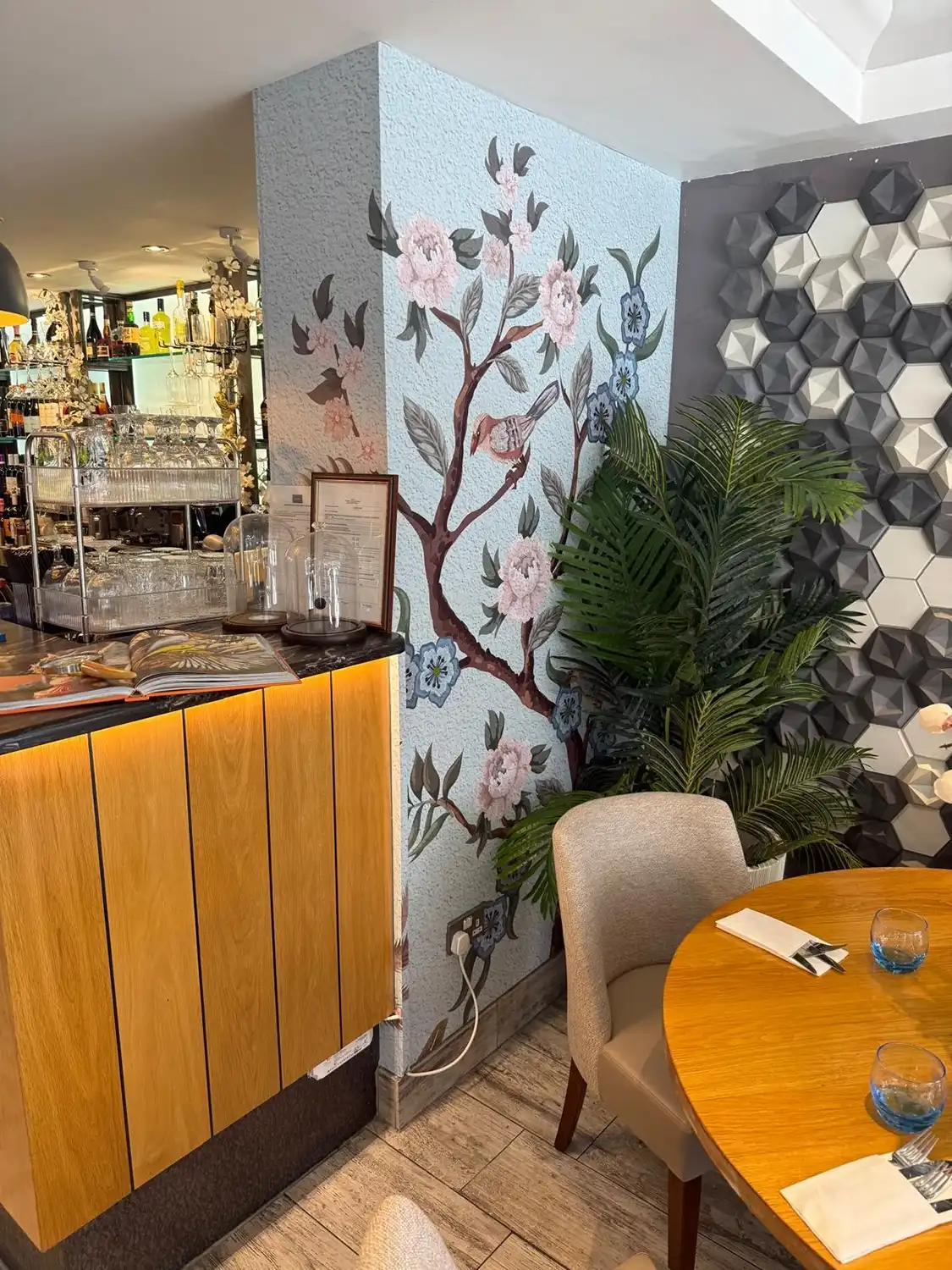
The layout at Fleet presented some interesting challenges. Several of the walls connected with columns and other architectural features, creating intricate areas where a continuous design could quickly become difficult to install. With a detailed wallpaper design like this, trying to align key elements across every corner, column and change in surface would have made installation unnecessarily complicated and left very little room for adjustment.
Our design team approached the artwork with installation in mind from the beginning. The design was carefully repositioned so that transitions fell naturally around the more complex areas, reducing the amount of intricate alignment required without compromising the overall appearance. This allowed our installers to work effectively around the architecture while keeping the finished wallpaper cohesive across the restaurant. It also meant that, although Fleet retained the same visual style and design elements as Wimbledon, the different layout required its own bespoke version of the artwork, giving each restaurant a unique interpretation of the Bella Capri design.
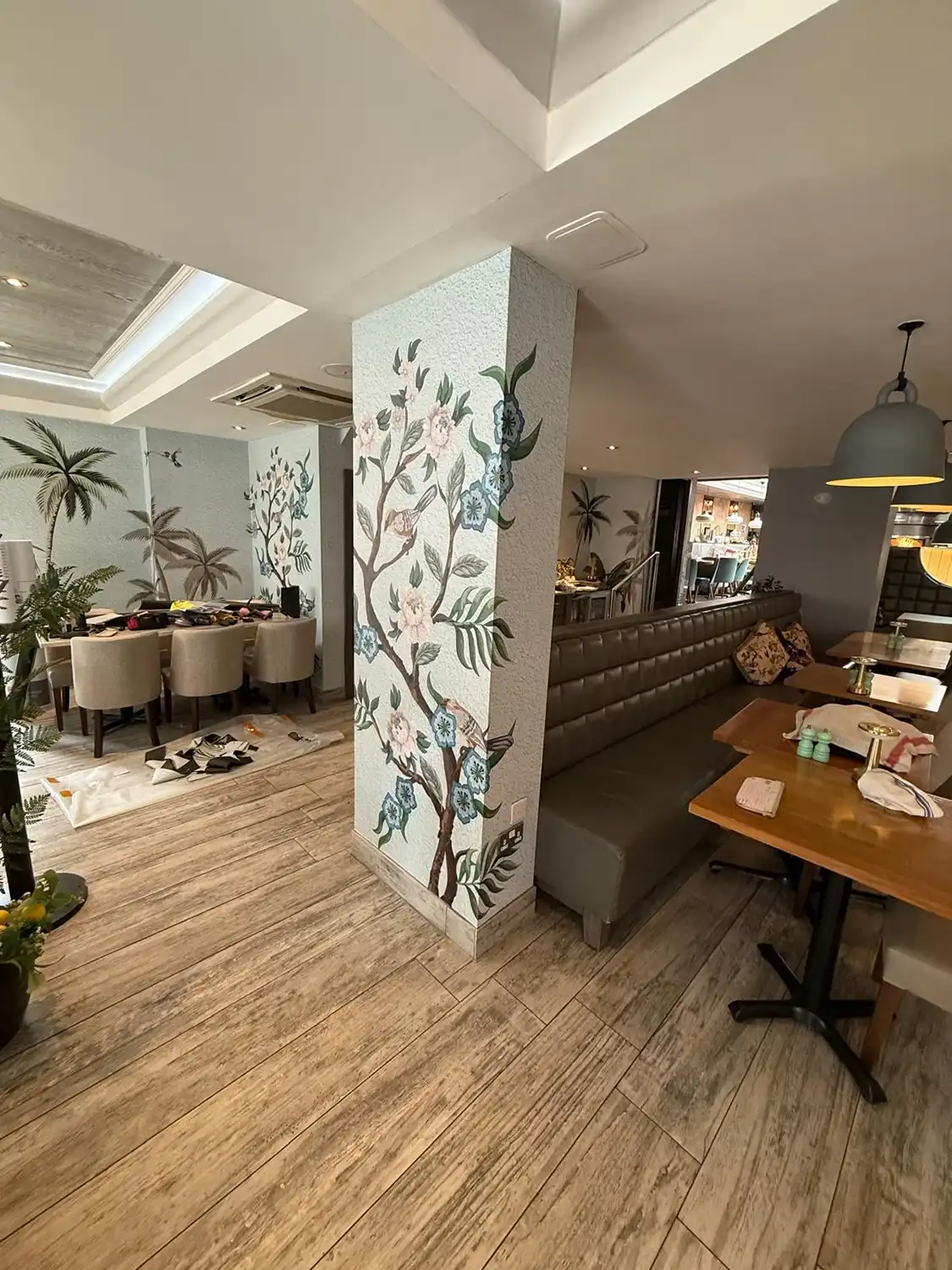

At Wimbledon, we had complemented the wallpaper with gold architectural film across selected ceiling areas. We considered using the same treatment at Fleet, but after assessing the space, decided with the client that it wouldn’t improve the finished interior. The proposed area was already relatively enclosed, and introducing a metallic gold architectural film to the ceiling risked making it feel even more boxed in. The existing ceiling architecture also created a natural visual break from the wallpaper, so adding another contrasting finish would have drawn unnecessary attention to an area that didn’t need it. Sometimes knowing what not to add is just as important as the finished design.
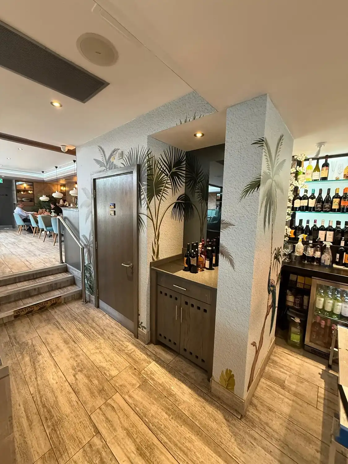
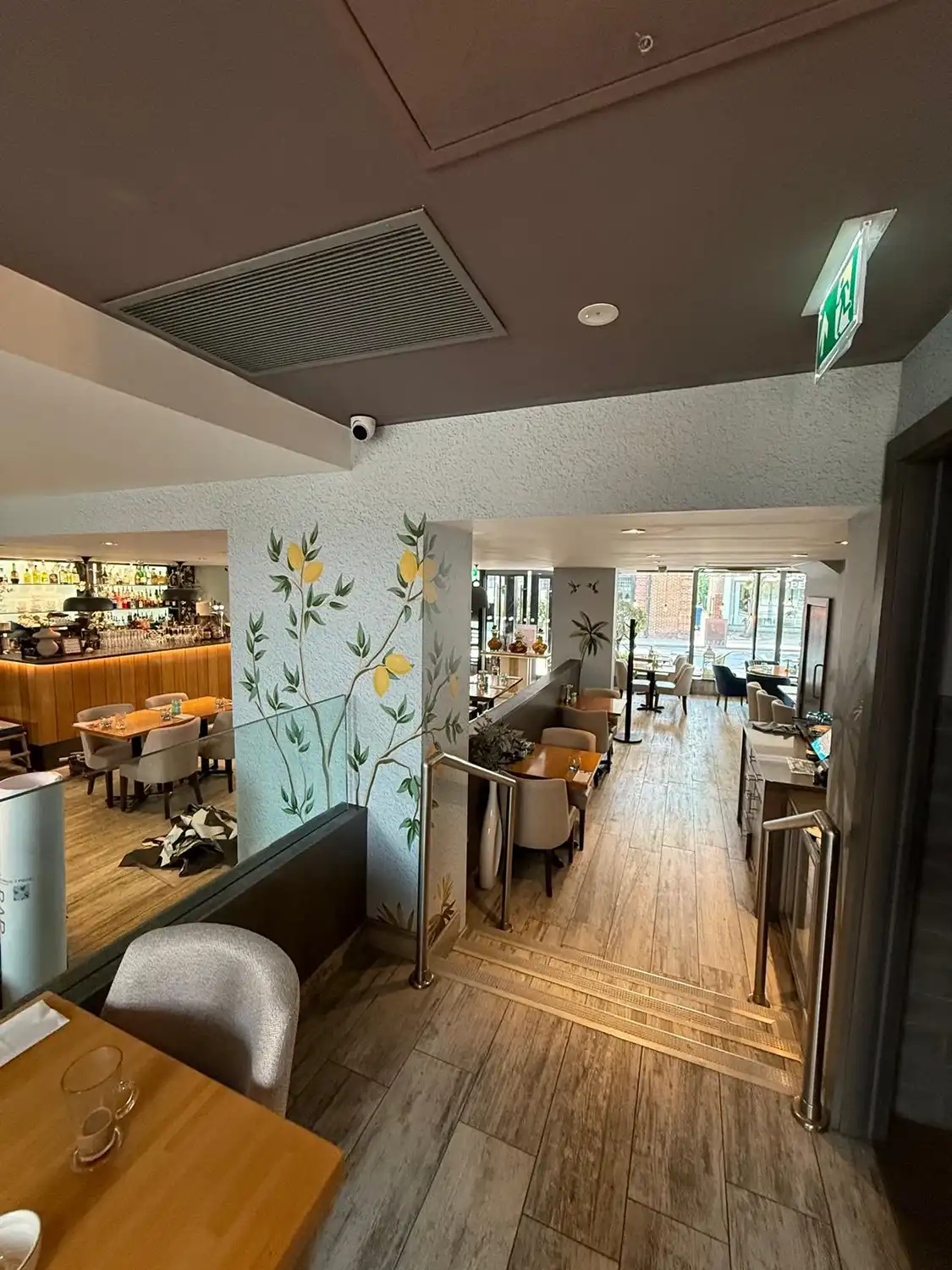
The installation team also needed to work around a functioning restaurant. We carried out much of the work during early mornings to keep disruption to a minimum, but as the restaurant opened for service, our team continued working during quieter lunchtime periods. This meant some diners were able to watch the transformation taking place while enjoying their lunch, with our installers carefully working around the restaurant’s day-to-day operations.
The finished installation gave Bella Capri Fleet the same distinctive visual identity we had originally developed for Wimbledon, but adapted specifically for the layout at Fleet. The client was once again delighted with the result, and for us, it was particularly rewarding to see a bespoke design originally created for one location become part of a wider, recognisable interior style for Bella Capri.
This project also demonstrates the value of bespoke artwork beyond a single installation. Because the original wallpaper was designed specifically for Bella Capri, we were able to revisit, reshape and adapt it for a completely different environment – creating consistency between the two restaurants without simply making them identical.
Opening a restaurant is a big milestone, and for the person behind Bulbul, it was one we were particularly pleased to be part of. Having worked with us previously on signage for another restaurant, he returned to us when opening Bulbul in London, this time with a restaurant he was managing himself. The branding was already established; our job was to take that identity and turn it into signage that would give the new restaurant the presence it deserved.
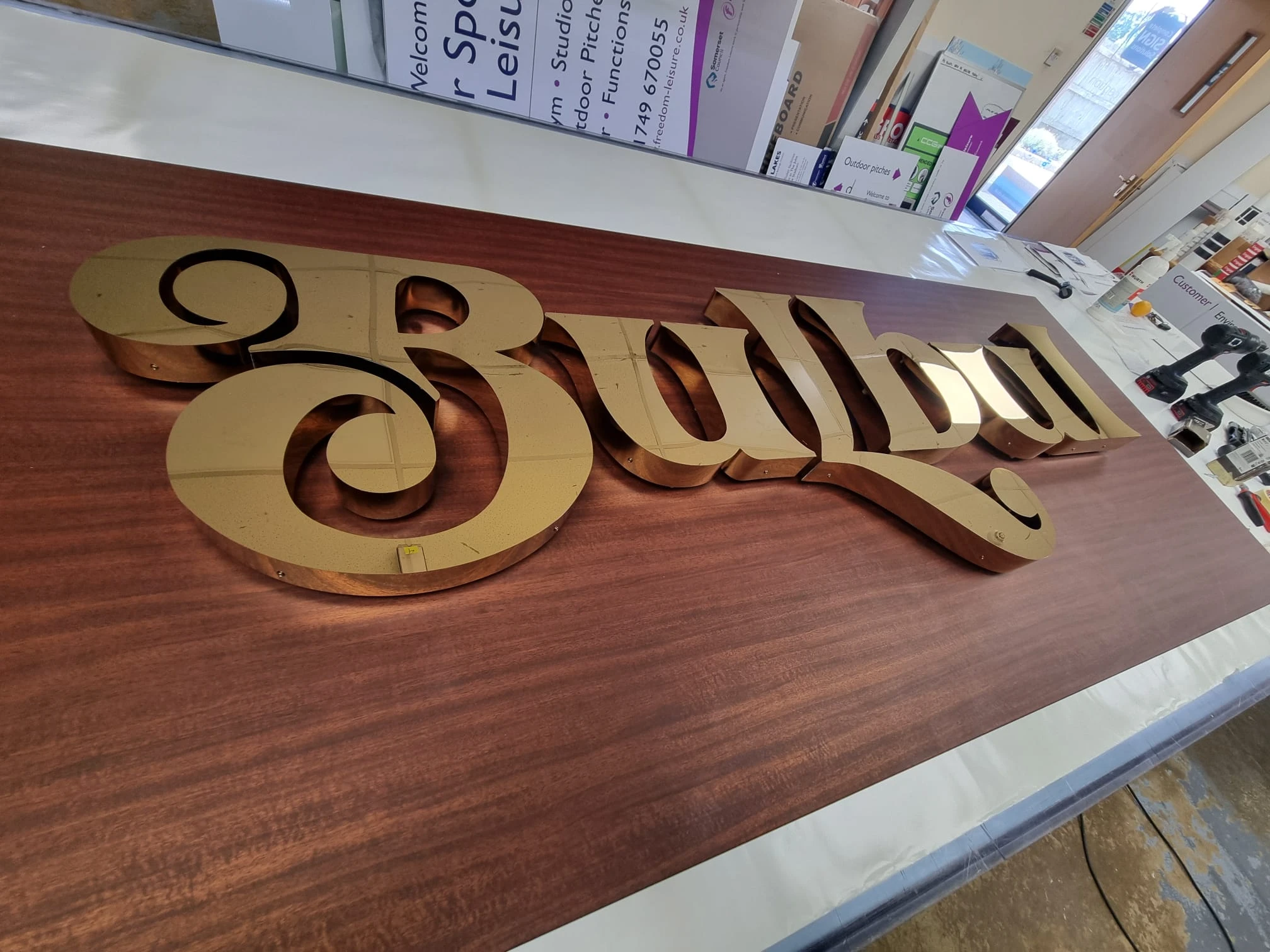
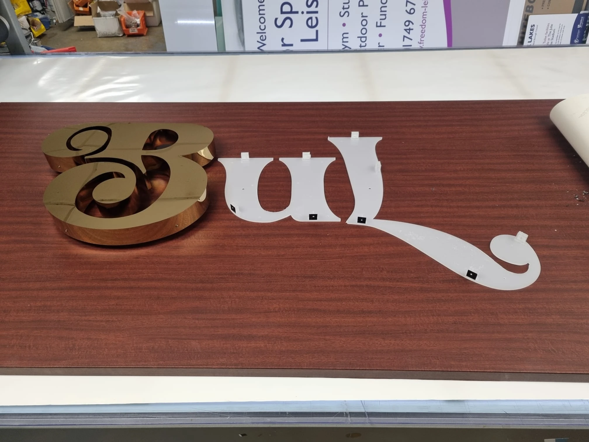
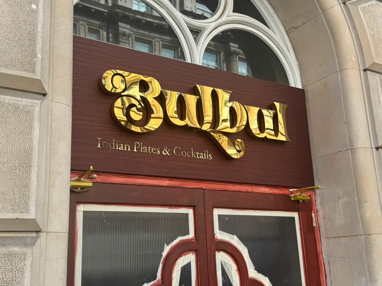
With gold forming part of Bulbul’s brand palette alongside rich burgundy and mahogany tones, we suggested polished gold as the main finish for the signage. The client wanted substantial, dimensional lettering that would stand out, so for the exterior we manufactured built-up polished gold letters with white halo illumination, creating a strong feature during the day and a warm glow once illuminated.
The lettering was mounted onto a fabricated sign tray finished in a wood-effect architectural film, selected to complement the finish chosen for the restaurant doors underneath. Architectural film was particularly well suited to the application because of the textured surface it had which gave the wood effect greater depth and character than a standard printed finish.
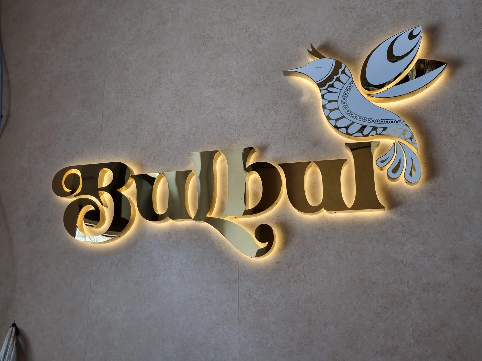
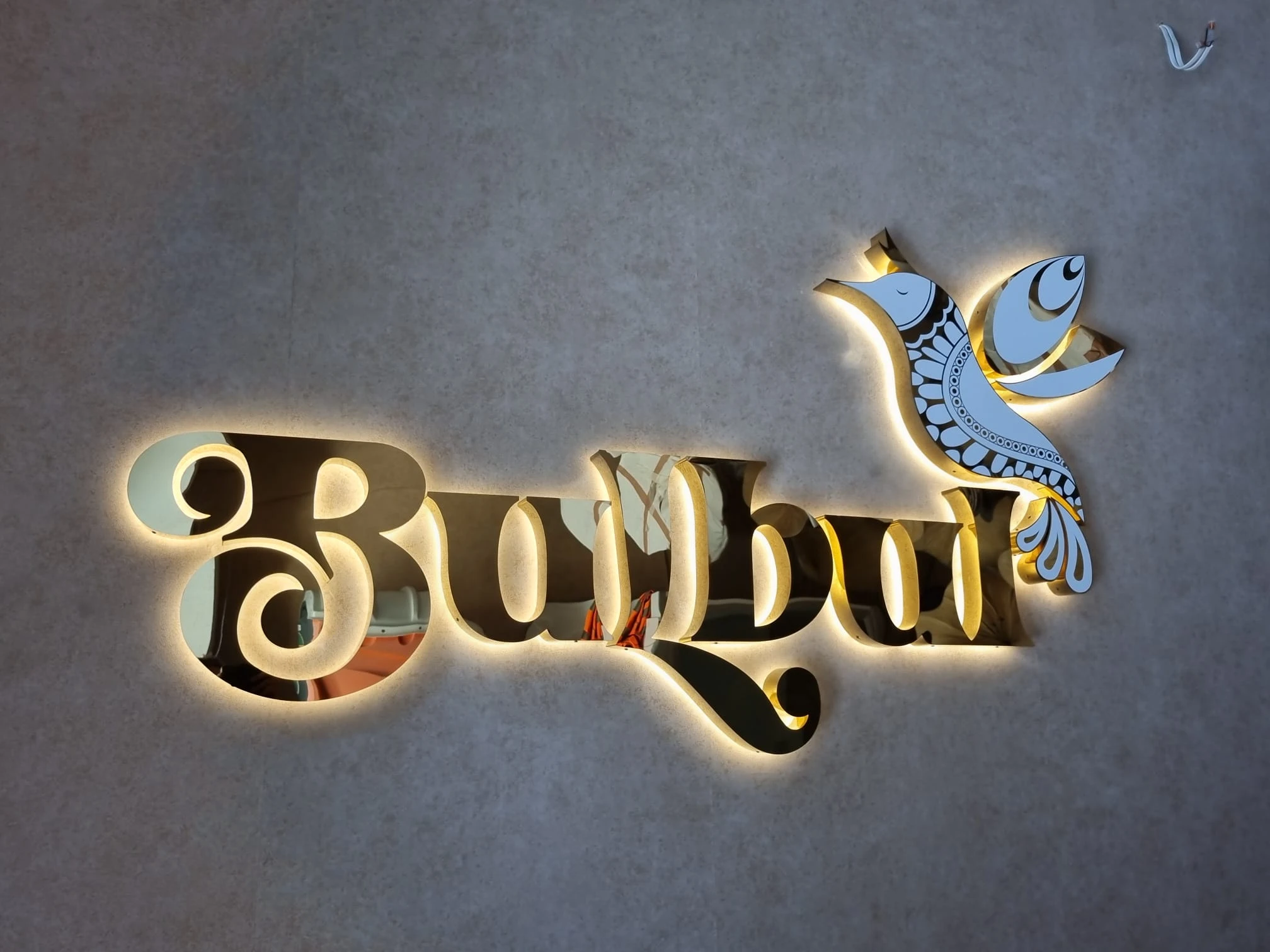
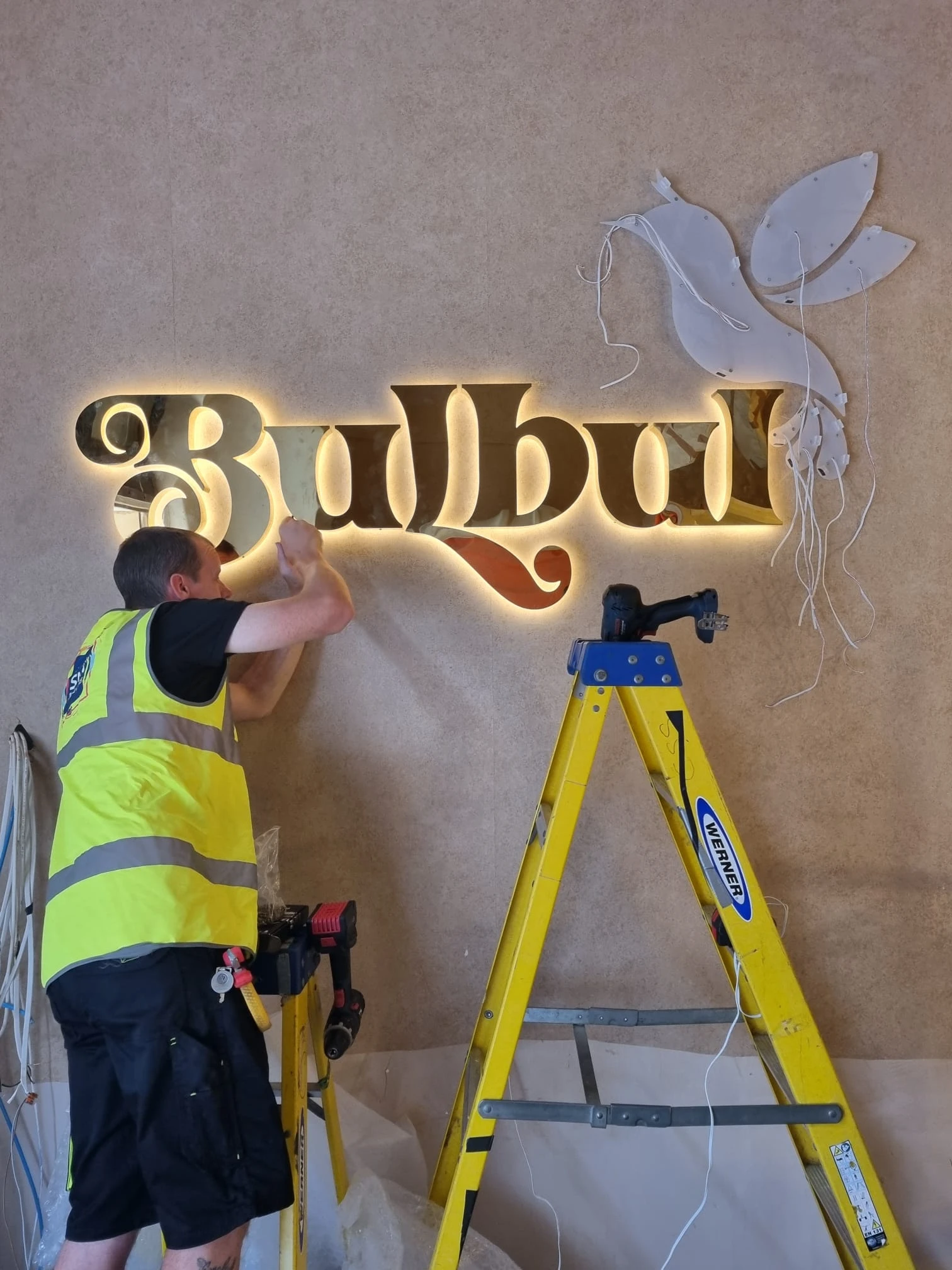
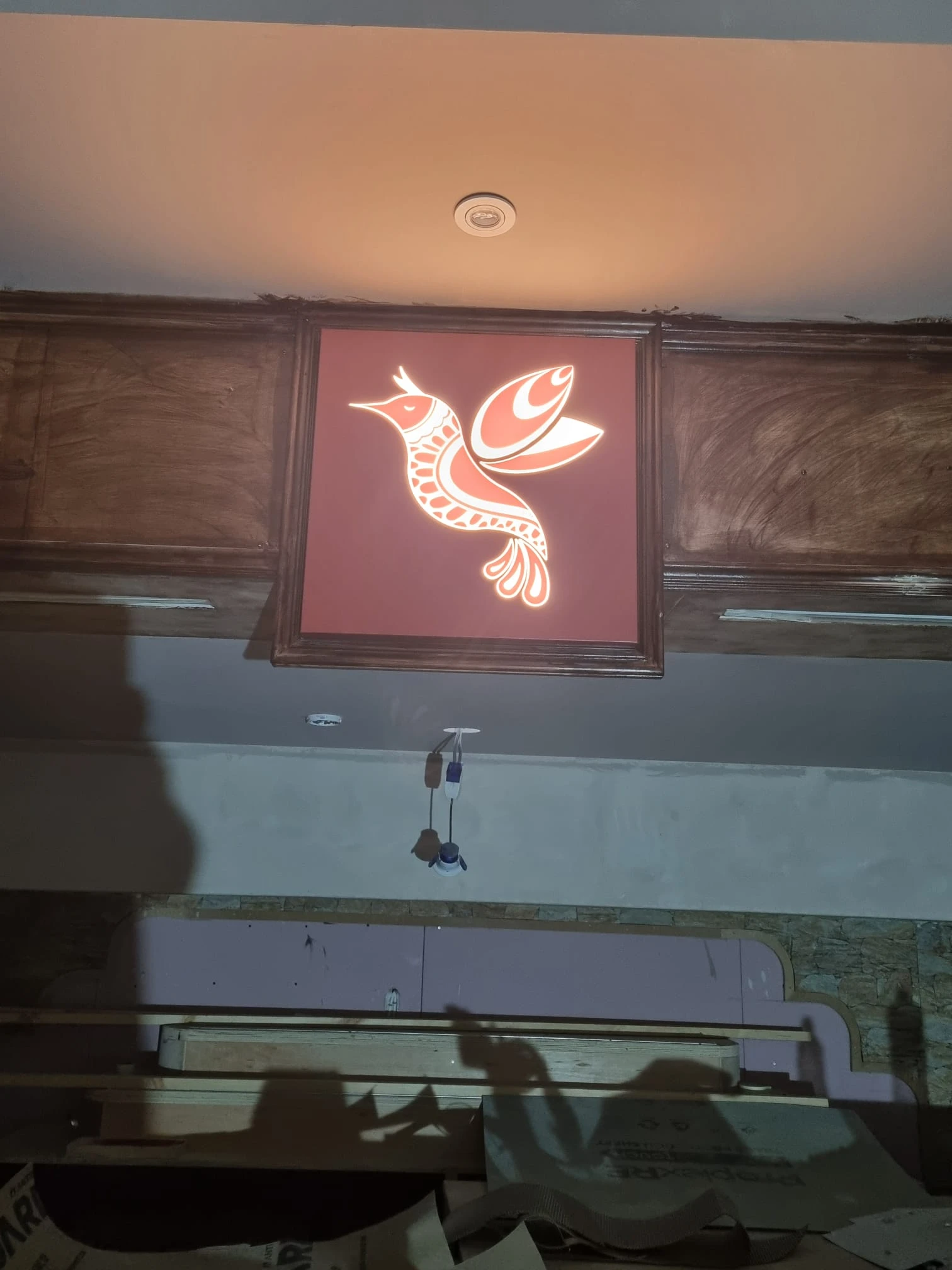
We also carried the Bulbul identity through to the interior using different interpretations of the branding. Above the bar, the bird from the logo became a feature in its own right, pushed through a sign tray and illuminated from behind. Near the entrance, we created another version of the full Bulbul logo in polished gold, using white vinyl detailing to reproduce the more intricate elements within the bird. Each sign had its own character while remaining clearly connected through the same colours, finishes and branding.
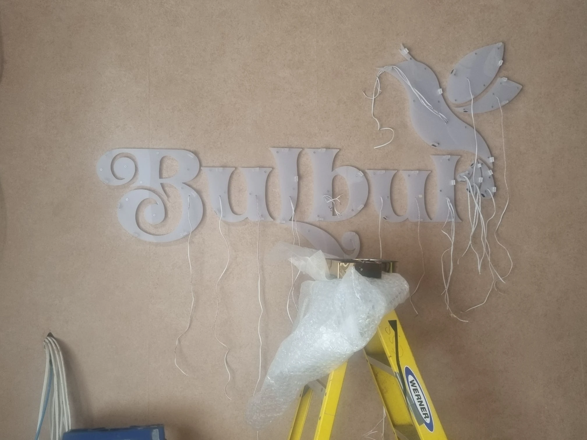
Before heading to site, the illuminated signage was assembled and tested in our workshop. This allowed us to check the lighting, finishes and overall appearance before installation and make sure everything was working exactly as intended.
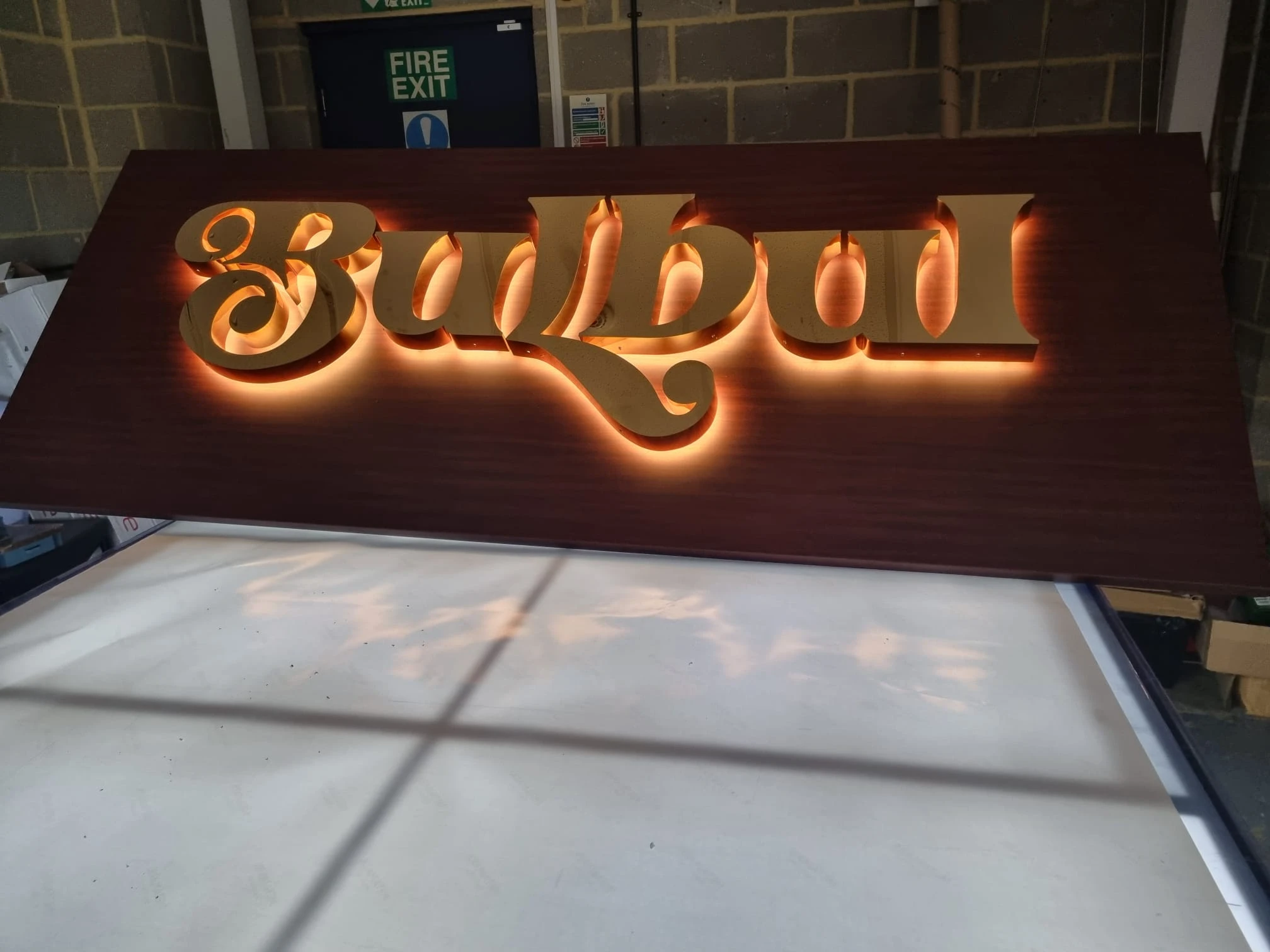
Once installed, the combination of polished gold, warm illumination, burgundy detailing and wood-effect finishes worked beautifully alongside the restaurant’s interior and existing brand palette. The client was delighted with the finished result, and having worked with him previously, it was particularly rewarding to help bring the identity of his own new restaurant to life for the first time.
There is also potential for further signage and graphics as the restaurant develops, so while this initial project is complete, we hope it won’t be the last time we get to work with Bulbul.


