Vehicle graphics and vehicle wraps are both effective ways to transform a car, van or commercial fleet into mobile advertising. Although the terms are sometimes used interchangeably, they can describe very different levels of coverage.
READ MOREComplete Sign Solutions was commissioned to install elegant oak plank signs with engraved detailing at The Franciscan Centre, Ladywell.
READ MOREVehicle graphics and vehicle wraps are both effective ways to transform a car, van or commercial fleet into mobile advertising. Although the terms are sometimes used interchangeably, they can describe very different levels of coverage.
Vehicle graphics usually consist of vinyl graphics made up of individually cut lettering, logos and printed elements which are then applied to selected areas of the vehicle. A vehicle wrap uses larger sections of vinyl to cover a more substantial part of the bodywork, or sometimes all of it, which changes the vehicle’s appearance completely.
Neither option is automatically better. The right choice depends on your budget, branding, vehicle type and how much visual impact you want to create.
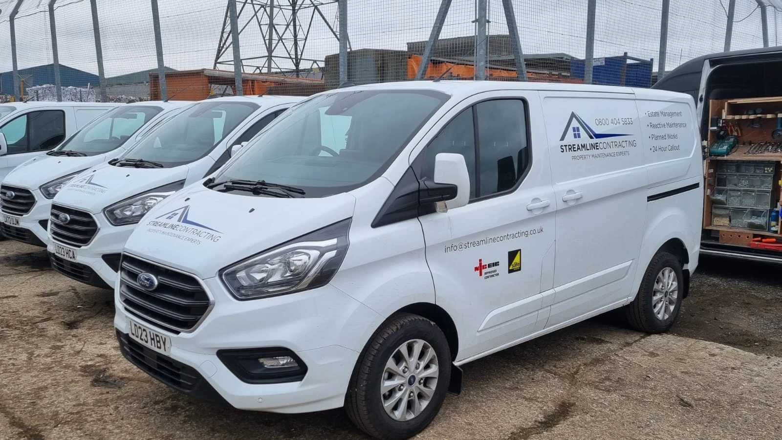
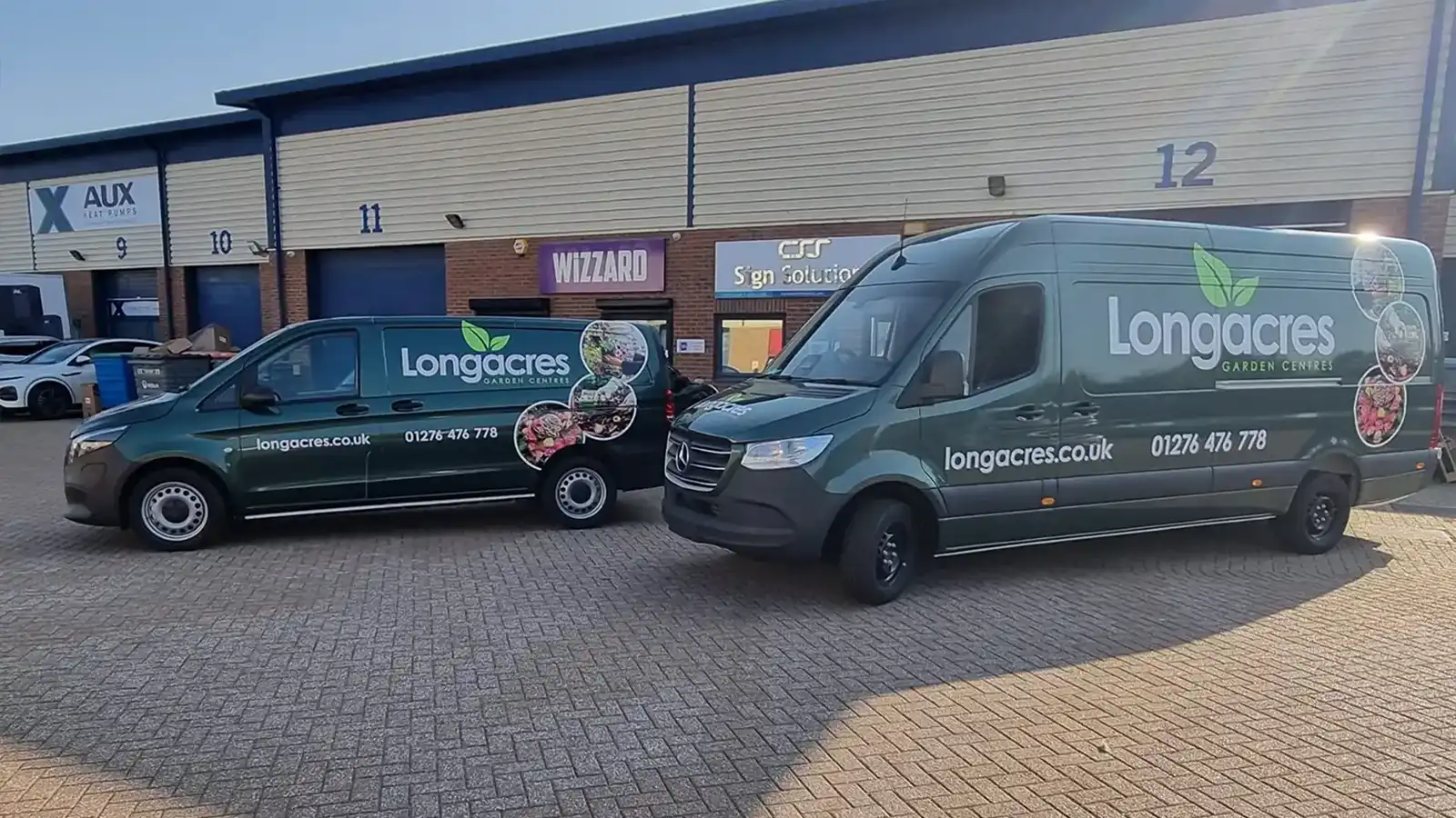
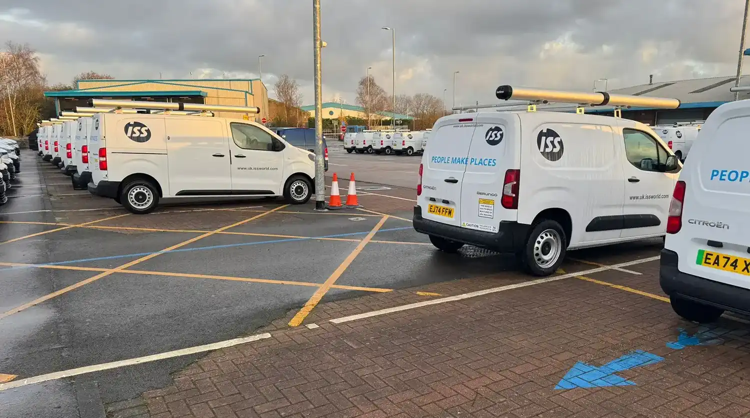
Vehicle graphics usually include a combination of elements to showcase a brand while on the road, taking into consideration what gets seen and where the vehicle is likely to be. Graphics can be produced using cut vinyl, digitally printed vinyl or a combination of both. Each element is applied in a chosen position without covering the entire panel.
A typical vehicle graphics package might include:
On top of this, you can add:
Because much of the original paintwork remains visible when a wrap is not being completed, the colour of the vehicle usually becomes part of the design. A white or silver van, for example, can provide a neutral background that works well with a wide range of brand colours.
Vehicle graphics can range from just a small logo and a phone number, to a designed design covering several areas of the vehicle. They offer plenty of creative freedom without requiring bodywork to be completely covered.
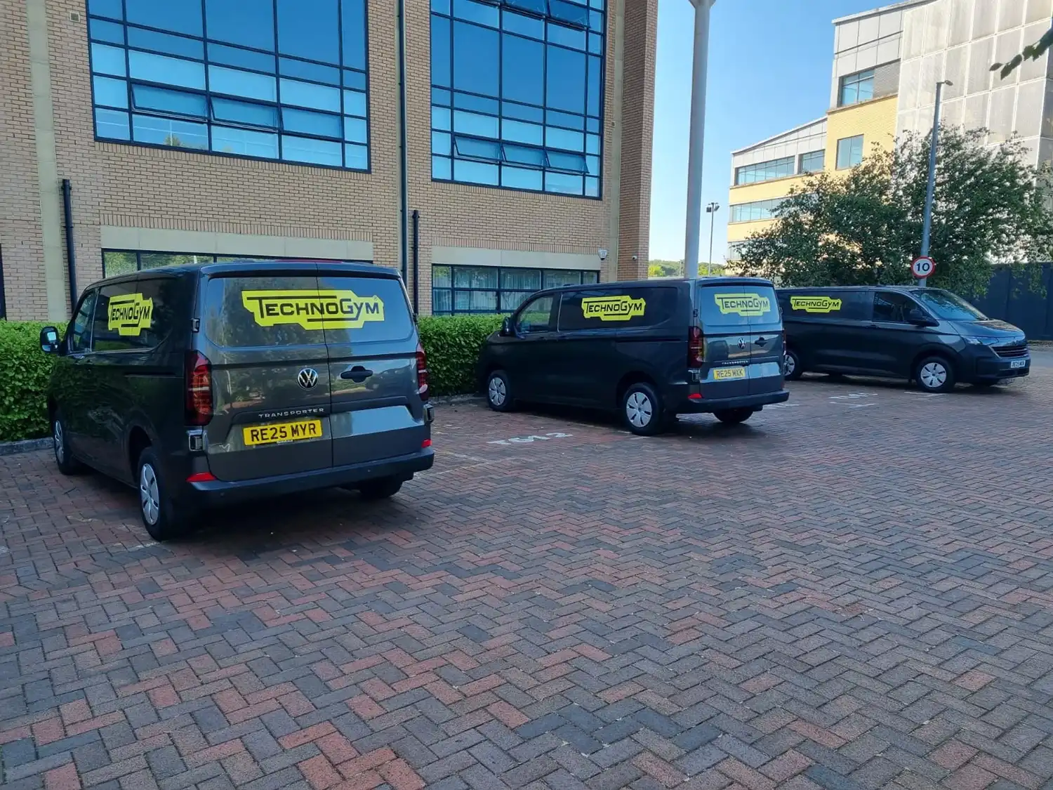
A vehicle wrap uses larger sheets of specialist vinyl to cover a substantial area of the vehicle. The vinyl is carefully fitted around the curves, recesses and contours of the bodywork to create a more complete visual transformation.
A wrap does not always need to cover the entire vehicle. There are several levels of coverage available.
A full wrap covers almost all visible painted body panels. It can completely change the vehicle’s colour or introduce a detailed design across the whole body. Door shuts, internal edges, roofs and other less visible areas are not always included as standard, so the exact coverage should be agreed with us before production begins.
A partial wrap, or a half wrap, covers selected sections of the vehicle white incorporating some of the original paint colour into the design. This could include the rear half, lower section, the back doors, or a sweeping shape across several areas. A well designed partial wrap can create much of the impact of a full wrap while using less material.
A colour change wrap is used primarily to alter the appearance of a vehicle, rather than to advertise a business. Branding can still be added afterwards, but the main purpose of the wrap is to change the exterior colour of finish. Depending on the chosen material, finishes can include gloss, matt, satin, metallic, textured effects, and also colour changing effects.
The main difference is the amount of the vehicle covered with vinyl. Vehicle graphics are generally made up of separate items that utilise the colour of the vehicles original bodywork. A wrap uses larger connected areas of vinyl to cover complete panels or sections of the vehicle.
The boundary between the two is not always exact. A vehicle might combine cut lettering with one large printed section, for example: within panel areas on the sides and rear of a van. This places the design somewhere between standard vehicle graphics and a partial wrap.
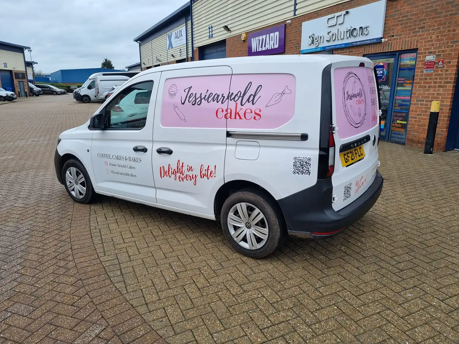
Vehicle graphics are a popular option for businesses that want their vehicles to look professional without covering large areas of bodywork.
A carefully positioned logo and set of contact details and make a plain vehicle look like part of an established business fleet. The design does not need to be complicated to be effective.
As vehicle graphics require less material and usually take less time to install, they will generally cost less than a partial or full wrap. The final price will still depend on the size and complexity of the design, the chosen vinyl and the number of areas being covered.
Simple graphics can be adapted across cars, small vans, large vans and other commercial vehicles. This makes it easier to create a consistent fleet even when the vehicles are different models or colours.
Smaller graphics usually require less printing, preparation and fitting time. This can reduce the amount of time the vehicle is unavailable for work.
If the paint colour already complements the company branding, it can be incorporated into the design. This reduces the need for large areas of printed or coloured vinyl.
A vehicle wrap provides more freedom to change the overall appearance of a vehicle and create a design with greater visual impact.
A wrap allows colours, illustrations, photographs and graphic elements to flow across multiple panels. This creates opportunities that are difficult to achieve with individual logos and lettering alone.
Large areas of colour can make a vehicle more noticeable on the road or when parked at a customer’s premises. This can be particularly valuable in competitive industries where several businesses offer similar services.
Wrapping can change the colour and finish of a vehicle without permanently repainting it. The vinyl can later be professionally removed, although the condition and consistency of the paintwork beneath it will affect the final result.
With standard graphics, the paintwork acts as the background. A wrap allows the designer to control much more of the available space, including the colours behind the logo and text.
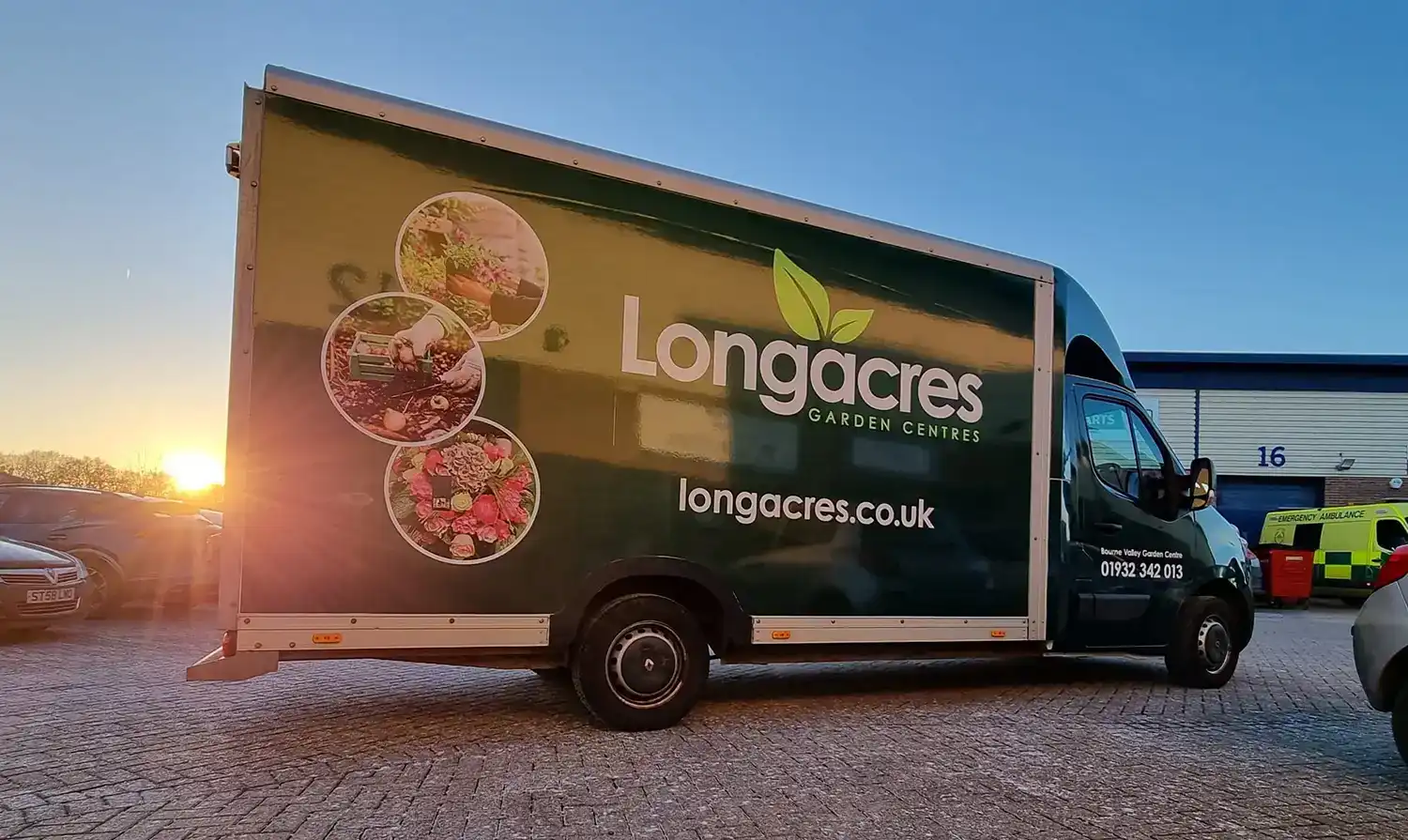
For many businesses, a partial wrap offers the best alance between cost and visual impact. Rather than covering the complete vehicle, a partial wrap can concentrate the strongest branding around areas such as the rear doors, lower panels or back half of the vehicle. The shape of the vinyl can then blend into the original paintwork.
This approach can:
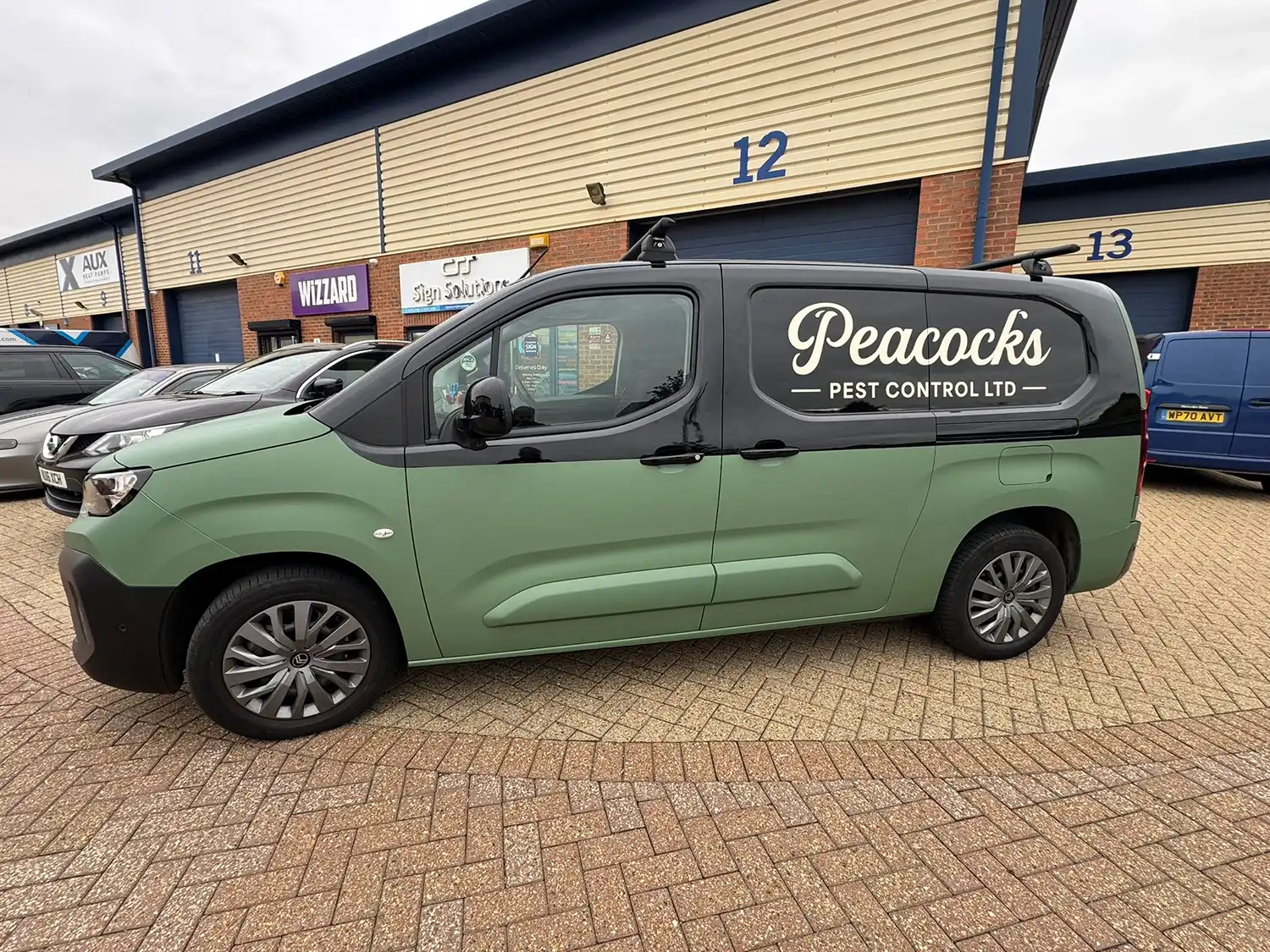
The design needs to be planned carefully. Simple ending a large rectangle of vinyl halfway along a panel can look unfinished. Purposeful angles, curves, faces or graphic shapes can make the transition feel like an intentional part of the branding.
Vehicle graphcis are usually the most affordable way to brand a vehicle. They are often ideal for new businesses, larger fleets or companies that require clear identification rather than a dramatic transformation.
A full wrap requires more vinyl, more preparation work, and considerably more fitting time. Complex designs may also involve additional printing, lamination and finishing elements.
A partial wrap sites between the two and can offer strong visual impact without the cost of covering every panel.
When comparing prices, it is important to look beyond the amount of vinyl used.
The quotation may also reflect:
A simpler design made with suitable materials and installed correctly will usually offer better value than a cheaper but poorly specified wrap.
A vehicle gives you a large advertising space, but that does not mean every part of it needs to contain information. Most people will only see the vehicle for a few seconds, so the message should be quick and easy to understand.
The most important details will usually be:
Long lists, small text and too many contact methods can make a design difficult to read. Clear branding viewed from a distance is often more effective than filling every available space.
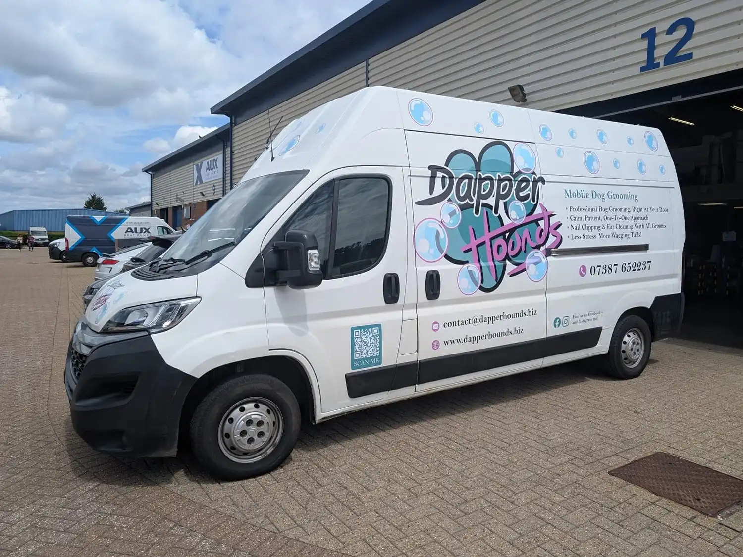
The sides and rear also perform different roles. The sides may be seen while the vehicle is moving, while the rear can be visible for longer while in traffic. Contact information and a short call to action can therefore work particularly well on the rear doors, and elements like QR codes can be introduced.
Vinyl can provide a layer between the paint and minor surface wear, but a commercial vehicle wrap should not be treated as a substitute for paint protection film.
It will not prevent dents, deep scratches, corrosion or damage caused by an impact. Stone chips and existing imperfections may also remain visible through the vinyl.
The condition of the paintwork before installation is important. Vinyl adheres best to sound, properly cured original paint. Rust, peeling lacquer, filler, poor repairs and unstable aftermarket paint can all affect adhesion and may create problems when the graphics are eventually removed.
Any concerns about the bodywork should be discussed before the vehicle is booked for installation.
The working life of vehicle vinyl depends on the material, installation, design, aftercare, and conditions that the vehicle experiences.
Factors that can affect longevity include:
Horizontal and upward facing areas such as bonnets and roofs often receive more direct sunlight than vertical sides. These areas may weather faster, particularly when printed films or certain colours and finishes are used.
We will always choose materials that are appropriate for the vehicle, intended coverage and expected lifespan. Most, if not all, of the vinyl films we use for vehicle graphics and wrapping offer a 7-year lifespan if cared for properly.
Both graphics and wraps can be professionally removed. However, the result will depend on the age of the vinyl, the condition of the paint and how the vehicle has been stored and maintained.
Paintwork that has remained uncovered may fade at a different rate from the areas beneath the graphics. This can leave a visible difference after removal, especially if the vinyl has been in place for several years.
Removal can also take longer when graphics are very old, brittle or applied over damaged paintwork. It is best to have them removed by an experienced installer or signage and graphics company (like us!) who can use the appropriate tools and required heat for a smooth removal.
If the vehicle is leased, always check the agreement before applying graphics and allow enough time for professional removal before it is returned.
Vehicle graphics may be the right choice if:
A partial or full wrap may be more suitable if:
Start with what you need the vehicle to achieve, rather than deciding how much of it should be covered.
If the main goal is to identify the company and provide clear contact details, professionally designed vehicle graphics may be all you need. If the vehicle is an important part of a wider advertising campaign or needs to make a stronger impression, a partial or full wrap could provide more impact.
Whichever option you choose, avoid overcrowding the design. Your company name and core service should be understood quickly, whether the vehicle is moving or stationary. The artwork must also be designed around the actual vehicle, taking account of door handles, panel gaps, windows, lights, recesses, and other markings.
If you are unsure whether your vehicle needs simple graphics, a partial wrap, or a full wrap, send out team photos of your vehicle, its make and model, and an idea of your budget. We can recommend a level of coverage that works with your branding and makes effective use of the available space.
When ordering signage, choosing the artwork is often the easy part. Deciding what the sign should be made from can be a little more complicated.
Dibond and Foamex are two of the most commonly used rigid materials in the signage industry. Once printed onto or covered with a vinyl print, they can produce a very similar appearance. Beneath the graphics, however, they are quite different.
The right material will depend on where you sign is being installed, how large it is, the conditions it will face, and how long you need it to last. In this short guide, we explain the difference between Dibond and Foamex and where each material works best.
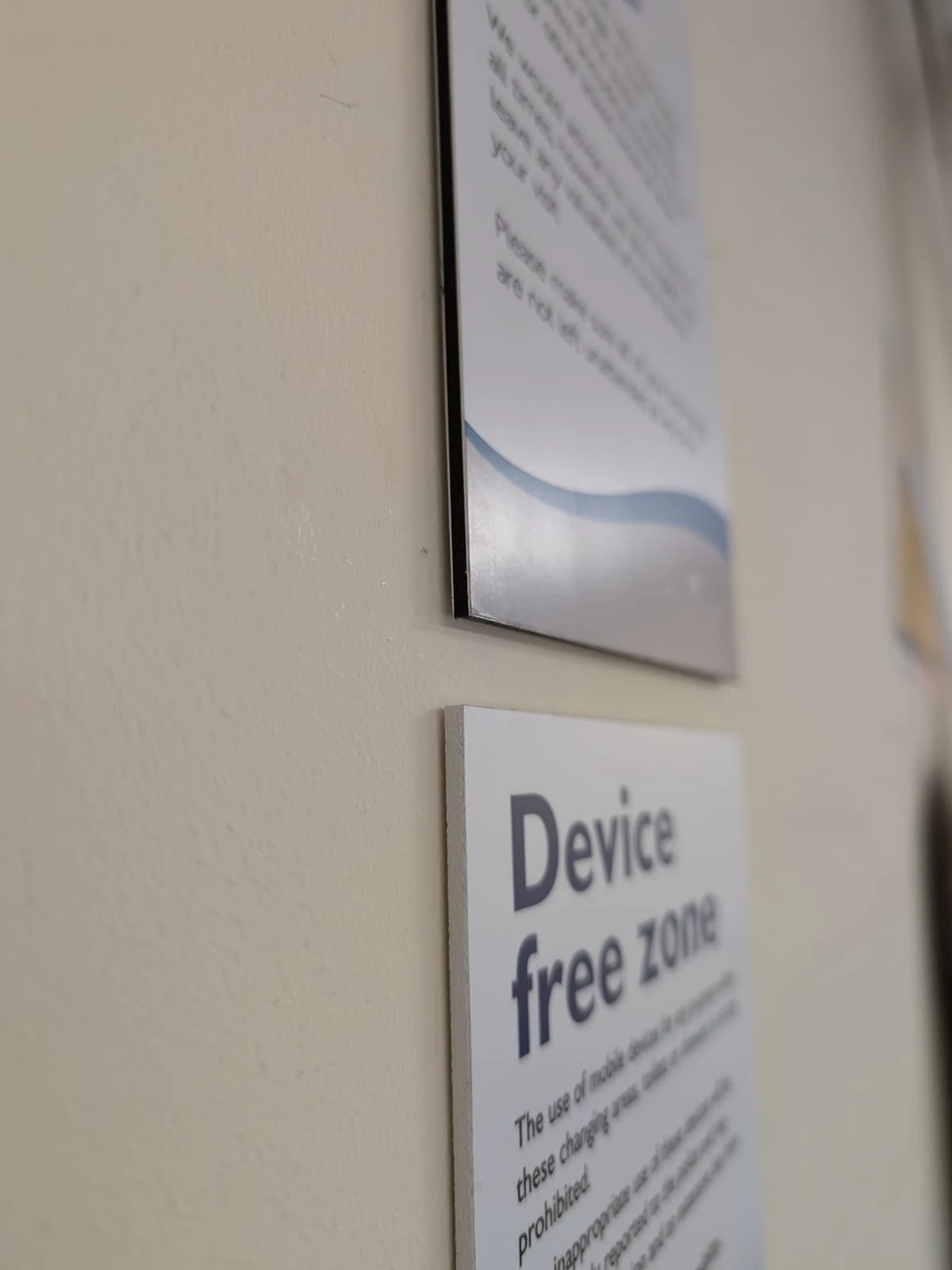
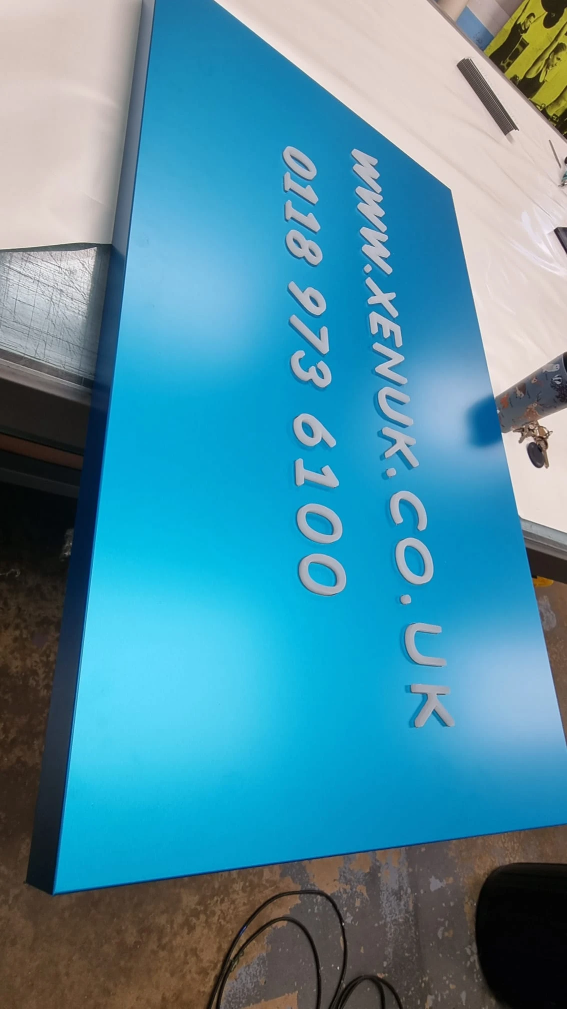
Dibond is a well known brand of aluminium composite material, often shortened to ACM. The name is frequently used more generally within the signage industry to describe this type of board.
Aluminium composte is made from two thin aluminium sheets bonded to a polyethylene core. This layered construction creates a strong and rigid panel without the weight of a solid sheet of aluminium.
For most general signage applications, aluminium composite is supplied at a thickness of 3mm. It provides a smooth, flat surface that can be printed directly or finished with a self-coloured or digitally printed vinyl. Dibond can also be cut, drilled, routed and folded. This makes it suitable for everything from straightforward flat panels to fabricated sign trays.
Its main benefits include:
Because it remains relatively lightweight, Dibond is often easier to handle and install than solid metal while still providing much of the strength needed for exterior signs.
Foamex is the name commonly used for rigid expanded PVC board. Despite the word “foam”, it is not a soft or flexible material. It is a firm, lightweight sheet with a smooth surface suitable for direct printing and applied vinyl graphics.
Foamex is commonly available in thicknesses including 3mm, 5mm 10mm, and even 19mm. Thinner sheets are useful for lightweight printed panels, while thicker boards offer greater rigidity and a more substantial edge.
It is easy to cut and can be shaped using CNC machinery, making it a versatile option for internal displays, shaped boards, flat-cut letters, and promotional signage.
Its main benefits include:
Foamex is particularly popular for indoor signage because it is light enough to install on many walls and display systems without requiring a heavy supporting structure.
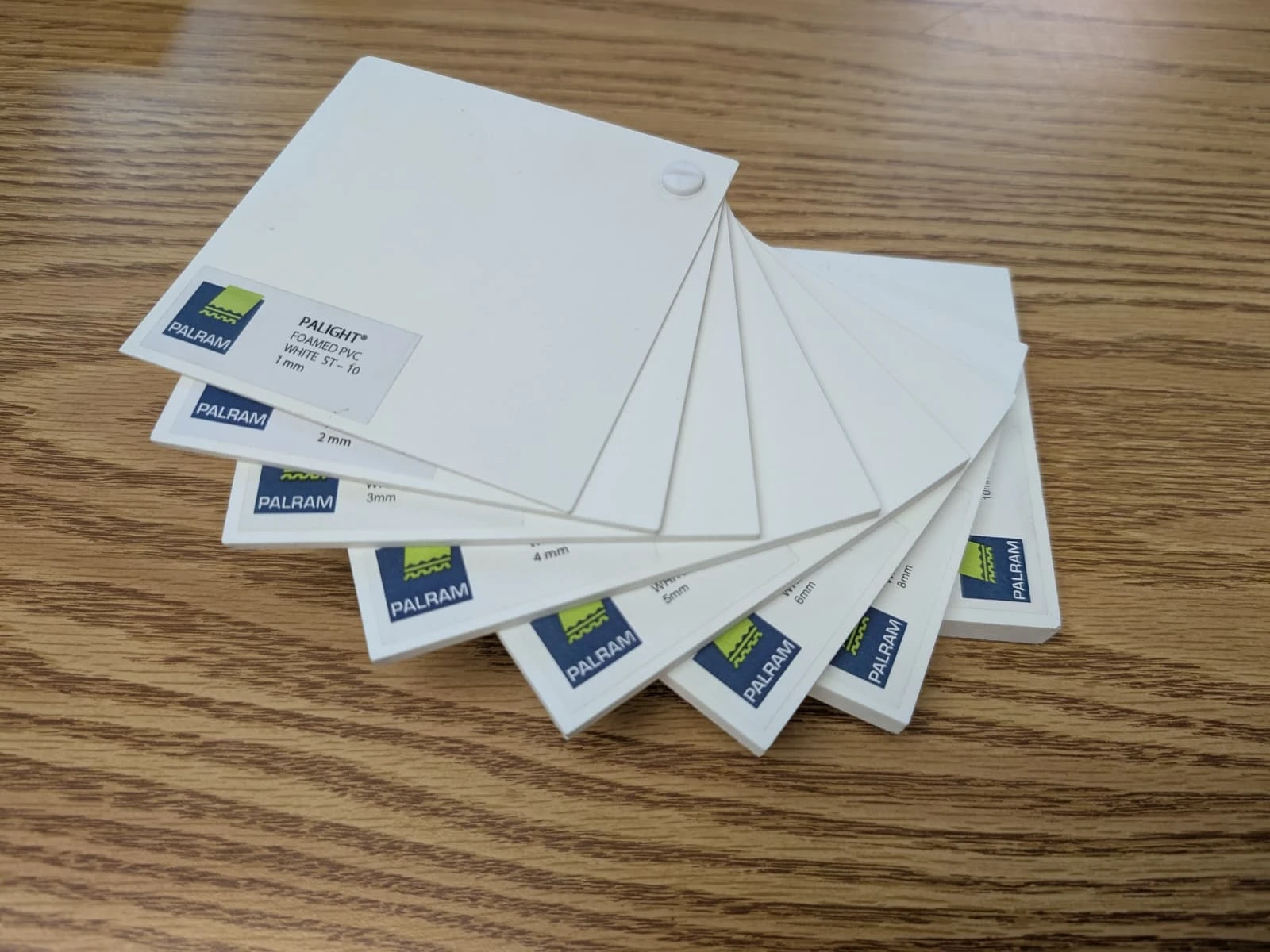
The most important difference is their construction, which therefore leads to what each material is best used for. Dibond has aluminium outer skins surrounding a plastic core, giving it greater strength and stability. Foamex is made form expanded PVC throughout, making it lighter but generally less rigid.
Dibond is usually the more suitable option when strength, rigidity and outdoor durability are important. It is commonly used for:
Its rigidity makes it particularly useful for larger signs that need to remain flat. Although any sign requires the correct support and fixing method, aluminium composite is less likely to flex or bow than an equivalent sheet of Foamex.
It is also better suited to exposed outdoor locations where the sign may face wind, rain, sunlight and changing temperatures.
For a permanent exterior business sign, Dibond or another suitable grade of aluminium composite will usually be a more dependable choice.
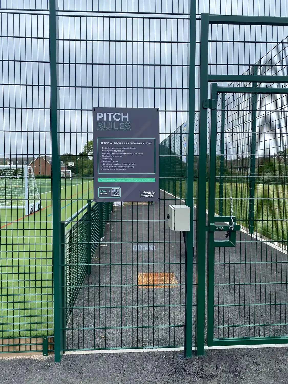
Foamex is a practical choice for indoor displays, lightweight signage and graphics that will only be required for a limited period. Common uses include:
Foamex is often the more economical choice, but this does not mean it is a lesser material. For the right application, its lower weight and easier handling can make it the most practical option.
Its low weight can make installation easier, particularly for internal displays that need to be moved or replaced regularly. It can also be cut into detailed shapes, making it useful for decorative panels and branded displays.
Foamex can be used outdoors, but its suitability depends on the size of the panel, its thickness, the installation method and the level of exposure.
Small Foamex signs can work well for temporary outdoor displays or in sheltered locations. Problems are more likely to arise when large panels are exposed to direct sunlight and changing temperatures. The material can expand, contract or begin to bow, particularly if it is not adequately supported.
Wind loading must also be considered. A large lightweight panel can be placed under considerable pressure in an exposed position, so choosing suitable fixings is just as important as choosing the board itself.
For long term exterior signage, especially in an exposed location, aluminium composite is generally the safer and more reliable option.
Dibond is not automatically better than Foamex. It is simply better suited to certain applications.
If you need a strong, rigid panel for a permanent outdoor sign, Dibond will usually be the better choice. If you need a lightweight internal display or a temporary promotional panel, Foamex may provide everything the project requires at a lower cost.
Before choosing your signage material, you should consider:
Avoid choosing between Dibond and Foamex based on price alone. The least expensive option at the point of purchase can become most costly if it isn’t right for your needs, or if it bows, breaks, or needs to replaced on a regular basis.
Instead, tell your signmaker where the sign will be installed, its rough dimensions and how long you expect to use it. Photographs of the location can also be helpful, particularly for exterior installations. With this information, they can recommend an appropriate material, thickness, print finish and fixing method for the job.
If you are still unsure whether Dibond or Foamex is right for your sign, contact our team with your rough sizes, installation location and approximate lifespan of the sign. We will then help you choose a solution that suits both the application and your budget, as well as give you the pros and cons of using either of the materials for your project.
Sometimes a project begins with a finished idea rather than a blank canvas. Bella Capri approached us with an image of another restaurant interior they had discovered and loved, particularly the wallpaper used throughout the space. They wanted to achieve a similar look at their Wimbledon restaurant and asked us to explore how we could bring that style into their own interior space.
After some research, we managed to track the original wallpaper down to a specialist supplier in Europe. While we had found exactly what the client had initially asked for, the cost of purchasing the wallpaper was considerably higher than anticipated. Rather than simply sourcing the existing product, we suggested another option: use the original image purely as inspiration and create something completely bespoke for Bella Capri!
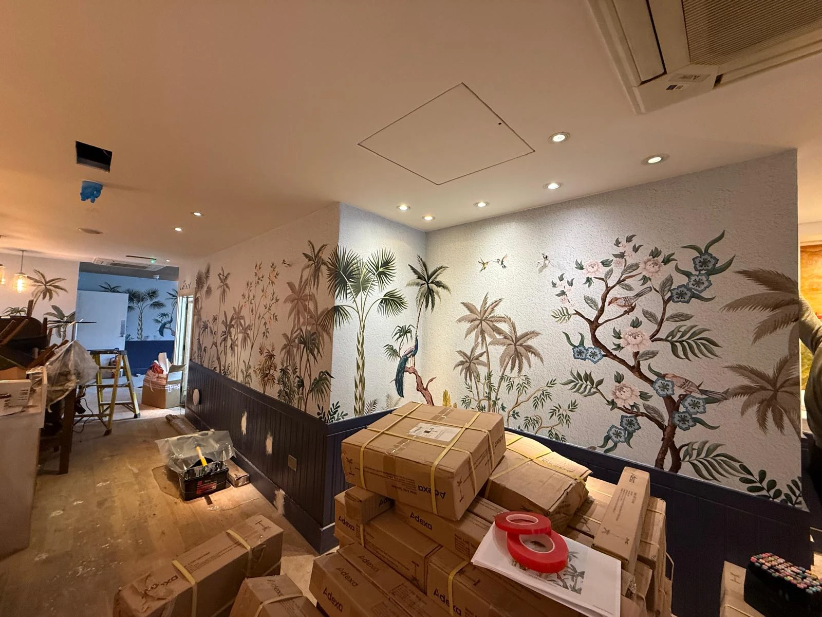
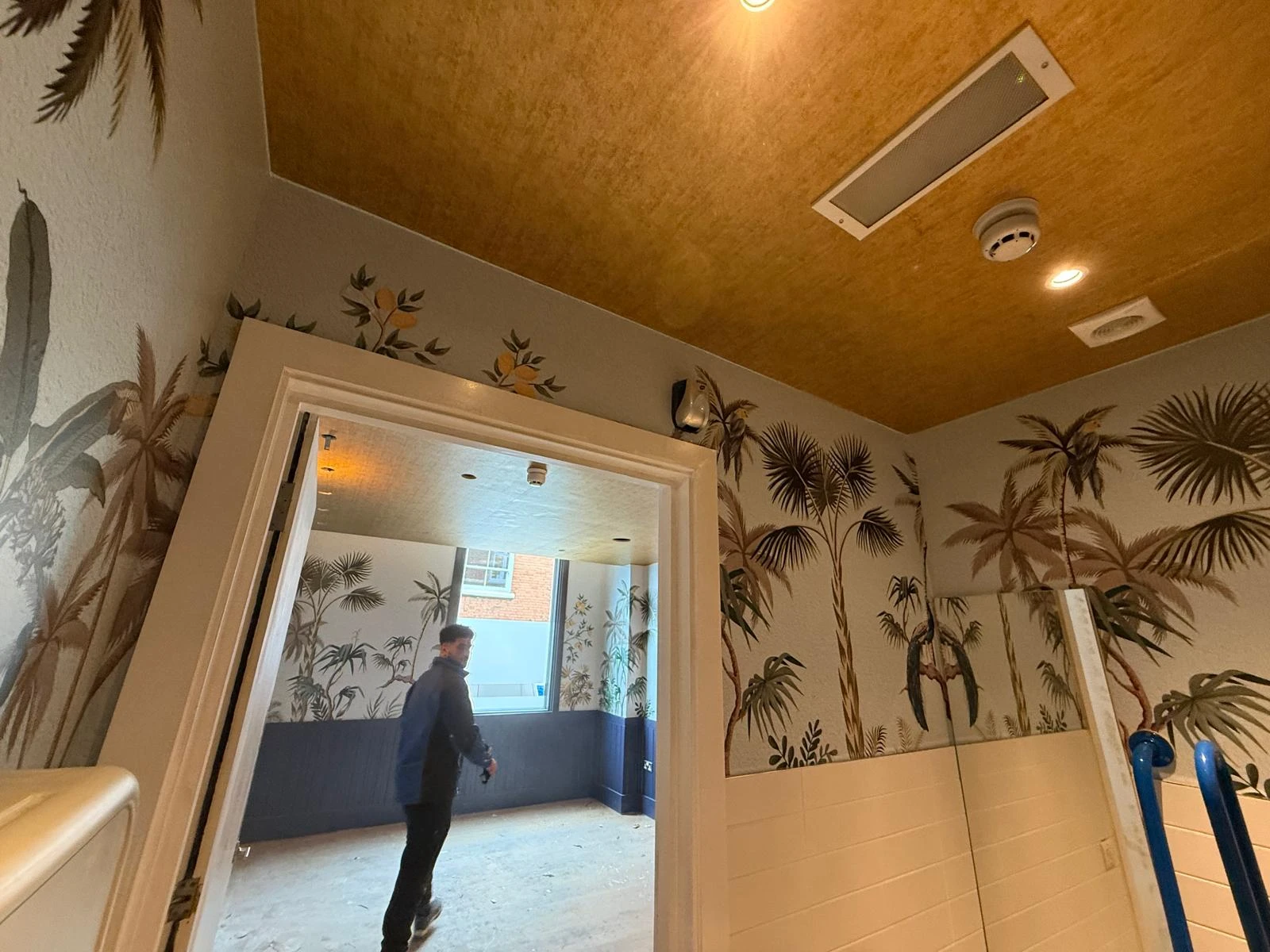
They loved the idea, giving our design team the opportunity to develop a wallpaper that captured the character and atmosphere they had been drawn to while creating something unique to their restaurant. Several concepts and revisions followed as we refined the artwork, gradually developing the design until we reached something they were completely happy with. The finished artwork could them be produced specifically for the dimensions and layout of their site in Wimbledon, rather than adapting and existing wallpaper to fit the space.
Once approved by the client, we printed the bespoke design and installed it throughout the restaurant, turning the artwork from something developed on screen into a major feature of the finished interior. Creating the design ourselves also meant that Bella Capri wasn’t simply recreating something they had seen elsewhere. The inspiration had become the starting point for an interior graphic designed specifically for them, giving the Wimbledon restaurant an identity of its own.
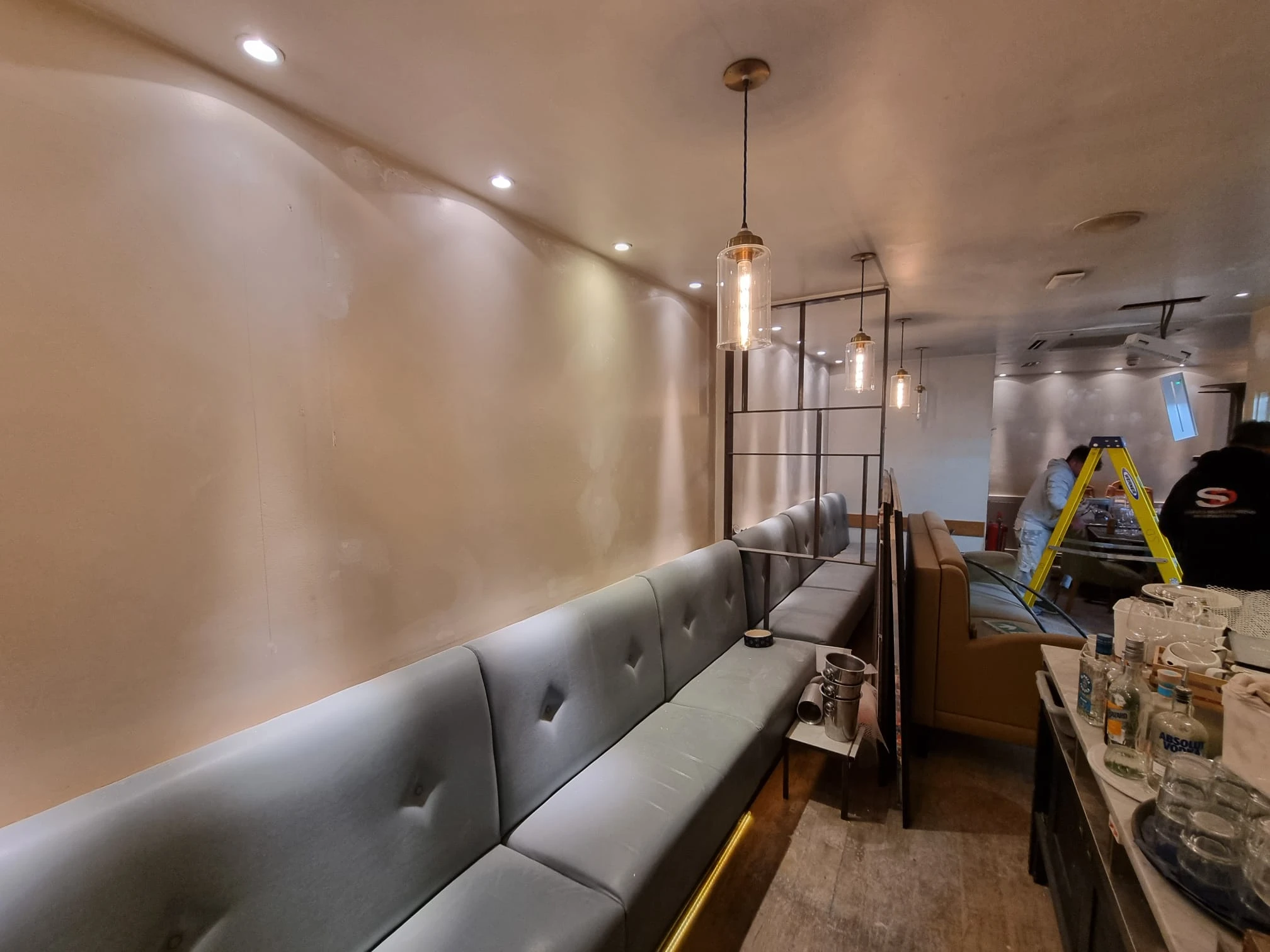
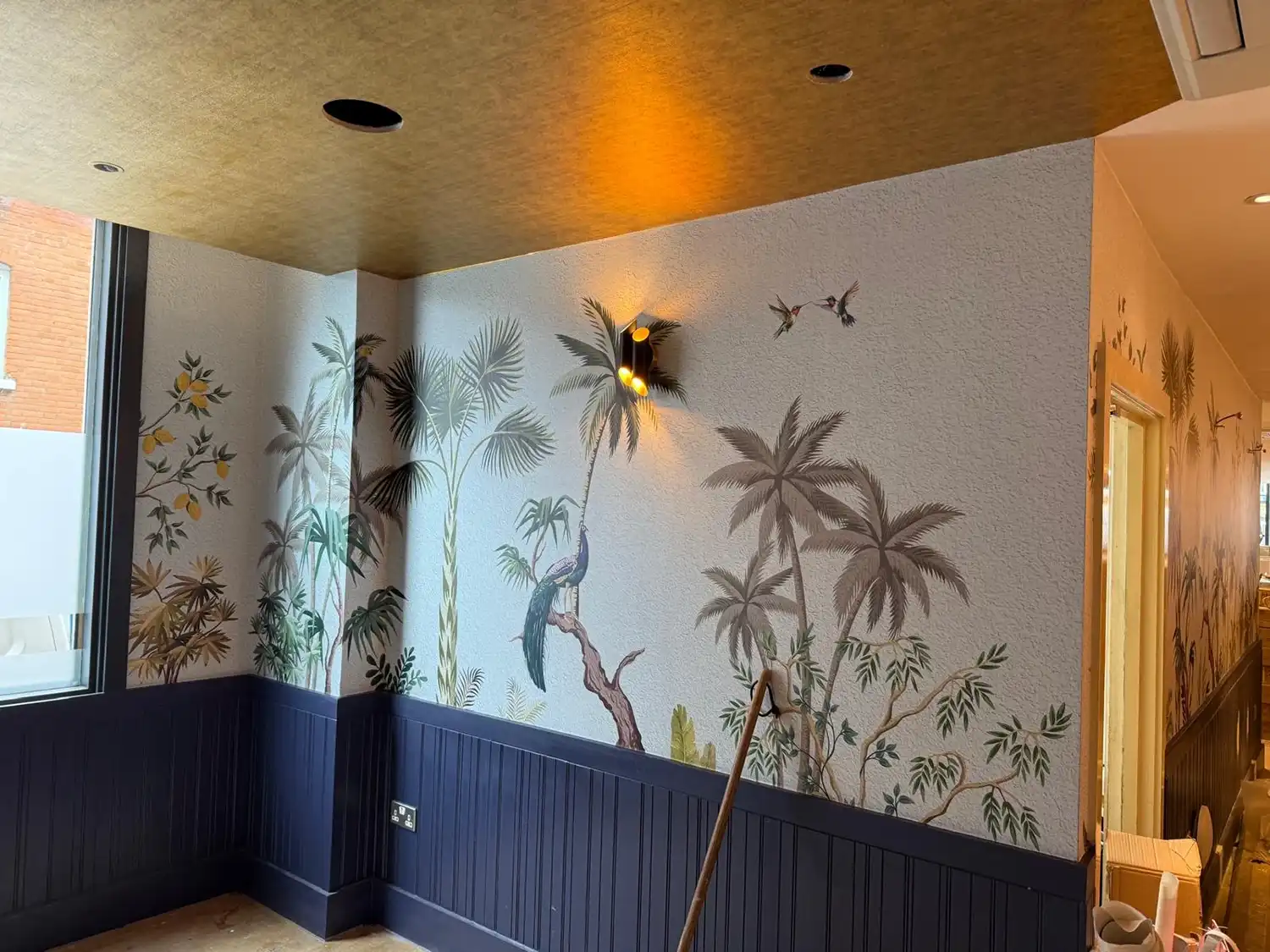
Wallpaper wasn’t the only transformation taking place. Bella Capri also wanted to introduce gold details into several areas of the restaurant. We applied a gold architectural film to ceiling areas within the toilets and corridors surrounding the toilets, creating a completely different finish without the need to replace the existing surfaces. The gold works particularly well alongside the bespoke wallpaper, adding another layer of detail and helping create the rich, decorative feel the client wanted for the interior.
The finished project is a great example of what can happen when a client’s initial inspiration is developed into something much more personal. What began as a request to replicate a wallpaper they had seen elsewhere ultimately resulted in a bespoke design created specifically for Bella Capri, complemented by architectural finishes that helped tie the wider interior together.
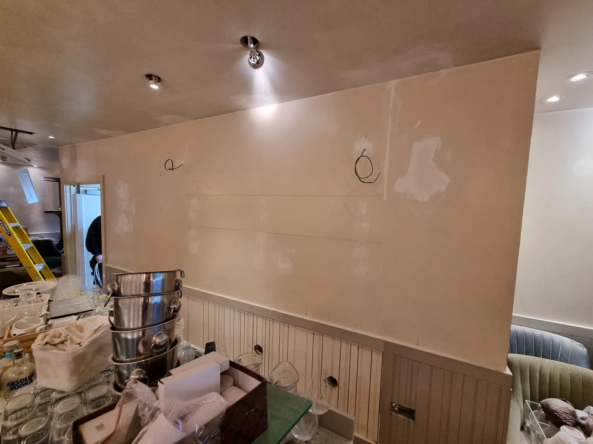
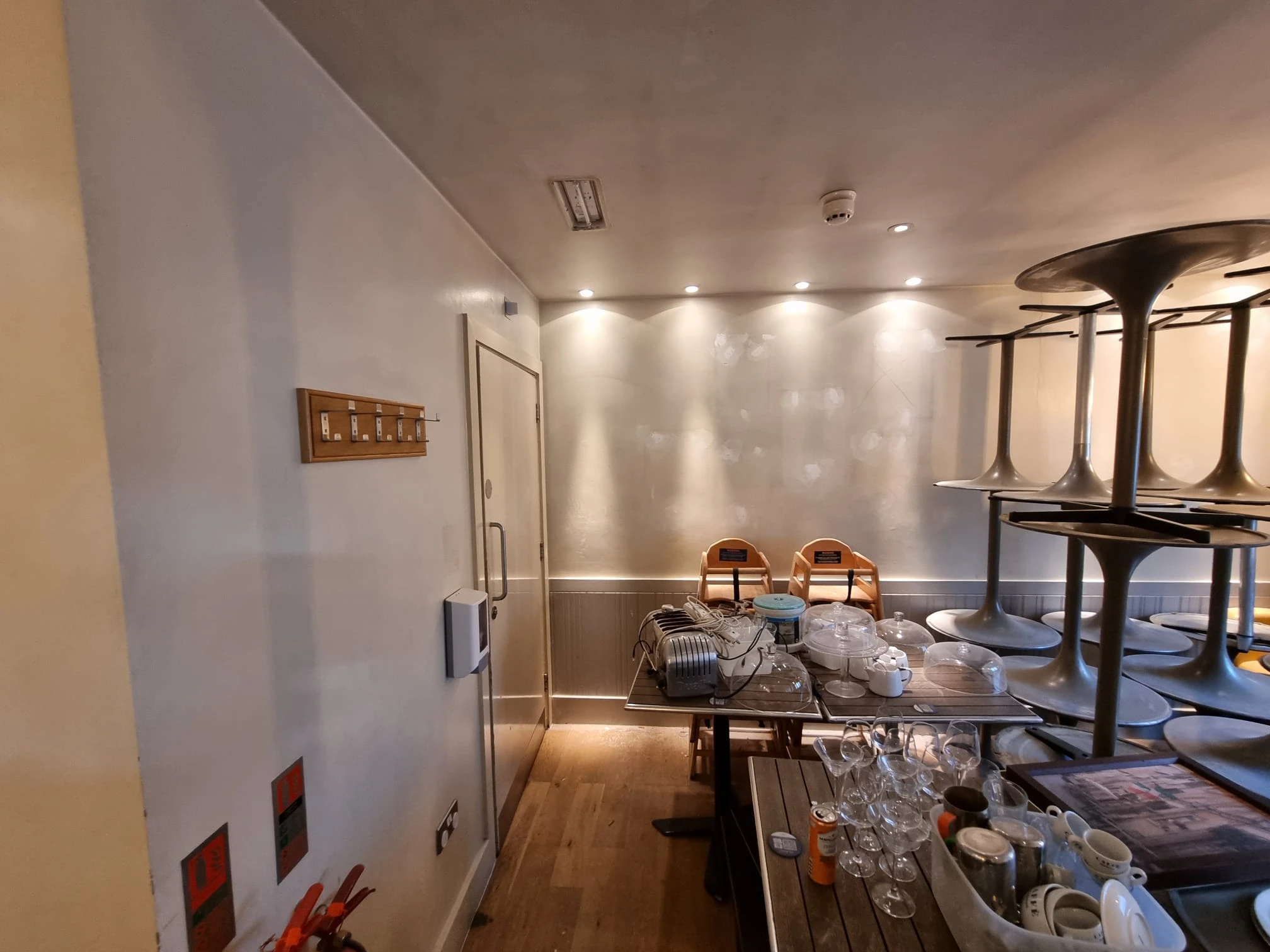
For us, it also demonstrates that bespoke design doesn’t always have to begin with a completely new idea. Inspiration can come from anywhere; the important part is taking what the client loves about it and developing it into something that feels entirely their own.
A waterslide is probably not the firs thing that comes to mind when you think of large format graphics, but this project for Freedom Leisure at Guildford Spectrum gave us the opportunity to take our design, print and installation capabilities somewhere a little different!
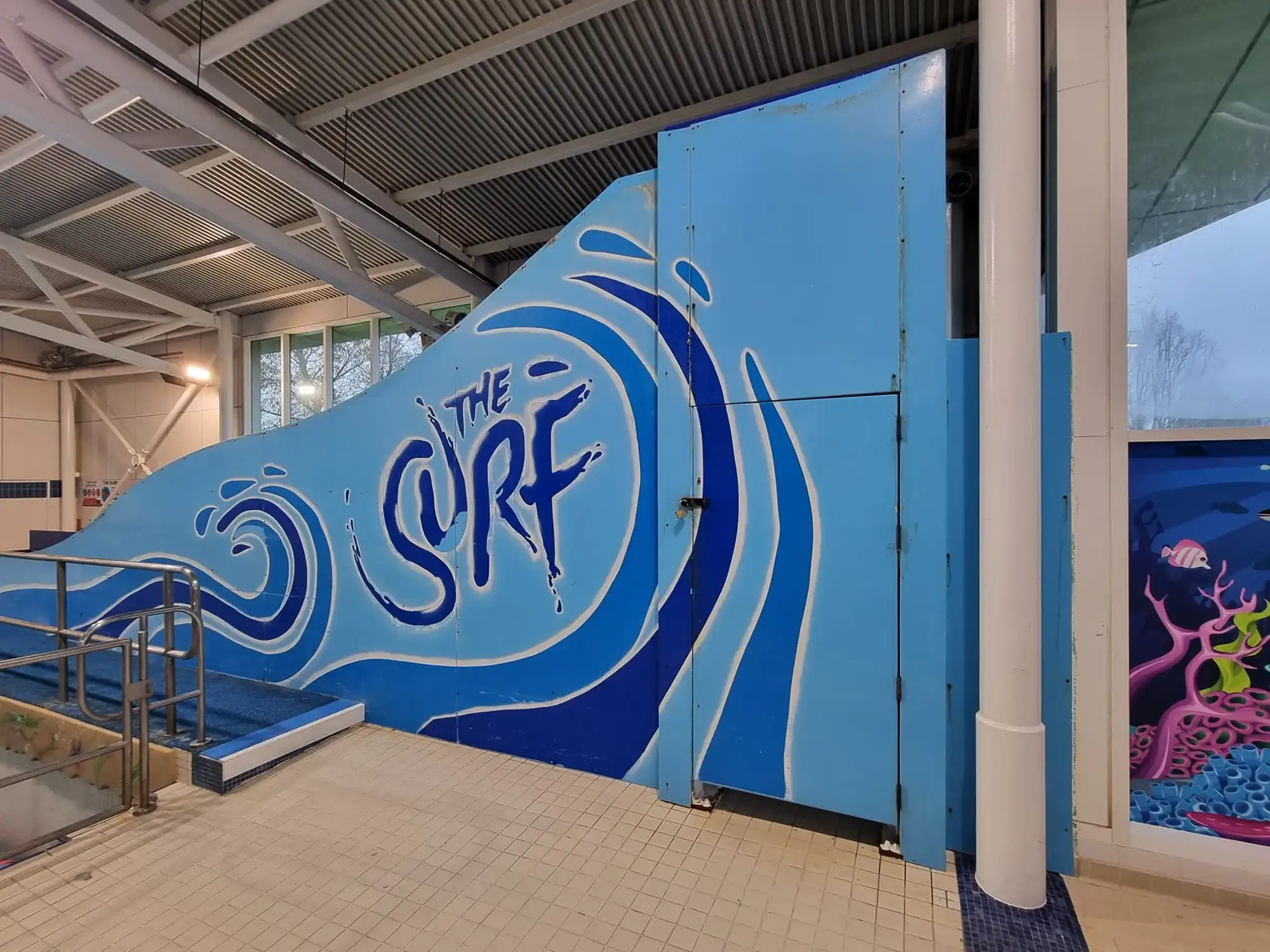
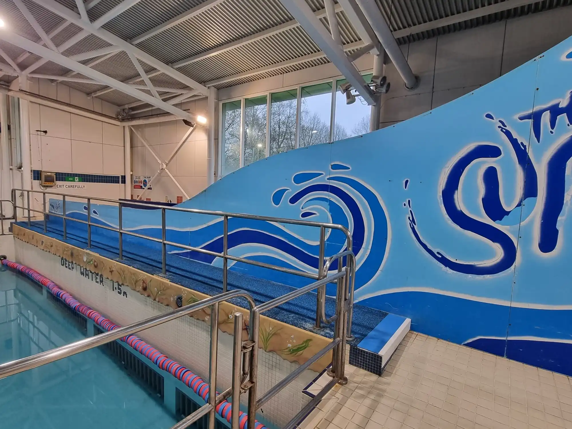
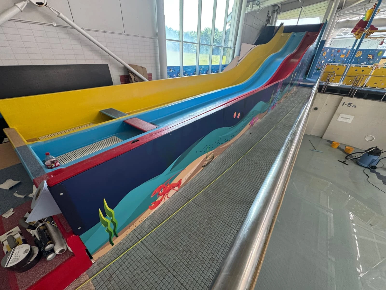
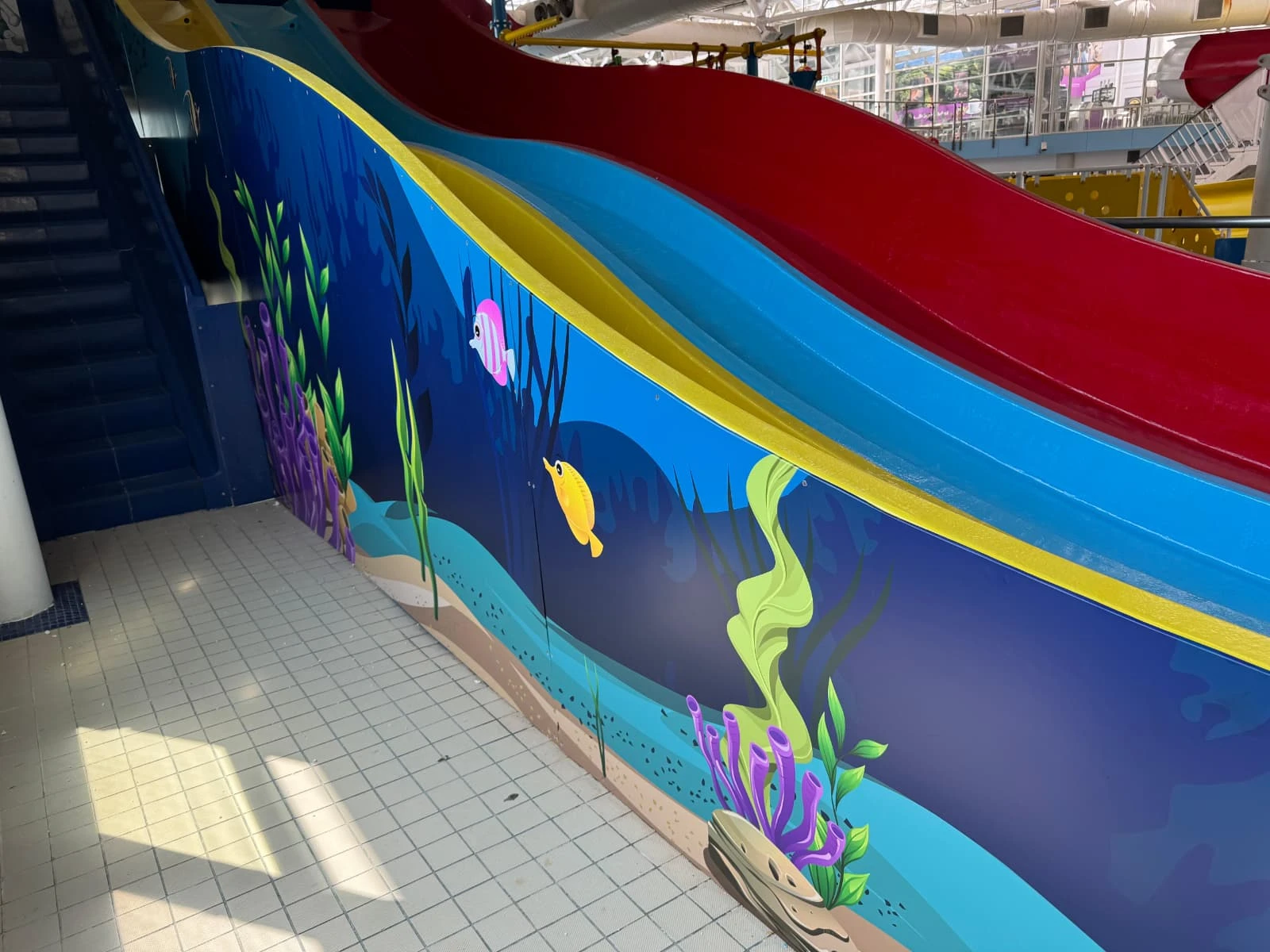
As part of an update to the leisure facility, Freedom Leisure wanted to give the large waterslide structure a fresh, more modern appearance. The existing design consisted mostly of blue painted panels with a vinyl graphic across the structure. The brief was to transform both sides of the slide with a colourful underwater theme, taking inspiration from artwork being used elsewhere within the facility’s upgrade works. Our design team recreated this visual style across the much larger structure, incorporating underwater scenery, sea life, coral and plant life to make the slide feel like part of the surrounding aquatic-themed environment.
The scale and construction of the waterslide made this considerable more involved than applying graphics to a regular wall. Both sides were made up of individual fibreglass panels, each forming part of the overall shape of the structure. Our installation team carefully removed the panels from the slide and transported them back to our workshop, where preparation could begin.
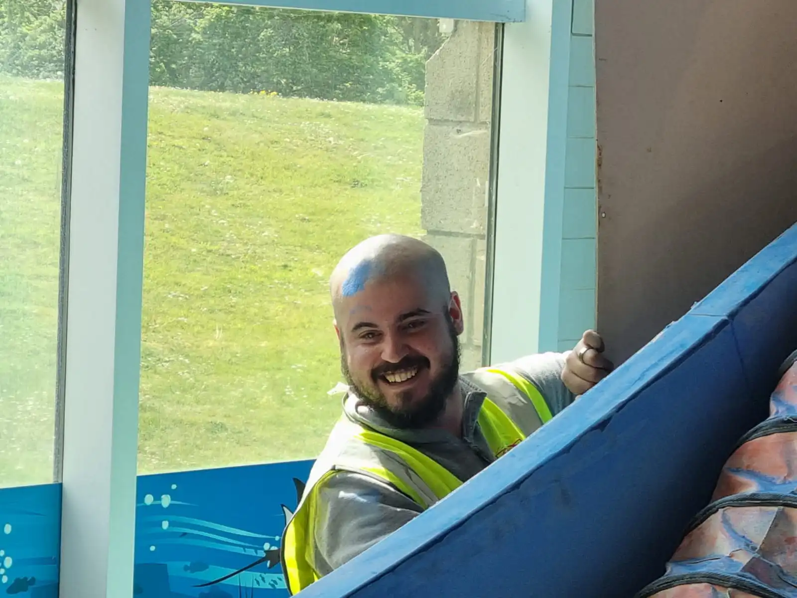
One of the team’s favourite photos from this project is one of our team members having a blue mark on his head from the residue where other contractors had already started working on sanding other areas of the slide down. He cracked on with a smile on his face though!!
Before any new graphics could be applied, every panel needed to have a clean and smooth surface. The previous vinyl and painted finish were removed and the fibreglass panels were sanded down individually, giving us the best possible base for the new graphics. With so many separate pieces eventually needing to come back together as one design, preparation wasn’t limited to the panels themselves. The artwork was carefully set up for print so that we could accurately position each section and ensure the underwater scene flowed from one panel to the next once everything was reassembled.
Each panel was wrapped at our workshop before being transported back to Guildford Spectrum for installation. Although the leisure centre remained operational throughout the project, the area surrounding the waterslide was closed, allowing our team to reinstall the finished panels safely and methodically. Piece by piece, the structure came back together and the individual graphics became one large underwater scene spanning both sides of the slide.
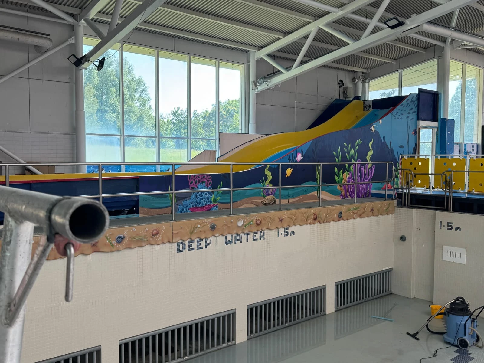
The difference between the original structure and the finished installation was huge! What had previously been a mostly blue feature became an engaging part of the pool environment, with the new artwork giving the waterslide a completely different character while matching the style used elsewhere in the facility. Freedom Leisure were delighted with how the finished graphics looked, and seeing the complete design come together on site was equally rewarding for our own team after the amount of preparation that had gone into it.
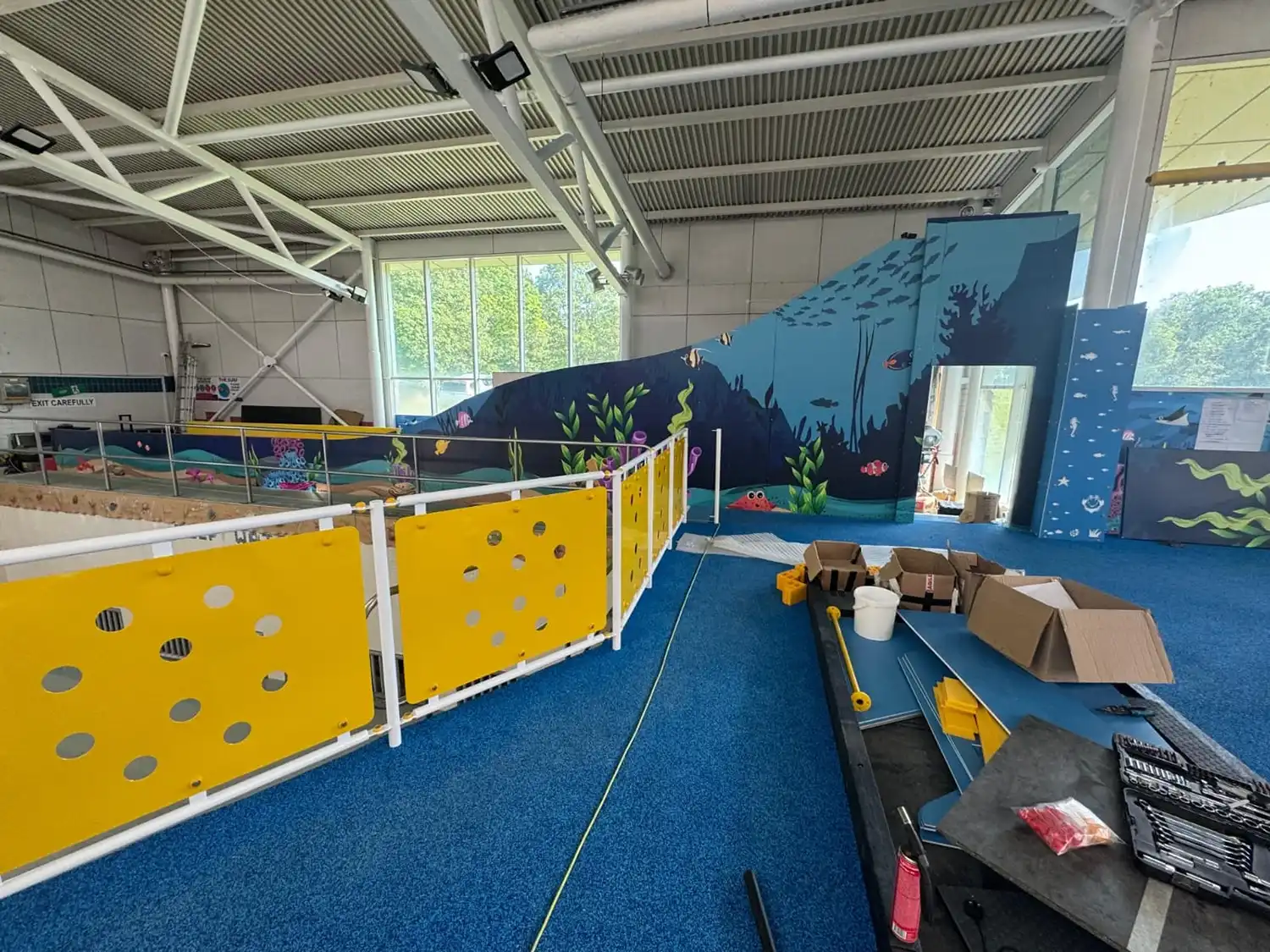
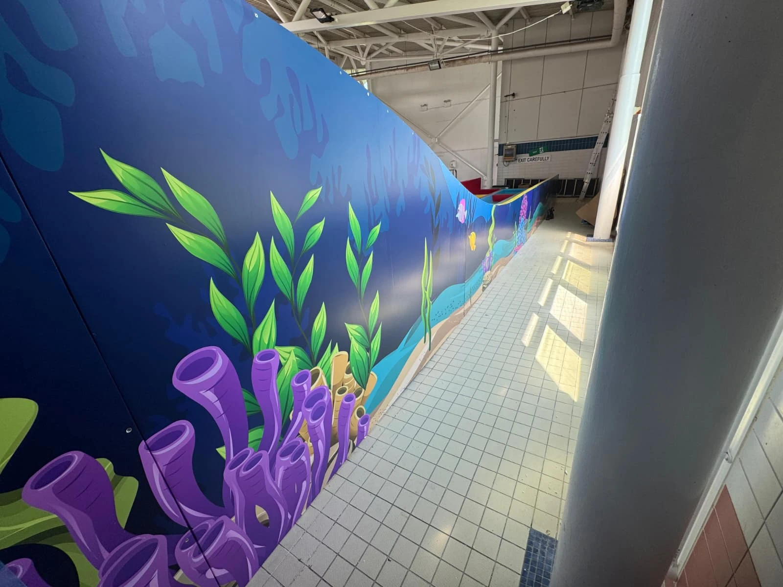
Projects like this are a great example of just how versatile large format graphics can be. A surface doesn’t necessarily need to be flat, straightforward or even conventional. With the right prep work, artwork and installation processes, graphics can completely transform any space or structure – even one as large and unusual as a waterslide!
Following the transformation of Bella Capri’s Wimbledon restaurant, the client returned to us with a new challenge: could we take the bespoke wallpaper we had created for Wimbledon and bring the same character to their restaurant in Fleet?
Rather than simple reproducing the original artwork, we needed to adapt it to work within a completely different space. Our team visited the Fleet restaurant to measure the areas and understand how the existing interior would affect the design. From there, we reworked the original artwork specifically for the new dimensions, retaining the recognisable style of the Wimbledon installation while ensuring it felt considered for its new surroundings.
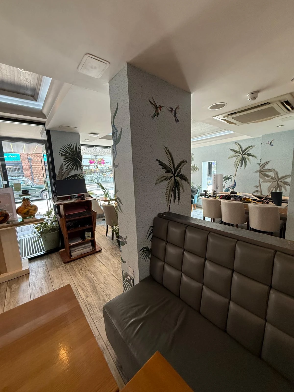
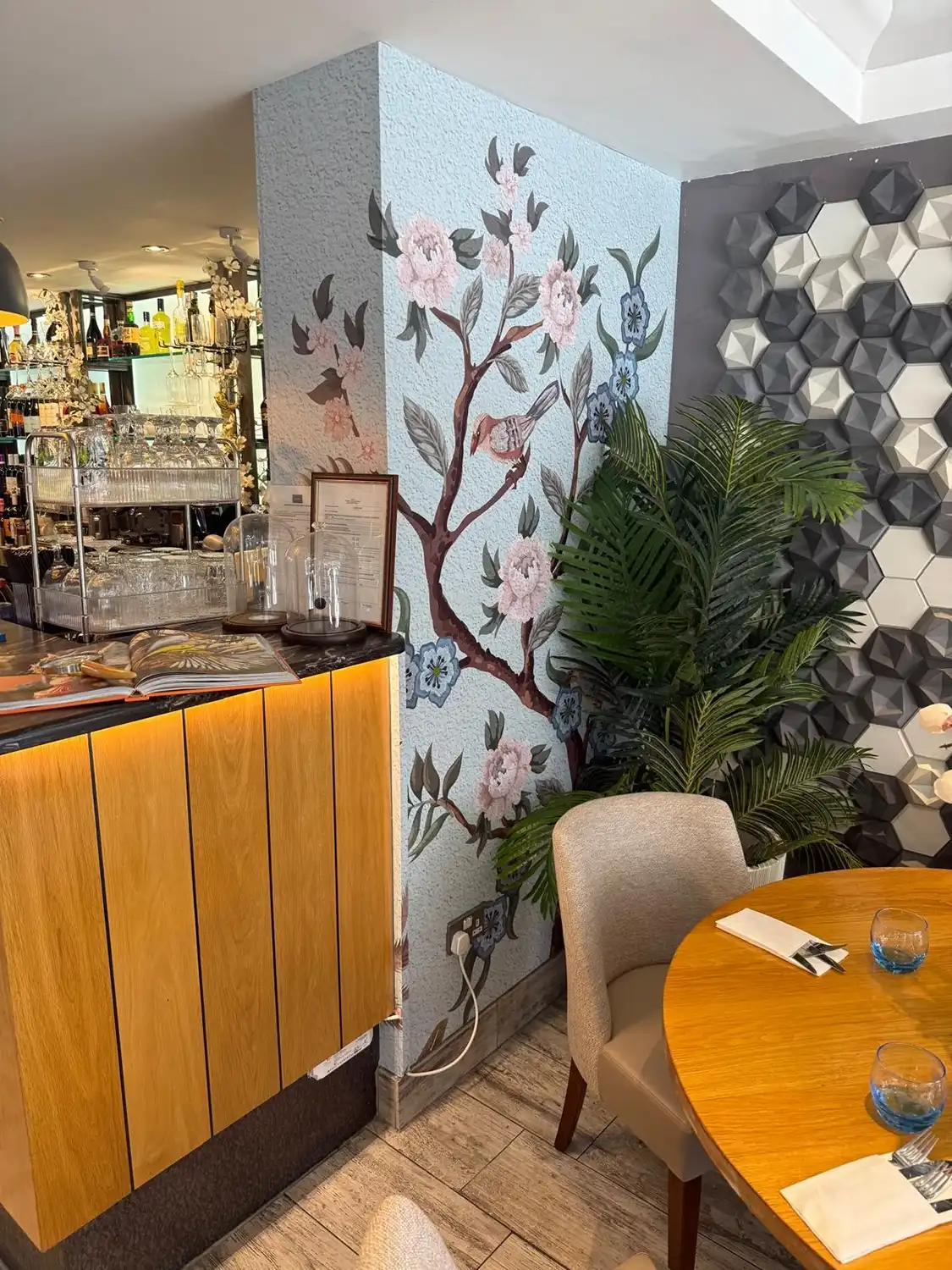
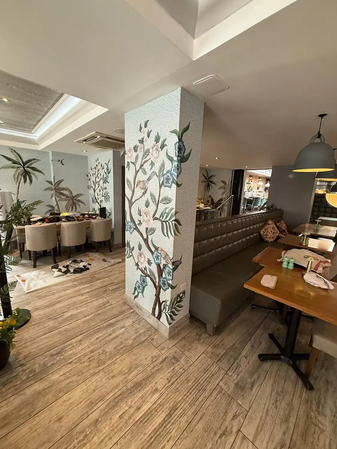
The layout at Fleet presented some interesting challenges. Several of the walls connected with columns and other architectural features, creating intricate areas where a continuous design could quickly become difficult to install. With a detailed wallpaper design like this, trying to align key elements across every corner, column and change in surface would have made installation unnecessarily complicated and left very little room for adjustment.
Our design team approached the artwork with installation in mind from the beginning. The design was carefully repositioned so that transitions fell naturally around the more complex areas, reducing the amount of intricate alignment required without compromising the overall appearance. This allowed our installers to work effectively around the architecture while keeping the finished wallpaper cohesive across the restaurant. It also meant that, although Fleet retained the same visual style and design elements as Wimbledon, the different layout required its own bespoke version of the artwork, giving each restaurant a unique interpretation of the Bella Capri design.
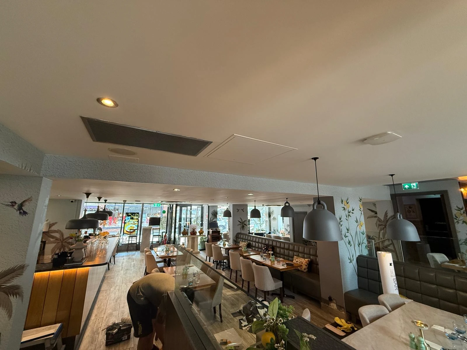
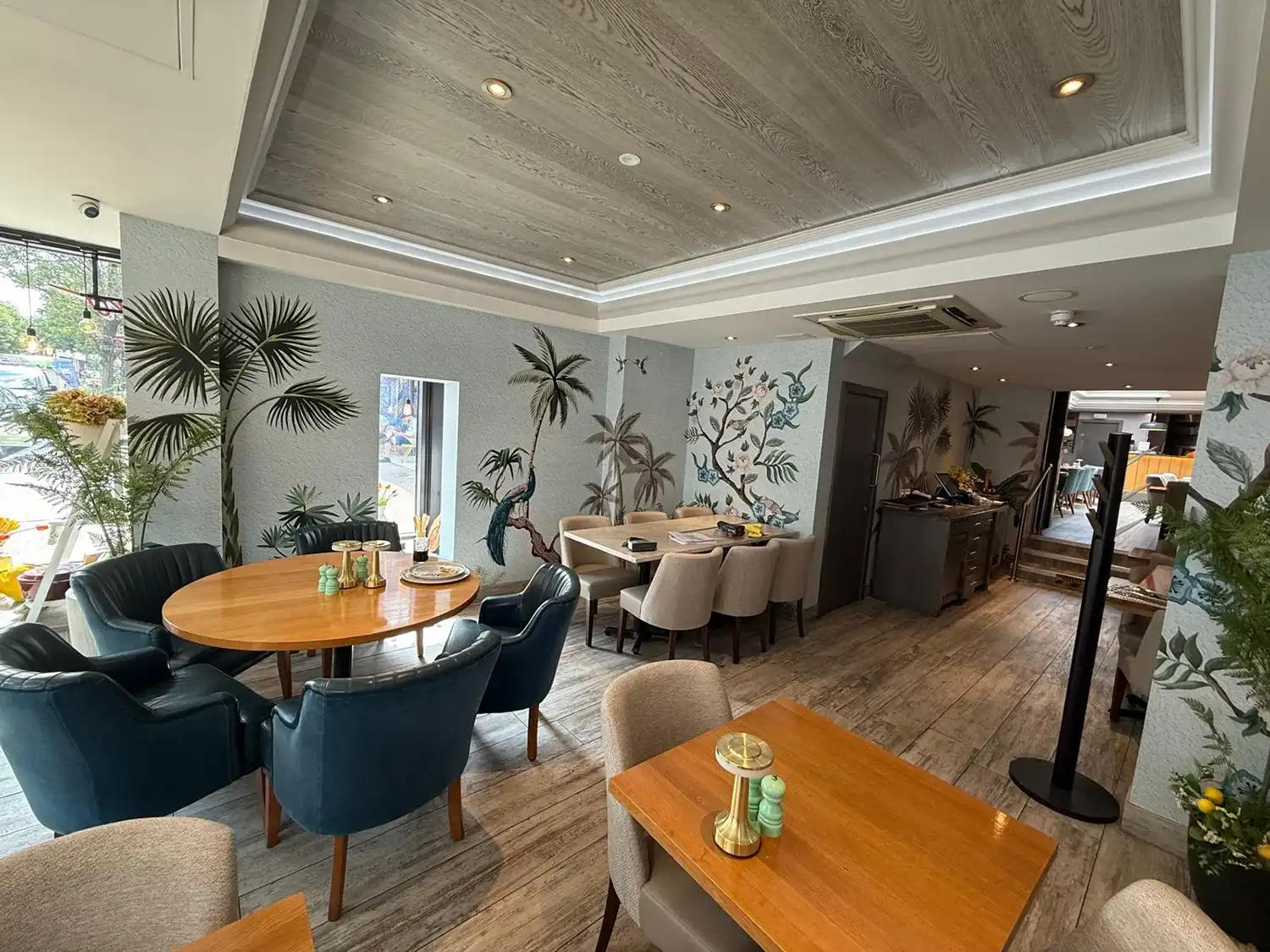
At Wimbledon, we had complemented the wallpaper with gold architectural film across selected ceiling areas. We considered using the same treatment at Fleet, but after assessing the space, decided with the client that it wouldn’t improve the finished interior. The proposed area was already relatively enclosed, and introducing a metallic gold architectural film to the ceiling risked making it feel even more boxed in. The existing ceiling architecture also created a natural visual break from the wallpaper, so adding another contrasting finish would have drawn unnecessary attention to an area that didn’t need it. Sometimes knowing what not to add is just as important as the finished design.
The installation team also needed to work around a functioning restaurant. We carried out much of the work during early mornings to keep disruption to a minimum, but as the restaurant opened for service, our team continued working during quieter lunchtime periods. This meant some diners were able to watch the transformation taking place while enjoying their lunch, with our installers carefully working around the restaurant’s day-to-day operations.

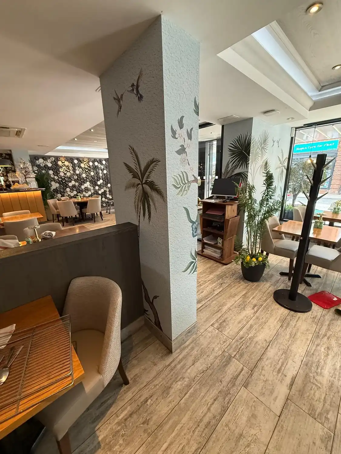
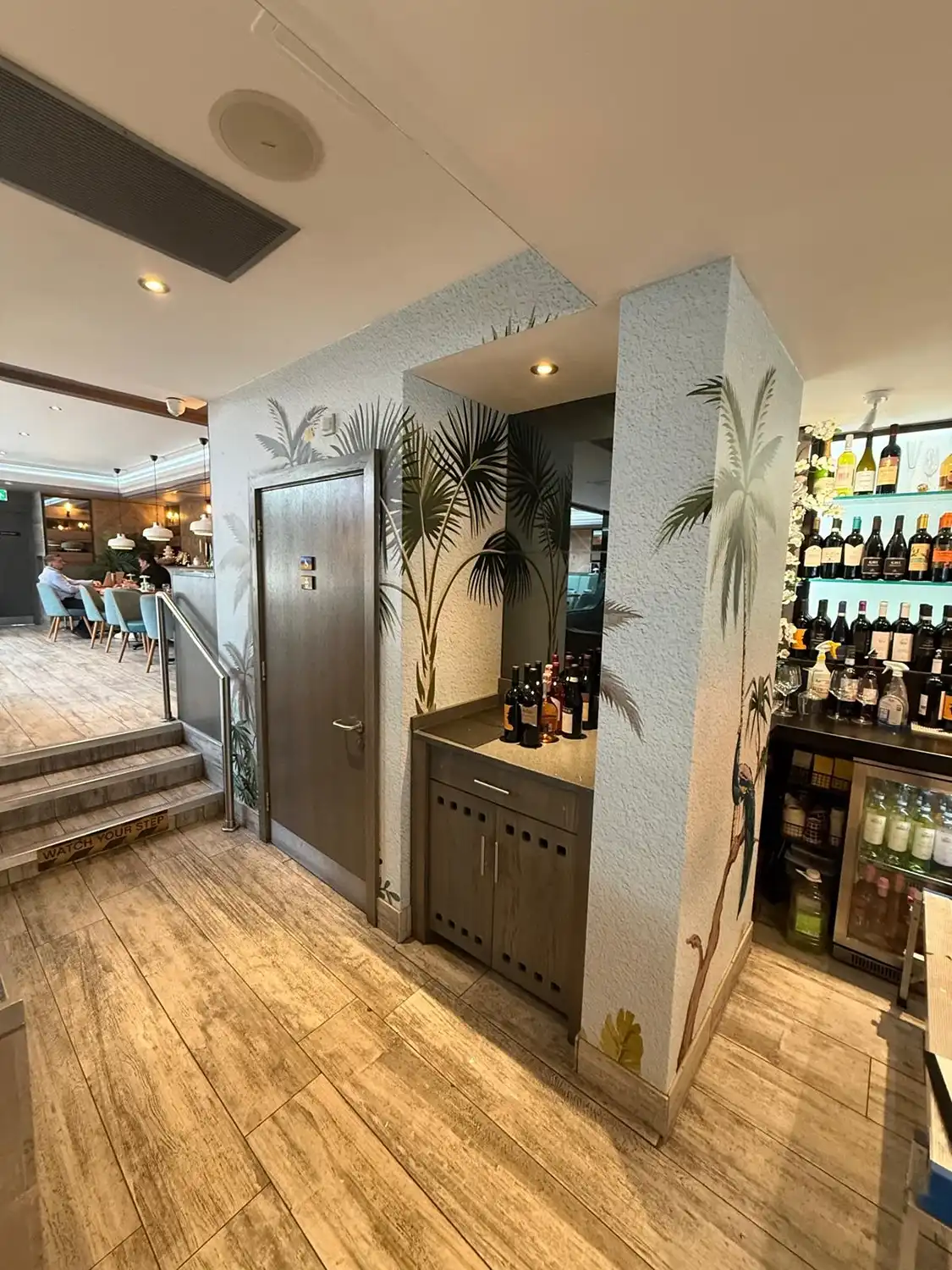
The finished installation gave Bella Capri Fleet the same distinctive visual identity we had originally developed for Wimbledon, but adapted specifically for the layout at Fleet. The client was once again delighted with the result, and for us, it was particularly rewarding to see a bespoke design originally created for one location become part of a wider, recognisable interior style for Bella Capri.
This project also demonstrates the value of bespoke artwork beyond a single installation. Because the original wallpaper was designed specifically for Bella Capri, we were able to revisit, reshape and adapt it for a completely different environment – creating consistency between the two restaurants without simply making them identical.
Opening a restaurant is a big milestone, and for the person behind Bulbul, it was one we were particularly pleased to be part of. Having worked with us previously on signage for another restaurant, he returned to us when opening Bulbul in London, this time with a restaurant he was managing himself. The branding was already established; our job was to take that identity and turn it into signage that would give the new restaurant the presence it deserved.
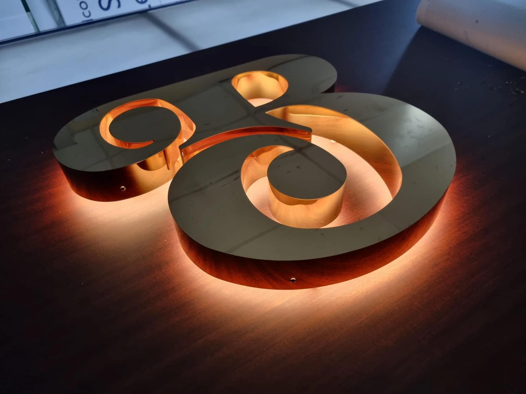
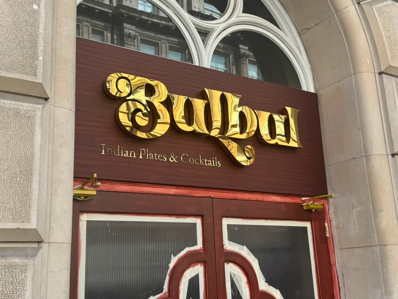
With gold forming part of Bulbul’s brand palette alongside rich burgundy and mahogany tones, we suggested polished gold as the main finish for the signage. The client wanted substantial, dimensional lettering that would stand out, so for the exterior we manufactured built-up polished gold letters with white halo illumination, creating a strong feature during the day and a warm glow once illuminated.
The lettering was mounted onto a fabricated sign tray finished in a wood-effect architectural film, selected to complement the finish chosen for the restaurant doors underneath. Architectural film was particularly well suited to the application because of the textured surface it had which gave the wood effect greater depth and character than a standard printed finish.
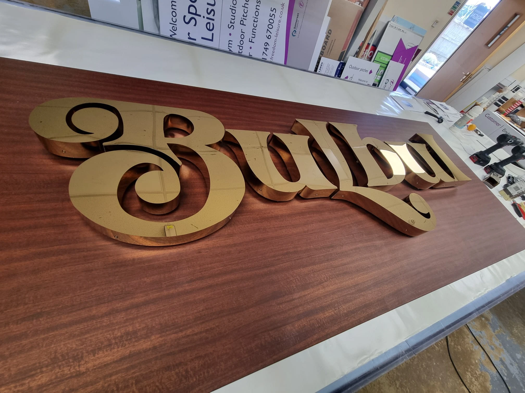
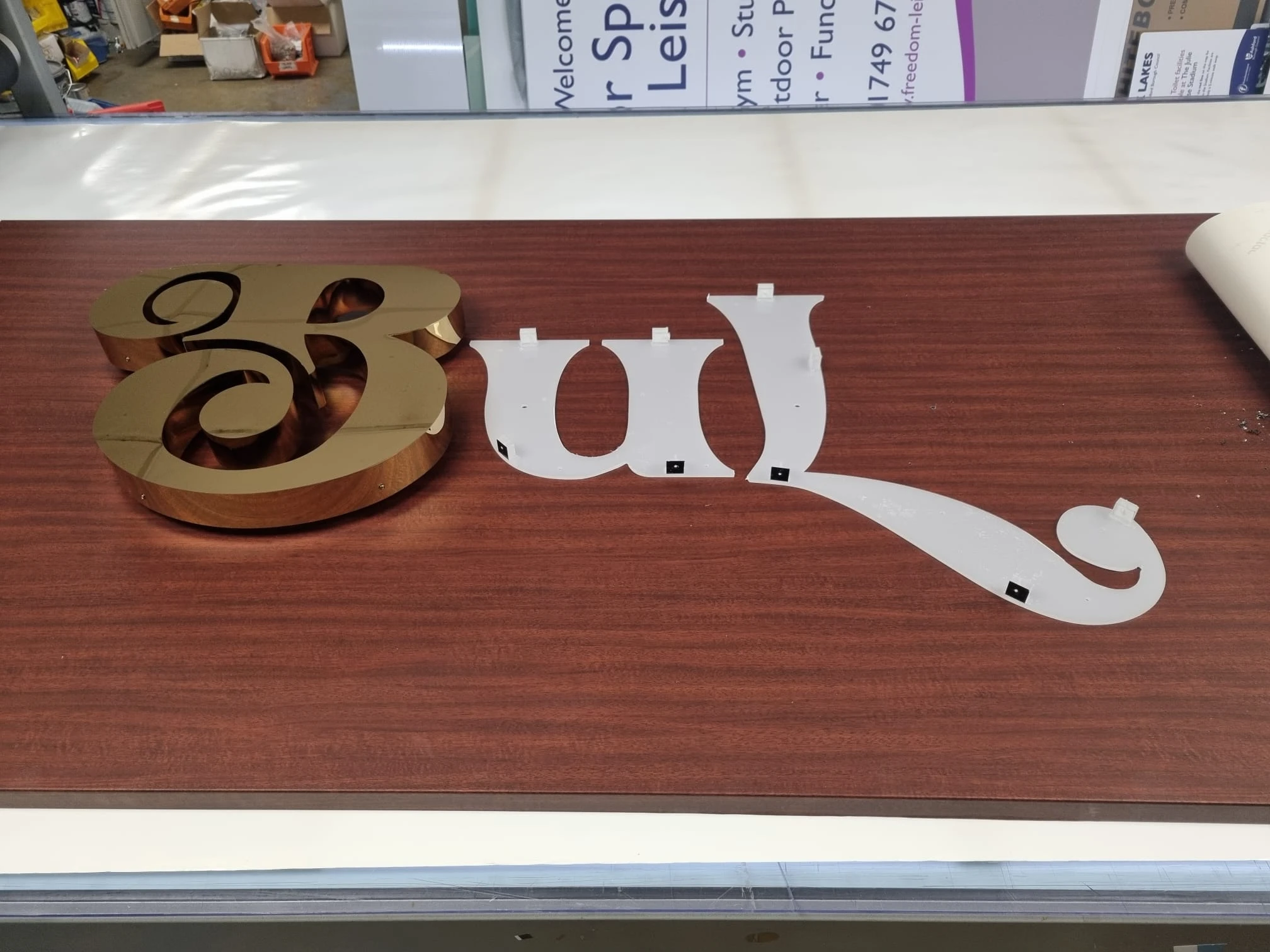
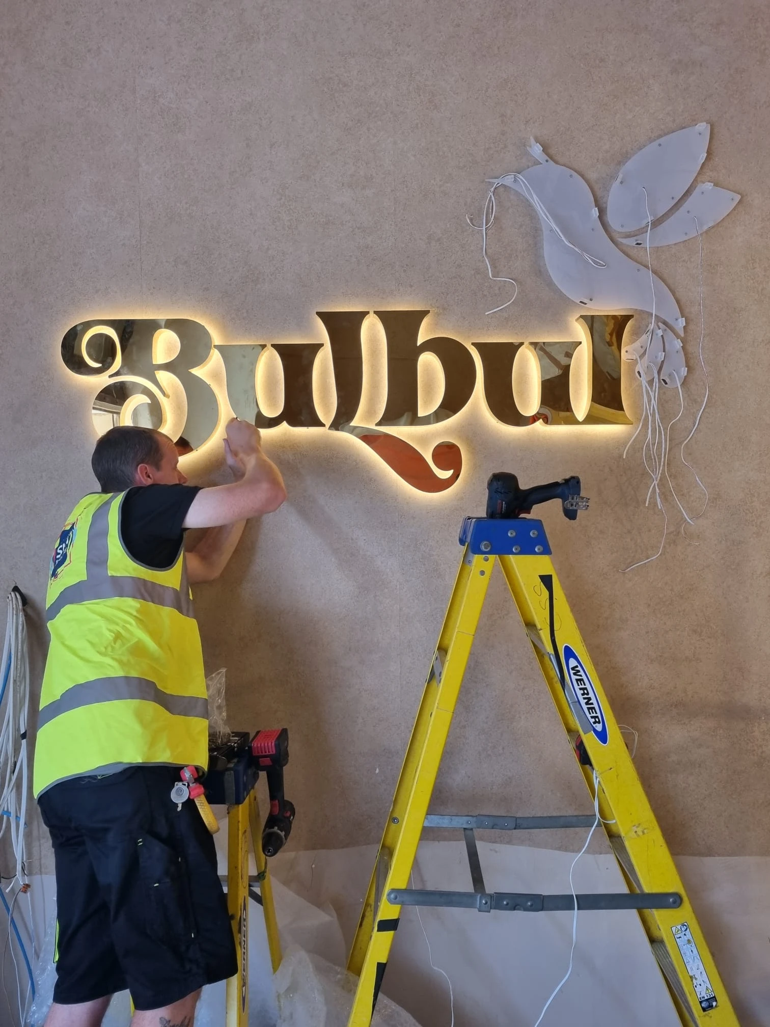
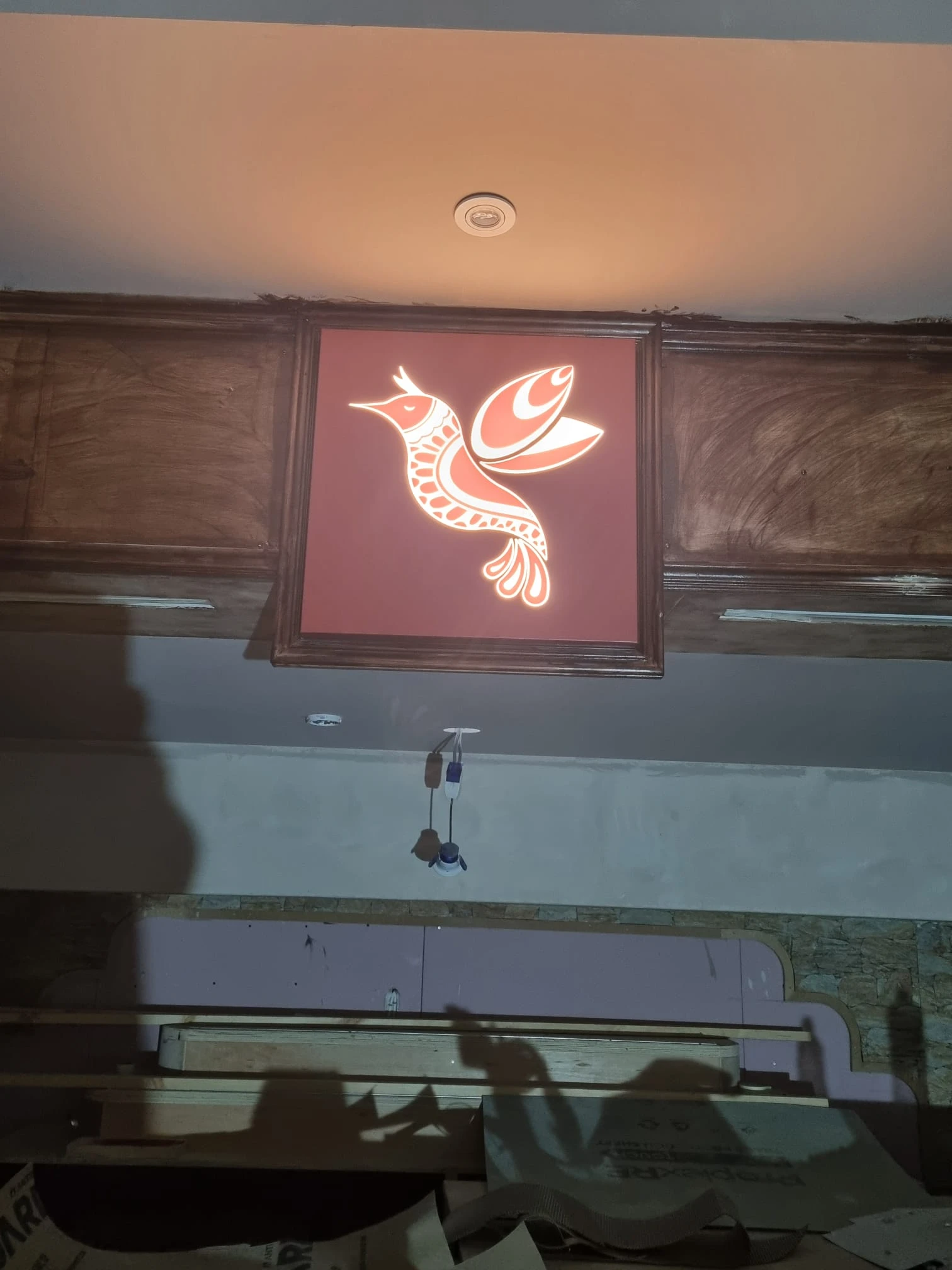
We also carried the Bulbul identity through to the interior using different interpretations of the branding. Above the bar, the bird from the logo became a feature in its own right, pushed through a sign tray and illuminated from behind. Near the entrance, we created another version of the full Bulbul logo in polished gold, using white vinyl detailing to reproduce the more intricate elements within the bird. Each sign had its own character while remaining clearly connected through the same colours, finishes and branding.

Before heading to site, the illuminated signage was assembled and tested in our workshop. This allowed us to check the lighting, finishes and overall appearance before installation and make sure everything was working exactly as intended.
Once installed, the combination of polished gold, warm illumination, burgundy detailing and wood-effect finishes worked beautifully alongside the restaurant’s interior and existing brand palette. The client was delighted with the finished result, and having worked with him previously, it was particularly rewarding to help bring the identity of his own new restaurant to life for the first time.
There is also potential for further signage and graphics as the restaurant develops, so while this initial project is complete, we hope it won’t be the last time we get to work with Bulbul.


